Enter/Exit Transition
You can use transition, a basic component transition API, to animate the process in which a component enters or exits the view. You can even use it with TransitionEffect to up your animation game.
Table 1 Transition effect APIs
| API | Description | Animation |
|---|---|---|
| IDENTITY | Disables the transition effect. | None. |
| OPACITY | Applies the default opacity transition effect. | The component enters by changing the opacity from 0 to 1 and exits by changing the opacity from 1 to 0. |
| SLIDE | Applies a sliding transition effect. | The component enters by sliding in from the left edge of the window and exits by sliding out from the right edge of the window. |
| translate | Applies a translation transition effect. | The component enters by moving from the position set by the translate API to the default position (value 0), and exits by moving from the default position (value 0) to the position set by the translate API. |
| rotate | Applies a rotation transition effect. | The component enters by rotating from the position set by the rotate API to the default position (value 0), and exits by rotating from the default position (value 0) to the position set by the rotate API. |
| opacity | Applies an opacity transition effect. | The component enters by changing the opacity from the set value to 1 (default value) and exits by changing the opacity from 1 to the set value. |
| move | Applies a transition effect by specifying which edge the component slides in and out of through TransitionEdge. | The component enters by sliding in from the edge specified by TransitionEdge and exits by sliding out of the same edge. |
| asymmetric | Applies an asymmetric transition effect. - appear: enter transition effect. - disappear: exit transition effect. |
The component enters by applying the transition effect specified by appear and exits by applying the transition effect specified by disappear. |
| combine | Combines with other transition effects. | The component enters and exits by combing with other transition effects. |
| animation | Defines the animation settings for the transition effect. - If animation settings are not specified here, the animation settings of animateTo will be used. - Animation settings cannot be configured through the animation API of the component. - The onFinish callback of the animation parameter in TransitionEffect does not take effect. |
The API call sequence is from top to bottom. This means that the animation settings of TransitionEffect at the upper level also take effect on TransitionEffect at the lower level . |
-
Create a TransitionEffect object.
// The component enters by applying all enter transition effects and exits by applying all exit transition effects. // Define the animation settings for each transition effect. private effect: object = TransitionEffect.OPACITY // Apply an opacity transition effect. As the animation API is not called here, the animation settings of animateTo are used. // Apply a scaling transition effect and specify springMotion (0.6, 1.2) as the curve. .combine(TransitionEffect.scale({ x: 0, y: 0 }).animation({ curve: curves.springMotion(0.6, 1.2) })) // Apply a rotation transition effect, whose animation settings follow TransitionEffect above, that is, springMotion (0.6, 1.2). .combine(TransitionEffect.rotate({ angle: 90 })) // Apply a translation transition effect, whose animation settings follow TransitionEffect above, that is, springMotion (0.6, 1.2). .combine(TransitionEffect.translate({ x: 150, y: 150 }) // Apply a move transition effect and specify springMotion as the curve. .combine(TransitionEffect.move(TransitionEdge.END)).animation({curve: curves.springMotion()})) // Apply an asymmetric transition effect. As the animation API is not called here, the animation settings follow TransitionEffect above, that is, springMotion. .combine(TransitionEffect.asymmetric(TransitionEffect.scale({ x: 0, y: 0 }), TransitionEffect.rotate({ angle: 90 }))); -
Set the transition effects to the component by calling transition.
Text('test') .transition(effect) -
Add or delete the component to trigger transition.
@State isPresent: boolean = true;
...
if (this.isPresent) {
  Text('test')
    .transition(effect)
}
...
// Control the addition or deletion of the component.
// Method 1: Place the control variable in the animateTo closure. In this case, the transition effect for which the animation API is not call will follow the animation settings of animateTo.
animateTo({ curve: curves.springMotion() }, () => {
  this.isPresent = false;
})

// Method 2: Directly delete or add the component. In this case, the transition effects follow the animation settings specified by animation.
this.isPresent = false;
Below is the complete sample code and effect. In the example, the transition is triggered by deleting or adding a component. It can also be triggered by changing the variables in the animateTo closure.
import curves from '@ohos.curves';
@Entry
@Component
struct TransitionEffectDemo {
@State isPresent: boolean = false;
// Step 1: Create a TransitionEffect object.
private effect: TransitionEffect =
// Apply the default opacity transition effect and specify springMotion (0.6, 0.8) as the curve.
TransitionEffect.OPACITY.animation({ curve: curves.springMotion(0.6, 0.8) })
// Combine with a scale transition effect, whose animation settings follow TransitionEffect above, that is, springMotion(0.6, 0.8).
.combine(TransitionEffect.scale({ x: 0, y: 0 }))
// Apply a rotation transition effect, whose animation settings follow TransitionEffect above, that is, springMotion(0.6, 0.8).
.combine(TransitionEffect.rotate({ angle: 90 }))
// Apply a translation transition effect, whose animation settings are specified by animation, which is springMotion().
.combine(TransitionEffect.translate({ y: 150 }).animation({ curve: curves.springMotion() }))
// Apply a movement transition effect, whose animation settings follow TransitionEffect above, that is, springMotion().
.combine(TransitionEffect.move(TransitionEdge.END))
build() {
Stack() {
if (this.isPresent) {
Column() {
Text('ArkUI')
.fontWeight(FontWeight.Bold)
.fontSize(20)
.fontColor(Color.White)
}
.justifyContent(FlexAlign.Center)
.width(150)
.height(150)
.borderRadius(10)
.backgroundColor(0xf56c6c)
// Step 2: Set the transition effects to the component through the transition API.
.transition(this.effect)
}
// Border
Column()
.width(155)
.height(155)
.border({
width: 5,
radius: 10,
color: Color.Black
})
// Step 3: Add or delete the component to trigger transition.
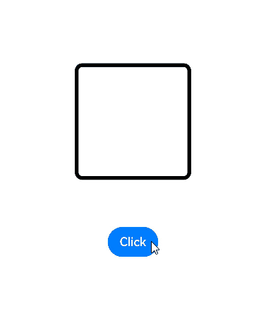
Button('Click')
.margin({ top: 320 })
.onClick(() => {
this.isPresent = !this.isPresent;
})
}
.width('100%')
.height('60%')
}
}
When adding transition effects to multiple components, you can configure different delay values in animation parameters of these effects so that the components exit one by one.
const ITEM_COUNTS = 9;
const ITEM_COLOR = '#ED6F21';
const INTERVAL = 30;
const DURATION = 300;

@Entry
@Component
struct Index1 {
  @State isGridShow: boolean = false;

  private dataArray: number[] = new Array(ITEM_COUNTS);

  aboutToAppear(): void {
    for (let i = 0; i < ITEM_COUNTS; i++) {
      this.dataArray[i] = i;
    }
  }

  build() {
    Stack() {
      if (this.isGridShow) {
        Grid() {
          ForEach(this.dataArray, (item: number, index: number) => {
            GridItem() {
              Stack() {
                Text((item + 1).toString())
              }
              .size({ width: 50, height: 50 })
              .backgroundColor(ITEM_COLOR)
              .transition(TransitionEffect.OPACITY
                .combine(TransitionEffect.scale({ x: 0.5, y: 0.5 }))
                // Add delay to the transition of each grid cell so that the grid cells exit one by one.
                .animation({ duration: DURATION, curve: Curve.Friction, delay: INTERVAL * index }))
              .borderRadius(10)
            }
            // When the grid cells exit, if the transition effect is not added to the parent component, the exit transition effect does not take effect.
            // Here the parent component of the grid cells is configured to always display with a 0.99 opacity when the cells exit. In this way, the transition effect of grid cells is not affected.
            .transition(TransitionEffect.opacity(0.99))
          }, (item: number) => item.toString())
        }
        .columnsTemplate('1fr 1fr 1fr')
        .rowsGap(15)
        .columnsGap(15)
        .size({ width: 180, height: 180 })
        // When the grid cells exit, if the transition effect is not added to the parent component, the exit transition effect does not take effect.
        // Here the parent component of the grid cells is configured to always display with a 0.99 opacity when the cells exit. In this way, the transition effect of grid cells is not affected.
        .transition(TransitionEffect.opacity(0.99))
      }
    }
    .size({ width: '100%', height: '100%' })
    .onClick(() => {
      animateTo({
        duration: DURATION + INTERVAL * (ITEM_COUNTS - 1),
        curve: Curve.Friction
      }, () => {
        this.isGridShow = !this.isGridShow;
      })
    })
  }
}
