Image
The <Image> component is usually used to display images in applications. It supports images in PNG, JPG, JPEG, BMP, SVG, WEBP, or GIF format from the following data sources: PixelMap](../../apis-image-kit/js-apis-image.md#pixelmap7), ResourceStr, or DrawableDescriptor.
NOTE
This component is supported since API version 7. Updates will be marked with a superscript to indicate their earliest API version.
Required Permissions
To use online images, the application must have the ohos.permission.INTERNET permission. For details about how to apply for a permission, see Declaring Permissions.
Child Components
Not supported
APIs
Image(src: PixelMap | ResourceStr | DrawableDescriptor)
Obtains an image from the specified source for subsequent rendering and display.
If the <Image> component fails to obtain the image or the obtained image size is 0, the <Image> component is automatically resized to 0 and does not follow the layout constraints of its parent component.
Since API version 9, this API is supported in ArkTS widgets.
Parameters
| Name | Type | Mandatory | Description |
|---|---|---|---|
| src | PixelMap | ResourceStr| DrawableDescriptor | Yes | Data source of the image. Local and online sources are supported. For details about how to reference an image, see Loading Image Resources. 1. PixelMap: an array of pixels storing graphical information. This type is usually used in image editing scenarios. 2. ResourceStr: a string or a Resource object. The string format can be used to load local images and, more frequently, online images. When using an image referenced using a relative path, for example, Image("common/test.jpg"), the <Image> component cannot be called across bundles or modules. If an image needs to be used globally, you are advised to use the Resource format. The following types of strings are supported: - Base64 strings in the format of data:image/[png|jpeg|bmp|webp];base64,[base64 data], where [base64 data] is a Base64 string. - Strings with the file:// prefix, that is, application sandbox URIs: file://<bundleName>/<sandboxPath>, which are used to access the images in the files folder in the installation directory of the application. Ensure that the application has the read permission to the files in the specified path. The Resource format allows for access across bundles and modules. It is recommended for accessing local images. 3. DrawableDescriptor: an object created when the passed resource ID or name belongs to a common image. NOTE - ArkTS widgets support GIF animations, but the animations only play once on display. - ArkTS widgets do not support the strings with the http:// or file:// prefix. - ArkTS widgets do not support the PixelMap type. - When a local image is being loaded, any modification or replacement of it may cause application crash. Therefore, to overwrite an image file, delete the file first and then create one with the same name. - Online images must support the RFC 9113 standard to be successfully loaded. - To display an SVG image that does not have the native size, you must set the width and height for the <Image> component. |
Attributes
For details about how to use the attributes, see Setting Attributes. In addition to the universal attributes, the following attributes are supported.
| Name | Type | Description |
|---|---|---|
| alt | string | Resource | Placeholder image displayed during loading. Local images (in PNG, JPG, BMP, SVG, or GIF format) are supported. Online images are not supported. Default value: null Since API version 9, this API is supported in ArkTS widgets. |
| objectFit | ImageFit | How the image is resized to fit its container. Default value: ImageFit.Cover Since API version 9, this API is supported in ArkTS widgets. |
| objectRepeat | ImageRepeat | How the image is repeated. When set to repeat, the image is repeated from the center to edges. The last image will be clipped if it does not fit in the component. Default value: ImageRepeat.NoRepeat Since API version 9, this API is supported in ArkTS widgets. NOTE This attribute is not applicable to SVG images. |
| interpolation | ImageInterpolation | Interpolation effect of the image, which can alleviate aliasing that occurs when the image is zoomed. Default value: ImageInterpolation.Low Since API version 9, this API is supported in ArkTS widgets. NOTE This attribute is not applicable to SVG images. |
| renderMode | ImageRenderMode | Rendering mode of the image, which can be Original or Template (monochrome). Default value: ImageRenderMode.Original Since API version 9, this API is supported in ArkTS widgets. NOTE This attribute is not applicable to SVG images. |
| sourceSize | { width: number, height: number } |
Decoding size of the image. This attribute can be used to reduce the image resolution when the image display size needs to be smaller than the component size. When used together with ImageFit.None, it can display a small image in the component. Unit: vp Since API version 9, this API is supported in ArkTS widgets. NOTE This attribute works only when the target size is smaller than the source size. This attribute is not applicable to SVG images. This attribute is not applicable to PixelMap objects. |
| matchTextDirection | boolean | Whether to display the image in the system language direction. When this parameter is set to true, the image is horizontally flipped in the right-to-left (RTL) language context. Default value: false Since API version 9, this API is supported in ArkTS widgets. |
| fitOriginalSize | boolean | Whether to fit the component to the original size of the image source when the component size is not set. Default value: false Since API version 9, this API is supported in ArkTS widgets. |
| fillColor | ResourceColor | Fill color to be superimposed on the image. Since API version 9, this API is supported in ArkTS widgets. NOTE This attribute applies only to an SVG image. Once set, the fill color will replace that of the SVG image. |
| autoResize | boolean | Whether to resize the image source based on the size of the display area during image decoding. This resizing can help reduce the memory usage. For example, if the size of the original image is 1920 x 1080 and the size of the display area is 200 x 200, you can set this attribute to true so that the image is downsampled to 200 x 200. Default value: false Since API version 9, this API is supported in ArkTS widgets. NOTE As downsampling images results in some loss of information, it may reduce the image quality, causing issues such as aliasing. To retain the original image quality, set autoResize to false. |
| syncLoad8+ | boolean | Whether to load the image synchronously. By default, the image is loaded asynchronously. During synchronous loading, the UI thread is blocked and the placeholder image is not displayed. Default value: false Since API version 9, this API is supported in ArkTS widgets. NOTE When loading a small image, you are advised to set syncLoad to true so that the image loading can be quickly completed on the main thread. |
| copyOption9+ | CopyOptions | Whether the image can be copied. When copyOption is set to a value other than CopyOptions.None, the image can be copied in various manners, such as long pressing, right-clicking, or pressing Ctrl+C. Default value: CopyOptions.None Since API version 9, this API is supported in ArkTS widgets. NOTE SVG images cannot be copied. |
| colorFilter9+ | ColorFilter | Color filter of the image. The input parameter is a 4 x 5 RGBA transformation matrix. The first row of the matrix represents a vector value of R (red), the second row represents a vector value of G (green), the third row represents a vector value of B (blue), and the fourth row represents a vector value of A (alpha). The four rows represent different RGBA vector values. If the matrix contains entries of 1 on the diagonal and entries of 0 in other places, the original color of the image is retained. Calculation rule: If the input filter matrix is as follows:  Wherein the color is [R, G, B, A]. Then the color after filtering is [R', G', B', A']. 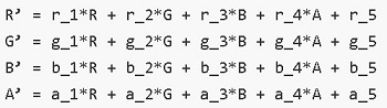 Since API version 9, this API is supported in ArkTS widgets. NOTE This attribute is not applicable to SVG images. |
| draggable9+ | boolean | Whether the image is draggable. The value true means that the image is draggable, and false means the opposite. This attribute cannot be used together with the onDragStart event. Default value: false NOTE The default value is false in API version 9 and true in API version 10. |
| enableAnalyzer11+ | boolean | Whether to enable the AI analyzer. The value true means to enable the AI analyzer. This attribute cannot be used together with the overlay attribute. If they are set at the same time, the CustomBuilder attribute in overlay has no effect. Default value: false NOTE This feature depends on device capabilities. Images to be analyzed must be static, non-vector images. That is, SVG and GIF images cannot be analyzed. Pixel maps in RGBA_8888 format can be passed in for analysis. For details, see Example. The placeholder images (specified by alt) cannot be analyzed. An image can be analyzed only when objectRepeat is set to ImageRepeat.NoRepeat and obscured is disabled. Analysis is performed based on the complete original image. If the clip, margin, borderRadius, position, or objectFit attribute is set, the image is not displayed completely. If renderMode is used to apply a mask, analysis is still performed based on the complete original image. The copyOption attribute does not affect the AI analyzer. |
| resizable11+ | ResizableOptions | Resizable image options. NOTE 1. Resizing is effective for drag previews and placeholder images. 2. When ResizableOptions is set to a valid value, the objectRepeat setting does not take effect. 3. When the sum of the values of top and bottom is greater than the original image height or the sum of the values of left and right is greater than the original image width, the ResizableOptions setting does not take effect. |
NOTE
- To use shortcut keys to copy the <Image> component, the component must be in focus. By default, the <Image> component is not focusable. To enable it to gain focus, set both the focusable and focusable attributes to true.
- For SVG images, only the following tags are included in the supported list: svg, rect, circle, ellipse, path, line, polyline, and polygon.
ImageInterpolation
Since API version 9, this API is supported in ArkTS widgets.
| Name | Description |
|---|---|
| None | No image interpolation. |
| High | High quality interpolation. This mode produces scaled images of the highest possible quality, but may require more image rendering time. |
| Medium | Medium quality interpolation. |
| Low | Low quality interpolation. |
ImageRenderMode
Since API version 9, this API is supported in ArkTS widgets.
| Name | Description |
|---|---|
| Original | Render image pixels as they are in the original source image. |
| Template | Render image pixels to create a monochrome template image. |
ResizableOptions11+
Defines the resizable image options.
| Name | Type | Description |
|---|---|---|
| slice | EdgeWidths | Edge widths in different directions of a component. NOTE This parameter takes effect only when values of bottom and right are both greater than 0. |
EdgeWidths
| Name | Type | Mandatory | Description |
|---|---|---|---|
| top | number | No | Width of the top edge of the component. Default value: 0 Unit: vp |
| right | number | No | Width of the right edge of the component. Default value: 0 Unit: vp |
| bottom | number | No | Width of the bottom edge of the component. Default value: 0 Unit: vp |
| left | number | No | Width of the left edge of the component. Default value: 0 Unit: vp |
Events
In addition to the universal events, the following events are supported.
onComplete
onComplete(callback: (event?: { width: number, height: number, componentWidth: number, componentHeight: number, loadingStatus: number,contentWidth: number, contentHeight: number, contentOffsetX: number, contentOffsetY: number}) => void) }) => void)
Triggered when an image is successfully loaded or decoded. The size of the loaded image is returned.
Since API version 9, this API is supported in ArkTS widgets.
Parameters
| Name | Type | Description |
|---|---|---|
| width | number | Width of the image. Unit: pixel |
| height | number | Height of the image. Unit: pixel |
| componentWidth | number | Width of the component. Unit: pixel |
| componentHeight | number | Height of the component. Unit: pixel |
| loadingStatus | number | Loading status of the image. NOTE If the return value is 0, the image is successfully loaded. If the return value is 1, the image is successfully decoded. |
| contentWidth10+ | number | Actual rendered width of the image. Unit: pixel NOTE This parameter is valid only when the return value of loadingStatus is 1. |
| contentHeight10+ | number | Actual rendered height of the image. Unit: pixel NOTE This parameter is valid only when the return value of loadingStatus is 1. |
| contentOffsetX10+ | number | Offset of the rendered content relative to the component on the x-axis. Unit: pixel NOTE This parameter is valid only when the return value of loadingStatus is 1. |
| contentOffsetY10+ | number | Offset of the rendered content relative to the component on the y-axis Unit: pixel NOTE This parameter is valid only when the return value of loadingStatus is 1. |
onError9+
onError(callback: ImageErrorCallback)
Triggered when an error occurs during image loading.
Since API version 9, this API is supported in ArkTS widgets.
Parameters
| Name | Type | Description |
|---|---|---|
| callback | ImageErrorCallback | Triggered when an error occurs during image loading. |
onFinish
onFinish(event: () => void)
Triggered when the animation playback in the loaded SVG image is complete. If the animation is an infinite loop, this callback is not triggered.
Only SVG images are supported.
Since API version 9, this API is supported in ArkTS widgets.
ImageErrorCallback9+
type ImageErrorCallback = (error: ImageError) => void
Triggered when an error occurs during image loading.
| Name | Type | Description |
|---|---|---|
| error | ImageError | Return object that triggers the callback for when an error occurs during image loading. |
ImageError9+
Describes the return object that triggers the callback for when an error occurs during image loading.
| Name | Type | Description |
|---|---|---|
| componentWidth | number | Width of the component. Unit: pixel |
| componentHeight | number | Height of the component. Unit: pixel |
| message | string | Error information. |
Example
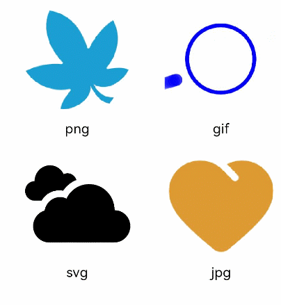
Loading Images of Basic Types
@Entry
@Component
struct ImageExample1 {
  build() {
    Column() {
      Flex({ direction: FlexDirection.Column, alignItems: ItemAlign.Start }) {
        Row() {
          // Load a PNG image.
          Image($r('app.media.ic_camera_master_ai_leaf'))
            .width(110).height(110).margin(15)
            .overlay('png', { align: Alignment.Bottom, offset: { x: 0, y: 20 } })
          // Load a GIF image.
          Image($r('app.media.loading'))
            .width(110).height(110).margin(15)
            .overlay('gif', { align: Alignment.Bottom, offset: { x: 0, y: 20 } })
        }
        Row() {
          // Load an SVG image.
          Image($r('app.media.ic_camera_master_ai_clouded'))
            .width(110).height(110).margin(15)
            .overlay('svg', { align: Alignment.Bottom, offset: { x: 0, y: 20 } })
          // Load a JPG image.
          Image($r('app.media.ic_public_favor_filled'))
            .width(110).height(110).margin(15)
            .overlay('jpg', { align: Alignment.Bottom, offset: { x: 0, y: 20 } })
        }
      }
    }.height(320).width(360).padding({ right: 10, top: 10 })
  }
}
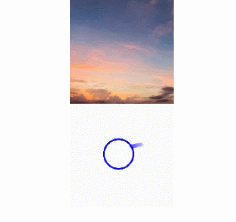
Loading Online Images
The default network timeout period is 5 minutes for loading online images. When using an online image, you are advised to use alt to configure the placeholder image displayed during loading. If more flexible network configuration is required, you can use HTTP to send a network request, and then decode the returned data into a PixelMap object in the <Image> component. For details about image development, see Image Processing.
To use online images, the application must have the ohos.permission.INTERNET permission. For details about how to apply for a permission, see Declaring Permissions.
@Entry
@Component
struct ImageExample2 {
  build() {
    Column({ space: 10 }) {
      Image("https://www.example.com/xxx.png")// Enter an image URL.
        .alt($r('app.media.icon'))// Use alt to set a placeholder image displayed during image loading.
        .width(100)
        .height(100)
    }
  }
}
Adding Events to an Image
@Entry
@Component
struct ImageExample3 {
  private imageOne: Resource = $r('app.media.earth');
  private imageTwo: Resource = $r('app.media.star');
  private imageThree: Resource = $r('app.media.moveStar');
  @State src: Resource = this.imageOne
  @State src2: Resource = this.imageThree
  build(){
    Column(){
      // Add a click event so that a specific image is loaded upon clicking.
      Image(this.src)
        .width(100)
        .height(100)
        .onClick(() => {
          this.src = this.imageTwo
        })

      // When the image to be loaded is in SVG format:
      Image(this.src2)
        .width(100)
        .height(100)
        .onClick(() => {
          // Load another image when the SVG image has finished its animation.
          this.src2 = this.imageOne
        })
    }.width('100%').height('100%')
  }
}
Enabling AI Analyzer for Pixel Maps
import image from '@ohos.multimedia.image'
@Entry
@Component
struct ImageExample4 {
  @State imagePixelMap: image.PixelMap | undefined = undefined

  async aboutToAppear() {
    this.imagePixelMap = await this.getPixmapFromMedia($r('app.media.app_icon'))
  }

  build() {
    Column() {
      Image(this.imagePixelMap)
        .enableAnalyzer(true)
        .width(200)
        .height(200)
    }
  }
  private async getPixmapFromMedia(resource: Resource) {
    let unit8Array = await getContext(this)?.resourceManager?.getMediaContent({
      bundleName: resource.bundleName,
      moduleName: resource.moduleName,
      id: resource.id
    })
    let imageSource = image.createImageSource(unit8Array.buffer.slice(0, unit8Array.buffer.byteLength))
    let createPixelMap: image.PixelMap = await imageSource.createPixelMap({
      desiredPixelFormat: image.PixelMapFormat.RGBA_8888
    })
    await imageSource.release()
    return createPixelMap
  }
}