svg动画
为svg组件添加动画效果。
属性样式动画
在Svg的子组件animate中,通过attributeName设置需要进行动效的属性,from设置开始值,to设置结束值。
<!-- xxx.hml -->
<div class="container">
  <svg>
    <text x="300" y="300" fill="blue">
      Hello
      <animate attributeName="font-size" from="30" to="60" dur="3s" repeatCount="indefinite">
      </animate>
      <animate attributeName="fill" from="red" to="blue" dur="3s" repeatCount="indefinite">
      </animate>
      <animate attributeName="opacity" from="1" to="0.3" dur="3s" repeatCount="indefinite">
      </animate>
    </text>
    <text x="300" y="600" fill="blue">
      World
      <animate attributeName="font-size" from="30" to="60" values="30;80" dur="3s" repeatCount="indefinite">
      </animate>
      <animate attributeName="fill" from="red" to="blue"  dur="3s" repeatCount="indefinite">
      </animate>
      <animate attributeName="opacity" from="0.3" to="1" dur="3s" repeatCount="indefinite">
      </animate>
    </text>
  </svg>
</div>
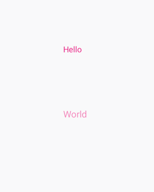
说明: 在设置动画变化值时,如果已经设置了values属性,则from和to都失效。
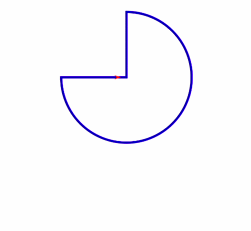
路径动画
在Svg的子组件animateMotion中,通过path设置动画变化的路径。
<!-- xxx.hml -->
<div class="container">
  <svg fill="white" width="800" height="900">
    <path d="M300,200 h-150 a150 150 0 1 0 150 -150 z" fill="white" stroke="blue" stroke-width="5" >
    </path>
    <path fill="red" d="M-5,-5 L10,0 L-5,5 L0,0 Z"  >
      <animateMotion dur="2000" repeatCount="indefinite" rotate="auto-reverse"path="M300,200 h-150 a150 150 0 1 0 150 -150 z">
      </animateMotion>
    </path>
  </svg>
</div>
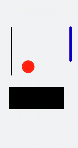
animateTransform动画
在Svg的子组件animateTransform中,通过attributeName绑定transform属性,type设置动画类型,from设置开始值,to设置结束值。
<!-- xxx.hml -->
<div class="container" style="">
  <svg>
    <line x1="90" y1="300" x2="90" y2="730" stroke-width="10" stroke="black" stroke-linecap="round">
      <animateTransform attributeName="transform" attributeType="XML" type="translate"  dur="3s" values="0;30;10;30;20;30;25;30" keyTimes="0;0.3;0.5;0.7;0.8;0.9;1.0;1.1"
      fill="freeze">
      </animateTransform>
    </line>
    <circle cx="500" cy="500" r="50" stroke-width="15" fill="red" stroke="#e70d0d">
      <animateTransform attributeName="transform" attributeType="XML" type="rotate"  dur="3s" values="0;30;10;30;20;30;25;30" keyTimes="0;0.3;0.5;0.7;0.8;0.9;1.0;1.1" fill="freeze">
      </animateTransform>
      <animateTransform attributeName="transform" attributeType="XML" type="scale"  dur="6s" values="1;1;1.3" keyTimes="0;0.5;1" fill="freeze"></animateTransform>
      <animateTransform attributeName="transform" attributeType="XML" type="translate"  dur="9s" values="0;0;300 7" keyTimes="0;0.6;0.9" fill="freeze"></animateTransform>
    </circle>
    <rect width="500" height="200" x="90" y="840">
      <animateTransform attributeName="transform" attributeType="XML" type="skewY"  dur="6s" values="0;0;30" keyTimes="0;0.5;1" fill="freeze"></animateTransform>
    </rect>
    <line x1="650" y1="300" x2="650" y2="600" stroke-width="20" stroke="blue" stroke-linecap="round">
      <animateTransform attributeName="transform" attributeType="XML" type="translate"  dur="9s" values="0;0;0 800" keyTimes="0;0.6;1" fill="freeze"></animateTransform>
    </line>
  </svg>
</div>
/* xxx.css */
.container {
  flex-direction: column;
  align-items: center;
  width: 100%;
  height: 100%;
  background-color: #F1F3F5;
}