Security Component Universal Attributes
Universal attributes of security components are basic attributes applicable to all security components.
NOTE
This component is supported since API version 10. Updates will be marked with a superscript to indicate their earliest API version.
Attributes
| Name | Type | Mandatory | Description |
|---|---|---|---|
| iconSize | Dimension | No | Icon size of the security component. Default value: 16vp |
| layoutDirection | SecurityComponentLayoutDirection | No | Direction of the icon and text on the security component. Default value: SecurityComponentLayoutDirection.HORIZONTAL |
| position | Position | No | Absolute position of the security component, that is, the offset of the component's upper left corner relative to its parent container's. Default value: { x: 0, y: 0 } |
| markAnchor | Position | No | Anchor of the security component for moving the component with its upper left corner as the reference point. Generally, this attribute is used together with the position and offset attributes. When used alone, it produces an effect similar to that produced by offset. Default value: { x: 0, y: 0 } |
| offset | Position | No | Coordinate offset of the security control relative to its own layout position. This attribute does not affect the layout in the parent container. The offset is used only during drawing. Default value: { x: 0, y: 0 } |
| fontSize | Dimension | No | Font size of the text on the security component. Default value: 16fp |
| fontStyle | FontStyle | No | Font style of the text on the security component. Default value: FontStyle.Normal |
| fontWeight | number | FontWeight | string | No | Font weight of the text on the security component. Default value: FontWeight.Medium |
| fontFamily | string | Resource | No | Font family of the text on the security component. Default font: 'HarmonyOS Sans' |
| fontColor | ResourceColor | No | Font color of the text on the security component. Default value: '#ffffffff' |
| iconColor | ResourceColor | No | Color of the icon on the security component. Default value: '#ffffffff' |
| backgroundColor | ResourceColor | No | Background color of the security component. Default value: #007dff |
| borderStyle | BorderStyle | No | Border style of the security component. By default, the border style is not set. |
| borderWidth | Dimension | No | Border width of the security component. By default, the border width is not set. |
| borderColor | ResourceColor | No | Border color of the security component. By default, the border color is not set. |
| borderRadius | Dimension | No | Radius of the rounded border corners of the security component. |
| padding | Padding | Dimension | No | Padding of the security component. Default value: 12 vp for the top and bottom paddings and 24 vp for the left and right paddings |
| textIconSpace | Dimension | No | Space between the icon and text on the security component. Default value: 4vp |
| width11+ | Length | No | Width of the security component. By default, the security component automatically adapts its width to the content. If the value is less than the minimum width allowed by the current attribute combination, the actual width will be greater than the set value to ensure that content of the security component is fully displayed. |
| height11+ | Length | No | Height of the security component. By default, the security component automatically adapts its height to the content. If the value is less than the minimum height allowed by the current attribute combination, the actual height will be greater than the set value to ensure that content of the security component is fully displayed. |
| size11+ | SizeOptions | No | Size of the security component. By default, the security component automatically adapts its size to the content. If the value is less than the minimum size allowed by the current attribute combination, the actual size will be greater than the set value to ensure that content of the security component is fully displayed. |
| constraintSize11+ | ConstraintSizeOptions | No | Size constraints of the component during component layout. constraintSize takes precedence over width and height. Learn how the value of this attribute affects the width and height. As with width and height, the actual size cannot be less than the minimum size allowed by the current attribute combination, so as to ensure that content of the security component is fully displayed. Default value: { minWidth: 0, maxWidth: Infinity, minHeight: 0, maxHeight: Infinity } |
SecurityComponentLayoutDirection
| Name | Value | Description |
|---|---|---|
| HORIZONTAL | 0 | The icon and text on security component are horizontally arranged. |
| VERTICAL | 1 | The icon and text on security component are vertically arranged. |
Example
// xxx.ets
@Entry
@Component
struct Index {
build() {
Row() {
Column({space:5}) {
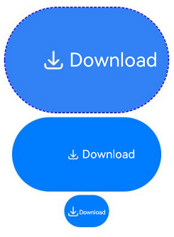
// Generate a save button and set its security component attributes.
SaveButton()
.fontSize(35)
.fontColor(Color.White)
.iconSize(30)
.layoutDirection(SecurityComponentLayoutDirection.HORIZONTAL)
.borderWidth(1)
.borderStyle(BorderStyle.Dashed)
.borderColor(Color.Blue)
.borderRadius(20)
.fontWeight(100)
.iconColor(Color.White)
.padding({left:50, top:50, bottom:50, right:50})
.textIconSpace(20)
.backgroundColor(0x3282f6)
SaveButton().size({width:200, height:100})
SaveButton().constraintSize({maxWidth:60})
}.width('100%')
}.height('100%')
}
}