Grid Layout
The <grid-container> component is the root container of the grid layout. Within the root container, you can use <grid-row> and <grid-col> for the grid layout. For details, see Grid-container.
Creating a <grid-container> Component
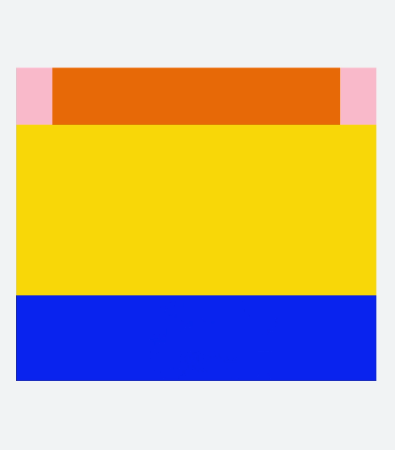
Create a <grid-container> component in the .hml file under pages/index and add a <Grid-row> child component.
<!-- index.hml -->
<div class="container">
  <grid-container id="mygrid" gutter="20px" style="background-color: pink;">
    <grid-row style="height:100px;justify-content:space-around;width: 80%;background-color: #f67002;margin-left:
      10%;"></grid-row>
    <grid-row style="height:300px;justify-content:space-around;background-color: #ffcf00;width: 100%;"></grid-row>
    <grid-row style="height:150px;justify-content:space-around;background-color: #032cf8;width: 100%;"></grid-row>
  </grid-container>
</div>
/* xxx.css */
.container{
  flex-direction: column;
  background-color: #F1F3F5;
  margin-top: 500px;
  justify-content: center;
  align-items: center;
}
NOTE
<grid-container> supports only <grid-row> as a child component.
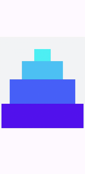
Methods
Touch the <grid-container> component to call the getColumns, getColumnWidth, and getGutterWidth methods to return the number of columns in the grid container, and column width and gutter width of the grid container. Press and hold the component to call the getSizeType method to return the size-responsive type of the grid container (xs|sm|md|lg).
<!-- index.hml -->
<div class="container">
  <grid-container id="mygrid" gutter="20px" style="background-color: pink;padding-top: 100px;"
    onclick="getColumns" onlongpress="getSizeType">
    <grid-row style="height:100px;justify-content:space-around;background-color: #4cedf3;width: 20%;margin-left:
      40%;"></grid-row>
    <grid-row style="height:150px;justify-content:space-around;background-color: #4cbff3;width: 50%;margin-left:
      25%;"></grid-row>
    <grid-row style="height:200px;justify-content:space-around;background-color: #465ff6;width: 80%;margin-left:
      10%;"></grid-row>
    <grid-row style="height:200px;justify-content:space-around;background-color: #5011ec;width: 100%;"></grid-row>
  </grid-container>
</div>
/* xxx.css */
.container{
  flex-direction: column;
  background-color: #F1F3F5;
  margin-top: 400px;
  justify-content: center;
  align-items: center;
}
// index.js
import promptAction from '@ohos.promptAction';
export default {
  data:{
    gutterWidth:'',
    columnWidth:'',
    columns:'',
  },
  getColumns(){
    this.$element('mygrid').getColumnWidth((result)=>{
      this.columnWidth = result;
    })
    this.$element('mygrid').getGutterWidth((result)=>{
      this.gutterWidth = result;
    })
    this.$element('mygrid').getColumns((result)=>{
      this.columns= result;
    })
    setTimeout(()=>{
      promptAction.showToast({duration:5000,message:'columnWidth:'+this.columnWidth+',gutterWidth:'+
      this.gutterWidth+',getColumns:'+this.columns})
    })
  },
  getSizeType(){
      this.$element('mygrid').getSizeType((result)=>{
      promptAction.showToast({duration:2000,message:'get size type:'+result})
    })
  },
}
Adding <grid-col>
After adding a <grid-row> child component to <grid-container>, add a <grid-col> child component to <grid-row> to form a layout.
<!-- index.hml -->
<div class="container">
  <grid-container id="mygrid" columns="4" gutter="0" style="background-color: pink;" onclick="getColumns" onlongpress="getSizeType">
    <grid-row style="height: 100px;justify-content: space-around;background-color: #4cbff3;width: 100%;">
      <grid-col span="0">
        <div style="align-items: center;justify-content: center;height: 100%;width: 100%;">
          <text style="color: dodgerblue;" onclick="getCol">top</text>
        </div>
      </grid-col>
    </grid-row>
    <grid-row style="height:500px;justify-content:space-around;background-color: #3b55ef;width: 100%;">
      <grid-col span="0" style="width: 20%;">
        <div style="align-items: center;justify-content: center;height: 100%;width: 100%;">
          <text style="color: dodgerblue;">left</text>
        </div>
      </grid-col>
      <grid-col span="0" style="background-color:orange;width: 80%;">
        <div style="width: 100%;height: 100%;align-items: center;justify-content: center;">
          <text>right</text>
        </div>
      </grid-col>
    </grid-row>
    <grid-row style="height: 100px;justify-content: space-around;background-color: #4cbff3;width: 100%;">
      <grid-col style="background-color:#c075ef;" span="0">
        <div style="width: 100%;height: 100%;padding: 20px;align-items: center;justify-content: center;">
          <text>bottom</text>
        </div>
      </grid-col>
    </grid-row>
  </grid-container>
</div>
/* xxx.css */
.container{
  flex-direction: column;
  background-color: #F1F3F5;
  width: 100%;
  height: 100%;
  justify-content: center;
  align-items: center;
}
text{
  color: white;
  font-size: 40px;
}
NOTE
<grid-row> supports only <grid-col> as a child component. You can add content only to <grid-col>.
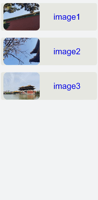
Example Scenario
In this example, the content in the list is output cyclically to create a grid layout. When the user pulls down the screen, the refresh method is triggered. In this case, a piece of data is added to the list and setTimeout is set to refresh the request data.
<!-- index.hml -->
<div class="container">
  <refresh refreshing="{{fresh}}" onrefresh="refresh">
    <grid-container id="mygrid" gutter="20" style="margin: 10px;">
      <grid-row style="height:200px;width: 100%;background-color: #e7e7e2;margin-top: 50px; padding: 0px 20px;border-radius: 15px;" for="item in list">
        <grid-col span="0" style="width: 40%;">
          <div style="align-items: center;justify-content: center">
            <image src="{{item.src}}" style="object-fit: contain;border-radius: 30px;"></image>
          </div>
        </grid-col>
        <grid-col span="0" style="width: 60%;">
          <div style="align-items: center;justify-content: center;width: 100%;height: 100%;text-align: center;">
            <text>image{{item.id}}</text>
          </div>
        </grid-col>
      </grid-row>
    </grid-container>
  </refresh>
</div>
/* xxx.css */
.container{
  flex-direction: column;
  background-color: #F1F3F5;
  width: 100%;
  height: 100%;
}
text{
  color: #0a0aef;
  font-size: 60px;
}
// index.js
import promptAction from '@ohos.promptAction';
export default {
  data:{
    list:[
      {src:'common/images/1.png',id:'1'},
      {src:'common/images/2.png',id:'2'},
      {src:'common/images/3.png',id:'3'}
    ],
    fresh:false
  },
  refresh(e) {
    promptAction.showToast({
      message: 'refreshing'
    })
    var that = this;
    that.fresh = e.refreshing;
    setTimeout(function () {
      that.fresh = false;
      that.list.unshift({src: 'common/images/4.png',id:'4'});
      promptAction.showToast({
        message: 'succeed'
      })
    }, 2000)
  }
}