自定义输入框
场景介绍
输入框是一种常见的场景,开发者为了丰富其多样性,在输入框中的占位符、下划线做了相关处理。本文即为大家介绍如何开发自定义输入框。
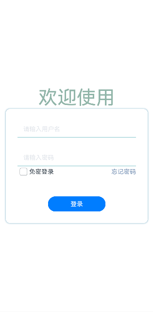
效果呈现
效果图如下:
运行环境
本例基于以下环境开发,开发者也可以基于其他适配的版本进行开发:
- IDE: DevEco Studio 3.2 Release
- SDK: Ohos_sdk_public 3.2.12.5 (API Version 9 Release)
实现思路
- 点击输入框,提示文字向上浮动并同时改变文字颜色,输入框底线进行匀速放缩:通过监听输入框状态(onEditChange)发生变化时,提示文字向上浮动以及底部线进行放缩,同时改变文字和底部线的颜色。
- 在输入文本时,输入框右侧显示“清除”图标。点击“清空”图标,清空输入文本:通过监听输入框中有文本输入(onChange)时,右侧显示“清除”图标。
开发步骤
- 封装TextInput组件去监听onEditChange事件(输入状态的变化)和onchange事件(输入内容的变化)。具体代码块如下:
TextInput({text:this.textValue}) .width('100%') .height('100%') .borderRadius(0) .borderColor('#86C7CC') .borderWidth({bottom: 1}) .backgroundColor(Color.Transparent) .type(this.typeInput) .showPasswordIcon(false) // 输入内容发生变化 .onEditChange((isEditing)=>{ this.isEditing = isEditing this.isFloatHint = this.isEditing || this.textValue !=='' }) // 输入状态变化时 .onChange((value)=>{ this.textValue = value this.isFloatHint = this.isEditing || this.textValue !== '' }) - 输入状态发生变化(onEditChange)时,提示文字向上浮动并同时改变颜色;输入框底线匀速放缩并改变颜色。具体代码如下:
// 提示文本(占位符) Text(this.placeholder) .enabled(false) .fontColor(this.isFloatHint ? '#5D7DB3' : '#E1E4EA') .position({x: 0, y: this.isFloatHint ? 0 : '50%'}) .translate({x: 15, y: '-50%'}) .animation({duration:100, curve: Curve.Linear}) // 底部线 Line() .width('100%') .height(1) .backgroundColor('#5D7DB3') .position({x: 0, y: 44}) .scale({x: this.isFloatHint ? 1 : 0, centerX: 0}) .animation({duration: 300, curve: Curve.Linear}) - 输入内容发生变化(onChange)时,输入框右侧显示“清除”图标,点击该图标清空输入框内容。具体代码块如下:
if (this.textValue){ Image($r("app.media.canel")) .width(15) .height(15) .border({width: 1, radius: 15, color: '#fffffff'}) .position({x: '90%', y: '50%'}) .translate({y: '-50%'}) .onClick(()=>{ this.textValue = '' }) } - 构建界面UI。具体代码块如下:
@Entry
@Component
struct InputFloatHintPage{
  build(){
    Column(){
      Text('欢迎使用')
        .fontSize(50)
        .fontColor('#91B5A9')
      Column(){
        InputFloatHint({placeholder: '请输入用户名'})
        Blank().height(30)
        InputFloatHint({placeholder: '请输入密码'})
      Column() {
        Row() {
          Checkbox()
            .select(false)
            .selectedColor(0x39a2db)
            .padding({left:1})
          Text('免密登录')
          Blank().width(150)
          Text('忘记密码')
            .fontColor('#5C9DBA')
        }
      }.justifyContent(FlexAlign.SpaceBetween)
        Blank().height(50)
        Button('登录').width(150)
      }
      .width('90%')
      .padding(30)
      .backgroundColor(Color.White)
      .border({radius: 10})
      .shadow({radius: 10, color: '#5C9DBA' })
    }.width('100%')
    .height('100%')
    .justifyContent(FlexAlign.Center)
  }
}
完整代码
完整示例代码如下:
@Component
struct InputFloatHint{
  @State isFloatHint: boolean = false
  @State textValue: string = ''
  isEditing = false
  placeholder: string
  typeInput:InputType = InputType.Normal

  build(){
    Stack(){
      TextInput({text:this.textValue})
        .width('100%')
        .height('100%')
        .borderRadius(0)
        .borderColor('#86C7CC')
        .borderWidth({bottom: 1})
        .backgroundColor(Color.Transparent)
        .type(this.typeInput)
        .showPasswordIcon(false)
        .onEditChange((isEditing)=>{
          this.isEditing = isEditing
          this.isFloatHint = this.isEditing || this.textValue !==''
        })
        .onChange((value)=>{
          this.textValue = value
          this.isFloatHint = this.isEditing || this.textValue !== ''
        })
      Text(this.placeholder)
        .enabled(false)
        .fontColor(this.isFloatHint ?  '#5D7DB3' : '#E1E4EA')
        .position({x: 0, y: this.isFloatHint ? 0 : '50%'})
        .translate({x: 15, y: '-50%'})
        .animation({duration:100, curve: Curve.Linear})

      Line()
        .width('100%')
        .height(1)
        .backgroundColor('#5D7DB3')
        .position({x: 0, y: 44})
        .scale({x: this.isFloatHint ? 1 : 0, centerX: 0})
        .animation({duration: 300, curve: Curve.Linear})

      if (this.textValue){
        Image($r("app.media.canel"))
          .width(15)
          .height(15)
          .border({width: 1, radius: 15, color: '#fffffff'})
          .position({x: '90%', y: '50%'})
          .translate({y: '-50%'})
          .onClick(()=>{
            this.textValue = ''
          })
      }
    }.width('100%').height(45)
  }
}

@Entry
@Component
struct InputFloatHintPage{
  build(){
    Column(){
      Text('欢迎使用')
        .fontSize(50)
        .fontColor('#91B5A9')
      Column(){
        InputFloatHint({placeholder: '账号'})
        Blank().height(30)
        InputFloatHint({placeholder: '密码'})
        Blank().height(50)
        Button('登录').width(150)
      }
      .width('90%')
      .padding(30)
      .backgroundColor(Color.White)
      .border({radius: 10})
      .shadow({radius: 10, color: '#5C9DBA' })
    }.width('100%')
    .height('100%')
    .justifyContent(FlexAlign.Center)
  }
}