Size
The size attributes set the width, height, and margin of a component.
NOTE
The APIs of this module are supported since API version 7. Updates will be marked with a superscript to indicate their earliest API version.
width
width(value: Length)
Sets the width of the component. By default, the width required to fully hold the component content is used. If the width of the component is greater than that of the parent container, the component will be drawn beyond the parent container scope.
Since API version 10, this API supports the calc calculation feature.
Widget capability: Since API version 9, this feature is supported in ArkTS widgets.
System capability: SystemCapability.ArkUI.ArkUI.Full
Parameters
| Name | Type | Mandatory | Description |
|---|---|---|---|
| value | Length | Yes | Width of the component to set. Unit: vp |
height
height(value: Length)
Sets the height of the component. By default, the height required to fully hold the component content is used. If the height of the component is greater than that of the parent container, the component will be drawn beyond the parent container scope.
Since API version 10, this API supports the calc calculation feature.
Widget capability: Since API version 9, this feature is supported in ArkTS widgets.
System capability: SystemCapability.ArkUI.ArkUI.Full
Parameters
| Name | Type | Mandatory | Description |
|---|---|---|---|
| value | Length | Yes | Height of the component to set. Unit: vp |
NOTE
For the <Row>, <Column>, and <RelativeContainer> components, the auto option of width and height means to adapt to their child components. For the <TextInput> component, the auto option of width means to adapt to the text width.
Size
size(value: SizeOptions)
Sets the size of the component.
Since API version 10, this API supports the calc calculation feature.
Widget capability: Since API version 9, this feature is supported in ArkTS widgets.
System capability: SystemCapability.ArkUI.ArkUI.Full
Parameters
| Name | Type | Mandatory | Description |
|---|---|---|---|
| value | SizeOptions | Yes | Size of the component to set. Unit: vp |
padding
padding(value: Padding | Length)
Sets the padding of the component.
Since API version 10, this API supports the calc calculation feature.
Widget capability: Since API version 9, this feature is supported in ArkTS widgets.
System capability: SystemCapability.ArkUI.ArkUI.Full
Parameters
| Name | Type | Mandatory | Description |
|---|---|---|---|
| value | Padding | Length | Yes | Padding of the component to set. When the parameter is of the Length type, the four paddings take effect. Default value: 0 Unit: vp When padding is set to a percentage, the width of the parent container is used as the basic value. |
margin
margin(value: margin | Length)
Sets the margin of the component.
Since API version 10, this API supports the calc calculation feature.
Widget capability: Since API version 9, this feature is supported in ArkTS widgets.
System capability: SystemCapability.ArkUI.ArkUI.Full
Parameters
| Name | Type | Mandatory | Description |
|---|---|---|---|
| value | Margin | Length | Yes | Margin of the component to set. When the parameter is of the Length type, the four margins take effect. Default value: 0 Unit: vp When margin is set to a percentage, the width of the parent container is used as the basic value. When child components are laid out along the cross axis of the <Row>, <Column>, or <Flex> container, the cross axis size of the child components and the margins add up to the total size of the container. For example, if the width of the <Column> container is 100, the width of the child component is 50, the left margin is 10, and the right margin is 20, then the actual horizontal offset of the child component is 20. |
layoutWeight
layoutWeight(value: number | string)
Sets the weight of the component during layout.
Widget capability: Since API version 9, this feature is supported in ArkTS widgets.
System capability: SystemCapability.ArkUI.ArkUI.Full
Parameters
| Name | Type | Mandatory | Description |
|---|---|---|---|
| value | number | string | Yes | Weight of the component during layout. When the container size is determined, the container space is allocated along the main axis among the component and sibling components based on the layout weight, and the component size setting is ignored. Default value: 0 NOTE This attribute is valid only for the <Row>, <Column>, and <Flex> layouts. The value can be a number greater than or equal to 0 or a string that can be converted to a number. |
constraintSize
constraintSize(value: ConstraintSizeOptions)
Sets the constraint size of the component, which is used to limit the size range during component layout.
Since API version 10, this API supports the calc calculation feature.
Widget capability: Since API version 9, this feature is supported in ArkTS widgets.
System capability: SystemCapability.ArkUI.ArkUI.Full
Parameters
| Name | Type | Mandatory | Description |
|---|---|---|---|
| value | ConstraintSizeOptions | Yes | Constraint size of the component to set. constraintSize takes precedence over width and height. See Impact of constraintSize on width/height. Default value: { minWidth: 0, maxWidth: Infinity, minHeight: 0, maxHeight: Infinity } Unit: vp |
Impact of constraintSize on width/height
| Default Value | Result |
|---|---|
| / | max(minWidth/minHeight, min(maxWidth/maxHeight, width/height)) |
| maxWidth/maxHeight | max(minWidth/minHeight, width/height) |
| minWidth/minHeight | min(maxWidth/maxHeight, width/height) |
| width/height | In the case of maxWidth/maxHeight > minWidth/minHeight, the layout logic of the component is used, and the result is between maxWidth/maxHeight and minWidth/minHeight. In other cases, the result is max(minWidth/minHeight, maxWidth/maxHeight). |
| maxWidth/maxHeight && width/height | minWidth/minHeight |
| minWidth/minHeight && width/height | The layout logic of the component is used. The final result does not exceed maxWidth/maxHeight. |
| maxWidth/maxHeight && minWidth/minHeight | Width/Height, which may be stretched or compressed based on other layout attributes. |
| maxWidth/maxHeight && minWidth/minHeight && width/height | The layout restrictions passed by the parent container are used for layout. |
SizeOptions
Since API version 9, this API is supported in ArkTS widgets.
| Name | Type | Mandatory | Description |
|---|---|---|---|
| width | Length | No | Component width. |
| height | Length | No | Component height. |
ConstraintSizeOptions
Since API version 9, this API is supported in ArkTS widgets.
| Name | Type | Mandatory | Description |
|---|---|---|---|
| minWidth | Length | No | Minimum width of the component. |
| maxWidth | Length | No | Maximum width of the component. |
| minHeight | Length | No | Minimum height of the component. |
| maxHeight | Length | No | Maximum height of the component. |
NOTE
For the <Row>, <Column>, and <RelativeContainer> components, the auto option of width and height means to adapt to their child components. For the <TextInput> component, the auto option of width means to adapt to the text width.
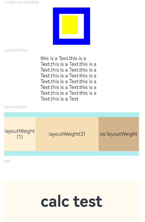
Example
// xxx.ets
@Entry
@Component
struct SizeExample {
  build() {
    Column({ space: 10 }) {
      Text('margin and padding:').fontSize(12).fontColor(0xCCCCCC).width('90%')
      Row() {
        // Width: 80; height: 80; margin: 20 (blue area); top, bottom, left, and right paddings: 5, 15, 10, and 20 (white area)
        Row() {
          Row().size({ width: '100%', height: '100%' }).backgroundColor(Color.Yellow)
        }
        .width(80)
        .height(80)
        .padding({ top: 5, left: 10, bottom: 15, right: 20 })
        .margin(20)
        .backgroundColor(Color.White)
      }.backgroundColor(Color.Blue)

      Text('constraintSize').fontSize(12).fontColor(0xCCCCCC).width('90%')
      Text('this is a Text.this is a Text.this is a Text.this is a Text.this is a Text.this is a Text.this is a Text.this is a Text.this is a Text.this is a Text.this is a Text.this is a Text.this is a Text.this is a Text.this is a Text')
        .width('90%')
        .constraintSize({ maxWidth: 200 })

      Text('layoutWeight').fontSize(12).fontColor(0xCCCCCC).width('90%')
      // When the container size is determined, the component occupies the space along the main axis based on the layout weight, and the component size setting is ignored.
      Row() {
        // Weight 1: The component occupies 1/3 of the remaining space along the main axis.
        Text('layoutWeight(1)')
          .size({ width: '30%', height: 110 }).backgroundColor(0xFFEFD5).textAlign(TextAlign.Center)
          .layoutWeight(1)
        // Weight 2: The component occupies 2/3 of the remaining space along the main axis.
        Text('layoutWeight(2)')
          .size({ width: '30%', height: 110 }).backgroundColor(0xF5DEB3).textAlign(TextAlign.Center)
          .layoutWeight(2)
        // If layoutWeight is not set, the component is rendered based on its own size setting.
        Text('no layoutWeight')
          .size({ width: '30%', height: 110 }).backgroundColor(0xD2B48C).textAlign(TextAlign.Center)
      }.size({ width: '90%', height: 140 }).backgroundColor(0xAFEEEE)
      // calc calculation feature
      Text('calc:').fontSize(12).fontColor(0xCCCCCC).width('90%')
      Text('calc test')
        .fontSize(50)
        .fontWeight(FontWeight.Bold)
        .backgroundColor(0xFFFAF0)
        .textAlign(TextAlign.Center)
        .margin('calc(25vp*2)')
        .size({ width: 'calc(90%)', height: 'calc(50vp + 10%)' })
    }.width('100%').margin({ top: 5 })
  }
}