MediaQuery (@ohos.mediaquery)
Overview
Media queries are at the core of responsive design and widely used on mobile devices. You can use media queries to apply application styles based on the device type or device state. Specifically, media queries allow you to:
-
Design a layout style based on the device and application attributes (such as display area, dark light color, and resolution).
-
Update the page layout to adapt to dynamic screen changes (for example, screen splitting or switching between landscape and portrait modes).
Usage
Invoke the API in the mediaquery module to set the media query condition and the callback, and change the page layout or implement service logic in the callback corresponding to the condition. The procedure is as follows:
Import the mediaquery module, as shown below:
import mediaquery from '@ohos.mediaquery';
Use the matchMediaSync API to set the media query condition and save the returned listener. The following is the example for listening for landscape events:
let listener: mediaquery.MediaQueryListener = mediaquery.matchMediaSync('(orientation: landscape)');
Register the onPortrait callback using the saved listener, and change the page layout or implement service logic in the callback. When the media query condition is matched, the callback is triggered. The sample code is as follows:
onPortrait(mediaQueryResult: mediaquery.MediaQueryResult) {
  if (mediaQueryResult.matches as boolean) {
    // do something here
  } else {
    // do something here
  }
}

listener.on('change', onPortrait);
Media Query Conditions
The media query condition consists of the media type (optional), logical operator, and media feature. The logical operator is used to connect different media types and media features. A media feature must be enclosed in parentheses (). There may be multiple media features.
Syntax
Syntax rules include media-type, media-logic-operations, and media-feature.
[media-type] [media-logic-operations] [(media-feature)]
Examples are as follows:
-
screen and (round-screen: true): The query is valid when the device screen is round.
-
(max-height: 800px): The query is valid when the height is less than or equal to 800 px.
-
(height <= 800px): The query is valid when the height is less than or equal to 800 px.
-
screen and (device-type: tv) or (resolution < 2): The query is valid when the device type is TV or the device resolution is less than 2. This is a multi-condition query that contains multiple media features.
media-type
| Type | Description |
|---|---|
| screen | Media query based on screen-related parameters. |
media-logic-operations
You can use logical operators (and, or, not, and only) to compose complex media queries. You can also combine them using comma (,). The following table describes the operators.
Table 1 Media logical operators
| Type | Description |
|---|---|
| and | The and operator is used to combine multiple media features into one media query, in a logical AND operation. The query is valid only when all media features are true. It can also combine media types and media functions. For example, screen and (device-type: wearable) and (max-height: 600px) evaluates to true when the device type is wearable and the maximum height of the application is 600 pixel units. |
| or | The or operator is used to combine multiple media features into one media query, in a logical OR operation. The query is valid if a media feature is true. For example, screen and (max-height: 1000px) or (round-screen: true) indicates that the query is valid when the maximum height of the application is 1000 pixel units or the device screen is round. |
| not | The not operator is used to perform a logical negation for a media query. true is returned if the query condition is not met. Otherwise, false is returned. For example, not screen and (min-height: 50px) and (max-height: 600px) evaluates to true when the height of the application is less than 50 pixel units or greater than 600 pixel units. You must specify the media type when using the not operator. |
| only | The only operator applies the selected style only when the entire expression is matched. It can be used to prevent ambiguity on browsers of earlier versions. The statements that contain both media types and media features produce ambiguity when they are received by some browsers of earlier versions. For example, regarding screen and (min-height: 50px), the browsers of earlier versions would mislead this sentence into screen, causing the fact that the specified style is applied when only the media type is matched. In this case, the only operator can be used to avoid this issue. You must specify the media type when using the only operator. |
| comma (,) | The or operator is used to combine multiple media features into one media query, in a logical OR operation. The query is valid if a media feature is true. The effect of a comma operator is equivalent to that of the or operator. For example, screen and (min-height: 1000px), (round-screen: true) indicates that the query is valid when the minimum height of the application is 1000 pixel units or the device screen is round. |
Media range operators include <=, >=, <, and >. For details, see the following table.
Table 2 Logical operators for range query
| Type | Description |
|---|---|
| <= | Less than or equal to, for example, screen and (50 <= height). |
| >= | Greater than or equal to, for example, screen and (600 >= height). |
| < | Less than, for example, screen and (50 < height). |
| > | Greater than, for example, screen and (height > 600). |
media-feature
The media features include the width and height of the application display area, device resolution, and device width and height. For details, see the following table.
Table 3 Media features
| Type | Description |
|---|---|
| height | Height of the drawing area of the application. |
| min-height | Minimum height of the drawing area of the application. |
| max-height | Maximum height of the drawing area of the application. |
| width | Width of the drawing area of the application. |
| min-width | Minimum width of the drawing area of the application. |
| max-width | Maximum width of the drawing area of the application. |
| resolution | Resolution of the device. The unit can be dpi, dppx, or dpcm. - dpi indicates the number of physical pixels per inch. 1 dpi ≈ 0.39 dpcm. - dpcm indicates the number of physical pixels per centimeter. 1 dpcm ≈ 2.54 dpi. - dppx indicates the number of physical pixels in each pixel. (This unit is calculated based on this formula: 96 px = 1 inch, which is different from the calculation method of the px unit on the page.) 1 dppx = 96 dpi. |
| min-resolution | Minimum device resolution. |
| max-resolution | Maximum device resolution. |
| orientation | Screen orientation. Options are as follows: - orientation: portrait - orientation: landscape |
| device-height | Height of the device. |
| min-device-height | Minimum height of the device. |
| max-device-height | Maximum height of the device. |
| device-width | Width of the device. |
| device-type | Type of the device. Available options: default and tablet |
| min-device-width | Minimum width of the device. |
| max-device-width | Maximum width of the device. |
| round-screen | Screen type. The value true indicates a circular screen, and false indicates a non-circular screen. |
| dark-mode | Whether the device is in dark mode. The value true means that the device is in dark mode, and false means the opposite. |
Example Scenario
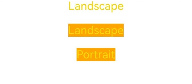
In the following examples, media queries are used to apply different content and styles to the page text when the screen is switched between landscape and portrait modes.
Stage model:
import mediaquery from '@ohos.mediaquery';
import window from '@ohos.window';
import common from '@ohos.app.ability.common';

@Entry
@Component
struct MediaQueryExample {
  @State color: string = '#DB7093';
  @State text: string = 'Portrait';
  @State portraitFunc:mediaquery.MediaQueryResult|void|null = null;
  // The query is valid when the device is in landscape mode.
  listener:mediaquery.MediaQueryListener = mediaquery.matchMediaSync('(orientation: landscape)');

  // The callback is triggered when the query is valid.
  onPortrait(mediaQueryResult:mediaquery.MediaQueryResult) {
    if (mediaQueryResult.matches as boolean) {// If the device is in landscape mode, the page layout is changed accordingly.
      this.color = '#FFD700';
      this.text = 'Landscape';
    } else {
      this.color = '#DB7093';
      this.text = 'Portrait';
    }
  }

  aboutToAppear() {
    // Bind to the current application instance.
    // Register the callback.
    this.listener.on('change', (mediaQueryResult:mediaquery.MediaQueryResult) => { this.onPortrait(mediaQueryResult) });
  }

  // Change the landscape/portrait mode of the device in the callback.
  private changeOrientation(isLandscape: boolean) {
    // Obtain the context information of the UIAbility instance.
    let context:common.UIAbilityContext = getContext(this) as common.UIAbilityContext;
    // Invoke this API to manually change the landscape/portrait mode of the device.
    window.getLastWindow(context).then((lastWindow) => {
      lastWindow.setPreferredOrientation(isLandscape ? window.Orientation.LANDSCAPE : window.Orientation.PORTRAIT)
    });
  }

  build() {
    Column({ space: 50 }) {
      Text(this.text).fontSize(50).fontColor(this.color)
      Text('Landscape').fontSize(50).fontColor(this.color).backgroundColor(Color.Orange)
        .onClick(() => {
          this.changeOrientation(true);
        })
      Text('Portrait').fontSize(50).fontColor(this.color).backgroundColor(Color.Orange)
        .onClick(() => {
          this.changeOrientation(false);
        })
    }
    .width('100%').height('100%')
  }
}
FA model:
import mediaquery from '@ohos.mediaquery';
import featureAbility from '@ohos.ability.featureAbility';

@Entry
@Component
struct MediaQueryExample {
  @State color: string = '#DB7093';
  @State text: string = 'Portrait';
  @State portraitFunc:mediaquery.MediaQueryResult|void|null = null;
  listener:mediaquery.MediaQueryListener = mediaquery.matchMediaSync('(orientation: landscape)'); // The query is valid when the device is in landscape mode.

  onPortrait(mediaQueryResult:mediaquery.MediaQueryResult) { // The callback is triggered when the query is valid.
    if (mediaQueryResult.matches as boolean) {// If the device is in landscape mode, the page layout is changed accordingly.
      this.color = '#FFD700';
      this.text = 'Landscape';
    } else {
      this.color = '#DB7093';
      this.text = 'Portrait';
    }
  }

  aboutToAppear() {
    // Bind to the current application instance.
    this.listener.on('change', (mediaQueryResult:mediaquery.MediaQueryResult) => { this.onPortrait(mediaQueryResult) }); // Register the callback.
  }

  build() {
    Column({ space: 50 }) {
      Text(this.text).fontSize(50).fontColor(this.color)
      Text('Landscape').fontSize(50).fontColor(this.color).backgroundColor(Color.Orange)
        .onClick(() => {
          let context = featureAbility.getContext();
          context.setDisplayOrientation(0); // Invoke this API to manually change the landscape/portrait mode of the device.
        })
      Text('Portrait').fontSize(50).fontColor(this.color).backgroundColor(Color.Orange)
        .onClick(() => {
          let context = featureAbility.getContext();
          context.setDisplayOrientation(1); // Invoke this API to manually change the landscape/portrait mode of the device.
        })
    }
    .width('100%').height('100%')
  }
}
Figure 1 Portrait mode
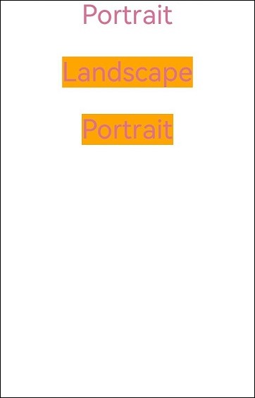
Figure 2 Landscape mode