Location
The location attributes set the alignment mode, layout direction, and position of a component.
NOTE
The APIs of this module are supported since API version 7. Updates will be marked with a superscript to indicate their earliest API version.
align
align(value: Alignment)
Sets the alignment mode of the component content in the drawing area.
Widget capability: Since API version 9, this API is supported in ArkTS widgets.
System capability: SystemCapability.ArkUI.ArkUI.Full
Parameters
| Name | Type | Mandatory | Description |
|---|---|---|---|
| value | Alignment | Yes | Alignment mode of the component content in the drawing area. This attribute is available only in the following components: <Stack>, <Button>, <StepperItem>,<FolderStack>, <Marquee>, <Text>, <TextArea>, and <TextInput>. For details about the alignment results of text-related components (the last four aforementioned components), see textAlign. If the component does not support the textAlign attribute, horizontal text alignment cannot be set. Default value: Alignment.Center |
direction
direction(value: Direction)
Sets how elements are laid out along the main axis of the container.
Widget capability: Since API version 9, this API is supported in ArkTS widgets.
System capability: SystemCapability.ArkUI.ArkUI.Full
Parameters
| Name | Type | Mandatory | Description |
|---|---|---|---|
| value | Direction | Yes | How elements are laid out along the main axis of the component. For example, the main axis of the <Column> component runs vertically. Default value: Direction.Auto |
position
position(value: Position)
Sets the absolute position of the component, which defines the offset of the component's upper left corner relative to the parent component's.
Widget capability: Since API version 9, this API is supported in ArkTS widgets.
System capability: SystemCapability.ArkUI.ArkUI.Full
Parameters
| Name | Type | Mandatory | Description |
|---|---|---|---|
| value | Position | Yes | Absolute position of the component, which defines the offset of the component's upper left corner relative to the parent component's. With this attribute set, the component does not participate in the layout of the parent component. That is, it is relocated during drawing based on the settings, but does not take up space in the parent component. This attribute is applicable to scenarios where the component is fixed at a position in the parent container, for example, where it is pinned to top or floating above the UI. |
markAnchor
markAnchor(value: Position)
Sets the anchor for locating the component.
Widget capability: Since API version 9, this API is supported in ArkTS widgets.
System capability: SystemCapability.ArkUI.ArkUI.Full
Parameters
| Name | Type | Mandatory | Description |
|---|---|---|---|
| value | Position | Yes | Anchor for locating the component, which is used to move the component further away from the position specified by position or offset. .position({x: value1, y: value2}).markAnchor({x: value3, y: value4}) has the same effect as .position({x: value1 - value3, y: value2 - value4}). The same applies to offset. When markAnchor is used alone, markAnchor ({x: value1, y: value2}) has the same effect as .offset ({x: -value1, y: -value2}). The default value varies by API version. API version 9 and earlier: { x: 0, y: 0 } API version 10: none |
offset
offset(value: Position)
Sets the offset of the component relative to itself.
Widget capability: Since API version 9, this API is supported in ArkTS widgets.
System capability: SystemCapability.ArkUI.ArkUI.Full
Parameters
| Name | Type | Mandatory | Description |
|---|---|---|---|
| value | Position | Yes | Offset of the component relative to itself. With this attribute set, the component participates in the layout of the parent component. During drawing, an extra offset is made based on the offset provided by the parent component. The default value varies by API version. API version 9 and earlier: { x: 0, y: 0 } API version 10: none |
alignRules9+
alignRules(value: AlignRuleOption)
Sets the alignment rules in the relative container. This API is valid only when the container is <RelativeContainer>.
Widget capability: Since API version 9, this API is supported in ArkTS widgets.
System capability: SystemCapability.ArkUI.ArkUI.Full
Parameters
| Name | Type | Mandatory | Description |
|---|---|---|---|
| value | AlignRuleOption | Yes | Alignment rules in the relative container. |
AlignRuleOption
Since API version 9, this API is supported in ArkTS widgets.
| Name | Type | Description |
|---|---|---|
| left | { anchor: string, align: HorizontalAlign } | Left alignment. - anchor: ID of the component that functions as the anchor point. - align: alignment mode relative to the anchor component. |
| right | { anchor: string, align: HorizontalAlign } | Right alignment. - anchor: ID of the component that functions as the anchor point. - align: alignment mode relative to the anchor component. |
| middle | { anchor: string, align: HorizontalAlign } | Horizontal center alignment. - anchor: ID of the component that functions as the anchor point. - align: alignment mode relative to the anchor component. |
| top | { anchor: string, align: VerticalAlign } | Top alignment. - anchor: ID of the component that functions as the anchor point. - align: alignment mode relative to the anchor component. |
| bottom | { anchor: string, align: VerticalAlign } | Bottom alignment. - anchor: ID of the component that functions as the anchor point. - align: alignment mode relative to the anchor component. |
| center | { anchor: string, align: VerticalAlign } | Vertical center alignment. |
| bias | Bias | Offset of the component under the anchor constraints. The value is the ratio of the distance to the left/upper anchor to the total distance between anchors. |
Bias
| Name | Type | Mandatory | Description |
|---|---|---|---|
| Bias | { horizontal?: number, vertical?: number } | No | Offset of the component under the anchor constraints. - horizontal: bias value in the horizontal direction. - vertical: bias value in the vertical direction. This parameter takes effect when: The width of the child component can be determined and there are two horizontal anchors. -The height of the child component can be determined and there are two vertical anchors. Default value: { horizontal: 0.5, vertical: 0.5 } |
Example
Example 1
// xxx.ets
@Entry
@Component
struct PositionExample1 {
build() {
Column() {
Column({ space: 10 }) {
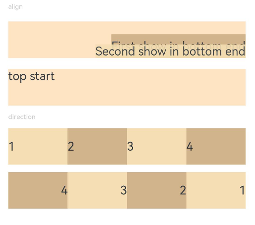
// When the component content is within the area specified by the component width and height, set the alignment mode of the content in the component.
Text('align').fontSize(9).fontColor(0xCCCCCC).width('90%')
Stack() {
Text('First show in bottom end').height('65%').backgroundColor(0xD2B48C)
Text('Second show in bottom end').backgroundColor(0xF5DEB3).opacity(0.9)
}.width('90%').height(50).margin({ top: 5 }).backgroundColor(0xFFE4C4)
.align(Alignment.BottomEnd)
Stack() {
Text('top start')
}.width('90%').height(50).margin({ top: 5 }).backgroundColor(0xFFE4C4)
.align(Alignment.TopStart)
// To arrange the child components from left to right, set direction of the parent container to Direction.Ltr.
Text('direction').fontSize(9).fontColor(0xCCCCCC).width('90%')
Row() {
Text('1').height(50).width('25%').fontSize(16).backgroundColor(0xF5DEB3)
Text('2').height(50).width('25%').fontSize(16).backgroundColor(0xD2B48C)
Text('3').height(50).width('25%').fontSize(16).backgroundColor(0xF5DEB3)
Text('4').height(50).width('25%').fontSize(16).backgroundColor(0xD2B48C)
}
.width('90%')
.direction(Direction.Ltr)
// To arrange the child components from right to left, set direction of the parent container to Direction.Rtl.
Row() {
Text('1').height(50).width('25%').fontSize(16).backgroundColor(0xF5DEB3).textAlign(TextAlign.End)
Text('2').height(50).width('25%').fontSize(16).backgroundColor(0xD2B48C).textAlign(TextAlign.End)
Text('3').height(50).width('25%').fontSize(16).backgroundColor(0xF5DEB3).textAlign(TextAlign.End)
Text('4').height(50).width('25%').fontSize(16).backgroundColor(0xD2B48C).textAlign(TextAlign.End)
}
.width('90%')
.direction(Direction.Rtl)
}
}
.width('100%').margin({ top: 5 })
}
}
Example 2
// xxx.ets
@Entry
@Component
struct PositionExample2 {
build() {
Column({ space: 20 }) {
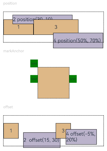
// Set the offset of the component's upper left corner relative to the parent component's upper left corner.
Text('position').fontSize(12).fontColor(0xCCCCCC).width('90%')
Row() {
Text('1').size({ width: '30%', height: '50' }).backgroundColor(0xdeb887).border({ width: 1 }).fontSize(16)
.textAlign(TextAlign.Center)
Text('2 position(30, 10)')
.size({ width: '60%', height: '30' })
.backgroundColor(0xbbb2cb)
.border({ width: 1 })
.fontSize(16)
.align(Alignment.Start)
.position({ x: 30, y: 10 })
Text('3').size({ width: '45%', height: '50' }).backgroundColor(0xdeb887).border({ width: 1 }).fontSize(16)
.textAlign(TextAlign.Center)
Text('4 position(50%, 70%)')
.size({ width: '50%', height: '50' })
.backgroundColor(0xbbb2cb)
.border({ width: 1 })
.fontSize(16)
.position({ x: '50%', y: '70%' })
}.width('90%').height(100).border({ width: 1, style: BorderStyle.Dashed })
// Offset relative to the start point. x indicates the horizontal distance between the end point and the start point. If the value of x is greater than 0, the component is offset to the left. Otherwise, the component is offset to the right.
// y indicates the vertical distance between the end point and the start point. If the value of y is greater than 0, the component is offset to the top. Otherwise, the component is offset to the bottom.
Text('markAnchor').fontSize(12).fontColor(0xCCCCCC).width('90%')
Stack({ alignContent: Alignment.TopStart }) {
Row()
.size({ width: '100', height: '100' })
.backgroundColor(0xdeb887)
Text('text')
.fontSize('30px')
.textAlign(TextAlign.Center)
.size({ width: 25, height: 25 })
.backgroundColor(Color.Green)
.markAnchor({ x: 25, y: 25 })
Text('text')
.fontSize('30px')
.textAlign(TextAlign.Center)
.size({ width: 25, height: 25 })
.backgroundColor(Color.Green)
.markAnchor({ x: -100, y: -25 })
Text('text')
.fontSize('30px')
.textAlign(TextAlign.Center)
.size({ width: 25, height: 25 })
.backgroundColor(Color.Green)
.markAnchor({ x: 25, y: -25 })
}.margin({ top: 25 }).border({ width: 1, style: BorderStyle.Dashed })
// Offset of the component relative to itself. If the value of x is greater than 0, the component is offset to the right. Otherwise, the component is offset to the left. If the value of y is greater than 0, the component is offset to the bottom. Otherwise, the component is offset to the top.
Text('offset').fontSize(12).fontColor(0xCCCCCC).width('90%')
Row() {
Text('1').size({ width: '15%', height: '50' }).backgroundColor(0xdeb887).border({ width: 1 }).fontSize(16)
.textAlign(TextAlign.Center)
Text('2 offset(15, 30)')
.size({ width: 120, height: '50' })
.backgroundColor(0xbbb2cb)
.border({ width: 1 })
.fontSize(16)
.align(Alignment.Start)
.offset({ x: 15, y: 30 })
Text('3').size({ width: '15%', height: '50' }).backgroundColor(0xdeb887).border({ width: 1 }).fontSize(16)
.textAlign(TextAlign.Center)
Text('4 offset(-5%, 20%)')
.size({ width: 100, height: '50' })
.backgroundColor(0xbbb2cb)
.border({ width: 1 })
.fontSize(16)
.offset({ x: '-5%', y: '20%' })
}.width('90%').height(100).border({ width: 1, style: BorderStyle.Dashed })
}
.width('100%').margin({ top: 25 })
}
}