Popup Control
You can bind a popup to a component, specifying its content, interaction logic, and visibility.
NOTE
This attribute is supported since API version 7. Updates will be marked with a superscript to indicate their earliest API version.
The visibility of the popup is returned through the onStateChange event callback. There is no strong mapping between the visibility and the creation or destruction of the component.
bindPopup
bindPopup(show: boolean, popup: PopupOptions | CustomPopupOptions)
Binds a popup to the component.
System capability: SystemCapability.ArkUI.ArkUI.Full
Parameters
| Name | Type | Mandatory | Description |
|---|---|---|---|
| show | boolean | Yes | Whether to show the popup. The default value is false, indicating that the popup is hidden. As the popup can be displayed only after building of all pages is completed, show cannot be set to true during page building. Otherwise, the display position and shape of the popup will be incorrect. |
| popup | PopupOptions | CustomPopupOptions8+ | Yes | Parameters of the popup. |
PopupOptions
| Name | Type | Mandatory | Description |
|---|---|---|---|
| message | string | Yes | Content of the popup message. |
| placementOnTop(deprecated) | boolean | No | Whether to display the popup above the component. Default value: false NOTE This API is deprecated since API version 10. You are advised to use placement instead. |
| primaryButton | { value: string, action: () => void } |
No | Primary button. value: text of the primary button in the popup. action: callback for clicking the primary button. |
| secondaryButton | { value: string, action: () => void } |
No | Secondary button. value: text of the secondary button in the popup. action: callback for clicking the secondary button. |
| onStateChange | (event: { isVisible: boolean }) => void | No | Callback for the popup status change event. The parameter isVisible indicates whether the popup is visible. |
| arrowOffset9+ | Length | No | Offset of the popup arrow relative to the popup. When the arrow is at the top or bottom of the popup: The value 0 indicates that the arrow is located on the leftmost, and any other value indicates the distance from the arrow to the leftmost; the arrow is centered by default. When the arrow is on the left or right side of the popup: The value indicates the distance from the arrow to the top; the arrow is centered by default. When the popup is displayed on either edge of the screen, it will automatically deviate leftward or rightward to stay within the safe area. When the value is 0, the arrow always points to the bound component. |
| showInSubWindow9+ | boolean | No | Whether to show the popup in the subwindow. The default value is false. |
| mask10+ | boolean | { color : ResourceColor } | No | Whether to apply a mask to the popup. The value true means to apply a transparent mask to the popup, false means not to apply a mask to the popup, and a color value means to apply a mask in the corresponding color to the popup. |
| messageOptions10+ | PopupMessageOptions | No | Parameters of the popup message. |
| targetSpace10+ | Length | No | Space between the popup and the target. |
| placement10+ | Placement | No | Position of the popup relative to the target. The default value is Placement.Bottom. If both placementOnTop and placement are set, the latter prevails. |
| offset10+ | Position | No | Offset of the popup relative to the display position specified by placement. NOTE This parameter cannot be set in percentage. |
| enableArrow10+ | boolean | No | Whether to display the arrow. Default value: true |
| popupColor11+ | Color | string | number | Resource | No | Color of the popup. Default value: TRANSPARENT plus COMPONENT_ULTRA_THICK |
| autoCancel11+ | boolean | No | Whether to automatically close the popup when an operation is performed on the page. Default value: true |
| width11+ | Dimension | No | Width of the popup. NOTE When showInSubWindow is set to true, the maximum height of the popup is the height of the device screen. When showInSubWindow is set to false, the maximum height is the height of the application window. Allowable height = Maximum height – Status bar height (0 if there is no status bar) – Dock height (0 if there is no dock) – 40 VP – 40 VP. |
| arrowPointPosition11+ | ArrowPointPosition | No | Position of the popup arrow relative to its parent component. Available positions are Start, Center, and End, in both vertical and horizontal directions. All these positions are within the parent component area. |
| arrowWidth11+ | Dimension | No | Arrow thickness. If the arrow thickness exceeds the length of the edge minus twice the size of the popup rounded corner, the arrow is not drawn. Default value: 16.0_vp NOTE This parameter cannot be set in percentage. |
| arrowHeight11+ | Dimension | No | Arrow height. Default value: 8.0_vp NOTE This parameter cannot be set in percentage. |
| radius11+ | Dimension | No | Rounded corner radius of the popup. Default value: 20.0_vp |
| shadow11+ | ShadowOptions | ShadowStyle | No | Popup shadow. Default value: ShadowStyle.OUTER_DEFAULT_MD |
| backgroundBlurStyle11+ | BlurStyle | No | Background blur style of the popup. Default value: BlurStyle.COMPONENT_ULTRA_THICK |
PopupMessageOptions10+
| Name | Type | Mandatory | Description |
|---|---|---|---|
| textColor | ResourceColor | No | Text color of the popup message. |
| font | Font | No | Font attributes of the popup message. |
CustomPopupOptions8+
| Name | Type | Mandatory | Description |
|---|---|---|---|
| builder | CustomBuilder | Yes | Popup builder. NOTE The popup attribute is a universal attribute. A custom popup does not support display of another popup. The position attribute cannot be used for the first-layer container in the builder. If the position attribute is used, the popup will not be displayed. If a custom component is used in the builder, the aboutToAppear and aboutToDisappear lifecycle callbacks of the custom component are irrelevant to the visibility of the popup. As such, the lifecycle of the custom component cannot be used to determine whether the popup is displayed or not. |
| placement | Placement | No | Preferred position of the popup. If the set position is insufficient for holding the popup, it will be automatically adjusted. Default value: Placement.Bottom |
| popupColor | number | Color | string | Resource | No | Color of the popup. The default value varies by API version. API version 10: '#4d4d4d' API version 11 and later: TRANSPARENT plus [COMPONENT_ULTRA_THICK]. (ts-appendix-enums.md#blurstyle9) |
| enableArrow | boolean | No | Whether to display an arrow. Since API version 9, if the position set for the popup is not large enough, the arrow will not be displayed. For example, if placement is set to Left, but the popup height (80 vp) is less than the sum of the arrow width (32 vp) and diameter of popup rounded corner (48 vp), the arrow will not be displayed. Default value: true |
| autoCancel | boolean | No | Whether to automatically close the popup when an operation is performed on the page. Default value: true NOTE To enable the popup to disappear upon a click on it, place a layout component in the builder, place the <Popup> component in the layout component, and modify the value of the bindPopup variable (show: boolean) in the onClick event of the layout component. |
| onStateChange | (event: { isVisible: boolean }) => void | No | Callback for the popup status change event. The parameter isVisible indicates whether the popup is visible. |
| arrowOffset9+ | Length | No | Offset of the popup arrow relative to the popup. When the arrow is at the top or bottom of the popup: The value 0 indicates that the arrow is located on the leftmost, and any other value indicates the distance from the arrow to the leftmost; the arrow is centered by default. When the arrow is on the left or right side of the popup: The value indicates the distance from the arrow to the top; the arrow is centered by default. When the popup is displayed on either edge of the screen, it will automatically deviate leftward or rightward to stay within the safe area. When the value is 0, the arrow always points to the bound component. |
| showInSubWindow9+ | boolean | No | Whether to show the popup in the subwindow. The default value is false. |
| maskColor(deprecated) | Resource | string | number | Color | No | Color of the popup mask. NOTE This parameter is deprecated since API version 10. You are advised to use mask instead. |
| mask10+ | boolean | { color : ResourceColor } | No | Whether to apply a mask to the popup. The value true means to apply a transparent mask to the popup, false means not to apply a mask to the popup, and a color value means to apply a mask in the corresponding color to the popup. |
| targetSpace10+ | Length | No | Space between the popup and the target. |
| offset10+ | Position | No | Offset of the popup relative to the display position specified by placement. NOTE This parameter cannot be set in percentage. |
| width11+ | Dimension | No | Width of the popup. NOTE When showInSubWindow is set to true, the maximum height of the popup is the height of the device screen. When showInSubWindow is set to false, the maximum height is the height of the application window. Allowable height = Maximum height – Status bar height (0 if there is no status bar) – Dock height (0 if there is no dock) – 40 VP – 40 VP. |
| arrowPointPosition11+ | ArrowPointPosition | No | Position of the popup arrow relative to its parent component. Available positions are Start, Center, and End, in both vertical and horizontal directions. All these positions are within the parent component area. |
| arrowWidth11+ | Dimension | No | Arrow thickness. If the arrow thickness exceeds the length of the edge minus twice the size of the popup rounded corner, the arrow is not drawn. Default value: 16.0_vp NOTE This parameter cannot be set in percentage. |
| arrowHeight11+ | Dimension | No | Arrow height. Default value: 8.0_vp NOTE This parameter cannot be set in percentage. |
| radius11+ | Dimension | No | Rounded corner radius of the popup. Default value: 20.0_vp |
| shadow11+ | ShadowOptions | ShadowStyle | No | Popup shadow. Default value: ShadowStyle.OUTER_DEFAULT_MD |
| backgroundBlurStyle11+ | BlurStyle | No | Background blur style of the popup. Default value: BlurStyle.COMPONENT_ULTRA_THICK |
| focusable11+ | boolean | No | Whether the popup obtains focus when displayed. Default value: true |
Example
Example 1
// xxx.ets
@Entry
@Component
struct PopupExample {
@State handlePopup: boolean = false
@State customPopup: boolean = false
// Popup builder
@Builder popupBuilder() {
Row({ space: 2 }) {
Image($r("app.media.icon")).width(24).height(24).margin({ left: -5 })
Text('Custom Popup').fontSize(10)
}.width(100).height(50).padding(5)
}
build() {
Flex({ direction: FlexDirection.Column }) {
// PopupOptions for setting the popup
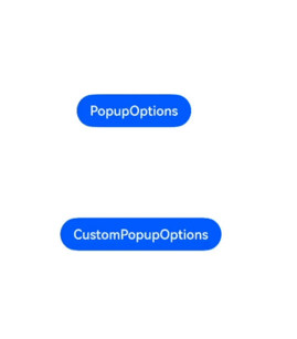
Button('PopupOptions')
.onClick(() => {
this.handlePopup = !this.handlePopup
})
.bindPopup(this.handlePopup, {
message: 'This is a popup with PopupOptions',
placementOnTop: true,
showInSubWindow:false,
primaryButton: {
value: 'confirm',
action: () => {
this.handlePopup = !this.handlePopup
console.info('confirm Button click')
}
},
// Secondary button
secondaryButton: {
value: 'cancel',
action: () => {
this.handlePopup = !this.handlePopup
console.info('cancel Button click')
}
},
onStateChange: (e) => {
console.info(JSON.stringify(e.isVisible))
if (!e.isVisible) {
this.handlePopup = false
}
}
})
.position({ x: 100, y: 150 })
// CustomPopupOptions for setting the popup
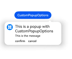
Button('CustomPopupOptions')
.onClick(() => {
this.customPopup = !this.customPopup
})
.bindPopup(this.customPopup, {
builder: this.popupBuilder,
placement: Placement.Top,
mask: {color:'#33000000'},
popupColor: Color.Yellow,
enableArrow: true,
showInSubWindow: false,
onStateChange: (e) => {
if (!e.isVisible) {
this.customPopup = false
}
}
})
.position({ x: 80, y: 300 })
}.width('100%').padding({ top: 5 })
}
}
Example 2
// xxx.ets
@Entry
@Component
struct PopupExample {
@State handlePopup: boolean = false
build() {
Column() {
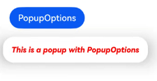
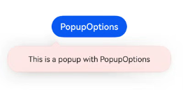
Button('PopupOptions')
.onClick(() => {
this.handlePopup = !this.handlePopup
})
.bindPopup(this.handlePopup, {
message: 'This is a popup with PopupOptions',
messageOptions: {
textColor: Color.Red,
font: {
size: '14vp',
style: FontStyle.Italic,
weight: FontWeight.Bolder
}
},
placement: Placement.Bottom,
enableArrow: false,
targetSpace: '15vp',
onStateChange: (e) => {
console.info(JSON.stringify(e.isVisible))
if (!e.isVisible) {
this.handlePopup = false
}
}
})
}.margin(20)
}
}
Example 3
// xxx.ets
@Entry
@Component
struct PopupExample {
  @State customPopup: boolean = false

  // Popup builder
  @Builder popupBuilder() {
    Row() {
      Text('Custom Popup Message').fontSize(10)
    }.height(50).padding(5)
  }

  build() {
    Column() {
      // CustomPopupOptions for setting the popup
      Button('CustomPopupOptions')
        .onClick(() => {
          this.customPopup = !this.customPopup
        })
        .bindPopup(this.customPopup, {
          builder: this.popupBuilder,
          targetSpace: '15vp',
          enableArrow: false,
          onStateChange: (e) => {
            if (!e.isVisible) {
              this.customPopup = false
            }
          }
        })
    }.margin(20)
  }
}

Example 4
// xxx.ets
@Entry
@Component
struct PopupExample {
  @State handlePopup: boolean = false

  build() {
    Column() {
      Button('PopupOptions')
        .position({ x: 100, y: 50 })
        .onClick(() => {
          this.handlePopup = !this.handlePopup
        })
        .bindPopup(this.handlePopup, {
          width: 300,
          message: 'This is a popup with PopupOptions',
          arrowPointPosition: ArrowPointPosition.START,
          popupColor: Color.Red,
          autoCancel: true,
        })
    }
    .width('100%')
    .height('100%')
  }
}
Example 5
// xxx.ets
import { Popup , PopupOptions,PopupTextOptions, PopupButtonOptions, PopupIconOptions } from '@ohos.arkui.advanced.Popup';

@Entry
@Component
struct PopupExample {
  @State customPopup: boolean = false

  @Builder
  popupBuilder() {
    // Define the custom advanced component through popup.
    Popup({
      // Set the icon through PopupIconOptions.
      icon: {
        image: $r('app.media.icon'),
        width:32,
        height:32,
        fillColor:Color.White,
        borderRadius: 16,
      } as PopupIconOptions,
      // Set the text through PopupTextOptions.
      title: {
        text: 'This is a popup with CustomPopupOptions',
        fontSize: 20,
        fontColor: Color.Black,
        fontWeight: FontWeight.Normal,

      } as PopupTextOptions,
      // Set the text through PopupTextOptions.
      message: {
        text: 'This is the message',
        fontSize: 15,
        fontColor: Color.Black,
      } as PopupTextOptions,
      showClose: false,
      onClose: () => {
        console.info('close Button click')
        this.customPopup = false
      },
      // Set the button through PopupButtonOptions.
      buttons: [{
        text: 'confirm',
        action: () => {
          console.info('confirm button click')
          this.customPopup = false
        },
        fontSize: 15,
        fontColor: Color.Black,

      },
        {
          text: 'cancel',
          action: () => {
            console.info('cancel button click')
            this.customPopup = false
          },
          fontSize: 15,
          fontColor: Color.Black,
        },] as [PopupButtonOptions?, PopupButtonOptions?],
    })
  }

  build() {
    Column() {
      Button('CustomPopupOptions')
        .onClick(() => {
          this.customPopup = !this.customPopup
        })
        .position({ x: 80, y: 200 })
        .bindPopup(this.customPopup, {
          builder: this.popupBuilder,
          width: 300,
          arrowPointPosition: ArrowPointPosition.END,
        })
    }
    .width('100%')
    .height('100%')
  }
}
Example 6
// xxx.ets
@Entry
@Component
struct PopupExample {
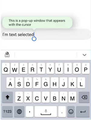
@State cursorPopup: boolean = false
build() {
Column() {
TextInput({placeholder:'I am placeholder text',text:'I am current text input'})
.position({ x: 0, y: 350 })
.onFocus(() => {
this.cursorPopup = !this.cursorPopup
})
.selectionMenuHidden(true)
.bindPopup(this.cursorPopup, {
width: 300,
message: 'This is a pop-up window that appears with the cursor',
arrowPointPosition: ArrowPointPosition.CENTER,
popupColor: Color.Green,
autoCancel: true,
})
}
.width('100%')
.height('100%')
}
}
Example 7
// xxx.ets
@Entry
@Component
struct PopupExample {
@State customPopup: boolean = false
build() {
Column() {
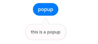
Button("popup")
.onClick(()=>{
this.customPopup = !this.customPopup
})
.bindPopup(this.customPopup, {
message: "this is a popup",
popupColor: Color.Pink,
arrowHeight: 20,
arrowWidth: 20,
radius: 20,
shadow: ShadowStyle.OUTER_DEFAULT_XS
})
}
.width('100%')
}
}