列表选择弹窗 (ActionSheet)
列表弹窗。
说明:
从API Version 8开始支持。后续版本如有新增内容,则采用上角标单独标记该内容的起始版本。
本模块功能依赖UI的执行上下文,不可在UI上下文不明确的地方使用,参见UIContext说明。
从API version 10开始,可以通过使用UIContext中的showActionSheet来明确UI的执行上下文。
ActionSheet.show
static show(value: ActionSheetOptions)
定义列表弹窗并弹出。
系统能力: SystemCapability.ArkUI.ArkUI.Full
参数:
| 参数名 | 类型 | 必填 | 描述 |
|---|---|---|---|
| value | ActionSheetOptions | 是 | 配置列表选择弹窗的参数。 |
ActionSheetOptions对象说明
| 名称 | 类型 | 必填 | 说明 |
|---|---|---|---|
| title | Resource | string | 是 | 弹窗标题。 |
| subtitle10+ | ResourceStr | 否 | 弹窗副标题。 |
| message | Resource | string | 是 | 弹窗内容。 |
| autoCancel | boolean | 否 | 点击遮障层时,是否关闭弹窗。 默认值:true 值为true时,点击遮障层关闭弹窗,值为false时,点击遮障层不关闭弹窗。 |
| confirm | { enabled10+?: boolean, defaultFocus10+?: boolean, style10+?: DialogButtonStyle, value: Resource | string, action: () => void } |
否 | 确认Button的使能状态、默认焦点、按钮风格、文本内容和点击回调。 enabled:点击Button是否响应,true表示Button可以响应,false表示Button不可以响应。 默认值:true defaultFocus:设置Button是否是默认焦点,true表示Button是默认焦点,false表示Button不是默认焦点。 默认值:false style:设置Button的风格样式。 默认值:DialogButtonStyle.DEFAULT value:Button文本内容。 action: Button选中时的回调。 |
| cancel | () => void | 否 | 点击遮障层关闭dialog时的回调。 |
| alignment | DialogAlignment | 否 | 弹窗在竖直方向上的对齐方式。 默认值:DialogAlignment.Bottom |
| offset | { dx: number | string | Resource, dy: number | string | Resource } |
否 | 弹窗相对alignment所在位置的偏移量。 默认值: 1.alignment设置为Top、TopStart、TopEnd时默认值为{dx: 0,dy: "40vp"} 2.alignment设置为其他时默认值为{dx: 0,dy: "-40vp"} |
| sheets | Array<SheetInfo> | 是 | 设置选项内容,每个选择项支持设置图片、文本和选中的回调。 |
| maskRect10+ | Rectangle | 否 | 弹窗遮蔽层区域,在遮蔽层区域内的事件不透传,在遮蔽层区域外的事件透传。 默认值:{ x: 0, y: 0, width: '100%', height: '100%' } 说明: showInSubWindow为true时,maskRect不生效。 |
| showInSubWindow11+ | boolean | 否 | 某弹框需要显示在主窗口之外时,是否在子窗口显示此弹窗。 默认值:false,弹窗显示在应用内,而非独立子窗口。 说明:showInSubWindow为true的弹窗无法触发显示另一个showInSubWindow为true的弹窗。 |
| isModal11+ | boolean | 否 | 弹窗是否为模态窗口,模态窗口有蒙层,非模态窗口无蒙层。 默认值:true,此时弹窗有蒙层。 |
| backgroundColor11+ | ResourceColor | 否 | 弹窗背板颜色。 默认值:Color.Transparent |
| backgroundBlurStyle11+ | BlurStyle | 否 | 弹窗背板模糊材质。 默认值:BlurStyle.COMPONENT_ULTRA_THICK |
SheetInfo接口说明
| 参数名 | 参数类型 | 必填 | 参数描述 |
|---|---|---|---|
| title | string | Resource | 是 | 选项的文本内容。 |
| icon | string | Resource | 否 | 选项的图标,默认无图标显示。 |
| action | ()=>void | 是 | 选项选中的回调。 |
DialogButtonStyle10+枚举说明
| 名称 | 描述 |
|---|---|
| DEFAULT | 白底蓝字(深色主题:白底=黑底)。 |
| HIGHLIGHT | 蓝底白字。 |
示例
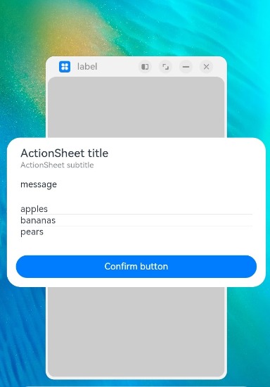
示例1
@Entry
@Component
struct ActionSheetExample {
  build() {
    Flex({ direction: FlexDirection.Column, alignItems: ItemAlign.Center, justifyContent: FlexAlign.Center }) {
      Button('Click to Show ActionSheet')
        .onClick(() => {
          ActionSheet.show({
            title: 'ActionSheet title',
            subtitle: 'ActionSheet subtitle',
            message: 'message',
            autoCancel: true,
            confirm: {
              defaultFocus: true,
              value: 'Confirm button',
              action: () => {
                console.log('Get Alert Dialog handled')
              }
            },
            cancel: () => {
              console.log('actionSheet canceled')
            },
            alignment: DialogAlignment.Bottom,
            offset: { dx: 0, dy: -10 },
            sheets: [
              {
                title: 'apples',
                action: () => {
                  console.log('apples')
                }
              },
              {
                title: 'bananas',
                action: () => {
                  console.log('bananas')
                }
              },
              {
                title: 'pears',
                action: () => {
                  console.log('pears')
                }
              }
            ]
          })
        })
    }.width('100%')
    .height('100%')
  }
}
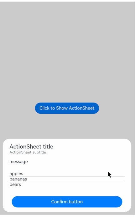
示例2
@Entry
@Component
struct ActionSheetExample {
  build() {
    Flex({ direction: FlexDirection.Column, alignItems: ItemAlign.Center, justifyContent: FlexAlign.Center }) {
      Button('Click to Show ActionSheet')
        .onClick(() => {
          ActionSheet.show({
            title: 'ActionSheet title',
            subtitle: 'ActionSheet subtitle',
            message: 'message',
            autoCancel: true,
            showInSubWindow: true,
            isModal: true,
            confirm: {
              defaultFocus: true,
              value: 'Confirm button',
              action: () => {
                console.log('Get Alert Dialog handled')
              }
            },
            cancel: () => {
              console.log('actionSheet canceled')
            },
            alignment: DialogAlignment.Center,
            offset: { dx: 0, dy: -10 },
            sheets: [
              {
                title: 'apples',
                action: () => {
                  console.log('apples')
                }
              },
              {
                title: 'bananas',
                action: () => {
                  console.log('bananas')
                }
              },
              {
                title: 'pears',
                action: () => {
                  console.log('pears')
                }
              }
            ]
          })
        })
    }.width('100%')
    .height('100%')
  }
}