CheckboxGroup
The <CheckboxGroup> component is used to select or deselect all check boxes in a group.
NOTE
This component is supported since API version 8. Updates will be marked with a superscript to indicate their earliest API version.
Child Components
Not supported
APIs
CheckboxGroup(options?: CheckboxGroupOptions)
Creates a check box group so that you can select or deselect all check boxes in the group at the same time. Check boxes and the check box group that share a group name belong to the same group.
Widget capability: Since API version 9, this feature is supported in ArkTS widgets.
System capability: SystemCapability.ArkUI.ArkUI.Full
Parameters
| Name | Type | Mandatory | Description |
|---|---|---|---|
| options | CheckboxGroupOptions | No | Check box group parameters. |
CheckboxGroupOptions
| Name | Type | Mandatory | Description |
|---|---|---|---|
| group | string | No | Group name. NOTE If there are multiple check box groups with the same group name, only the first check box group takes effect. |
Attributes
In addition to the universal attributes, the following attributes are supported.
| Name | Type | Description |
|---|---|---|
| selectAll | boolean | Whether to select all. Default value: false Since API version 9, this API is supported in ArkTS widgets. NOTE If the select attribute is set for a <Checkbox> component in the same group, the setting of the <Checkbox> has a higher priority. Since API version 10, this attribute supports $$ for two-way binding of variables. |
| selectedColor | ResourceColor | Color of the selected check box. Default value: $r('sys.color.ohos_id_color_text_primary_activated') An invalid value is handled as the default value. Since API version 9, this API is supported in ArkTS widgets. |
| unselectedColor10+ | ResourceColor | Border color of the check box when it is not selected. |
| mark10+ | MarkStyle | Internal icon style of the check box. |
Events
In addition to the universal events, the following events are supported.
| Name | Description |
|---|---|
| onChange (callback: (event: CheckboxGroupResult) => void ) | Triggered when the selected status of the check box group or any check box wherein changes. Since API version 9, this API is supported in ArkTS widgets. |
CheckboxGroupResult
Since API version 9, this API is supported in ArkTS widgets.
| Name | Type | Description |
|---|---|---|
| name | Array<string> | Names of all the selected check boxes in the group. |
| status | SelectStatus | Selected status. |
SelectStatus
Since API version 9, this API is supported in ArkTS widgets.
| Name | Description |
|---|---|
| All | All check boxes in the group are selected. |
| Part | Some check boxes in the group are selected. |
| None | None of the check boxes in the group are selected. |
MarkStyle10+
| Name | Type | Mandatory | Default Value | Description |
|---|---|---|---|---|
| strokeColor | ResourceColor | No | Color.White | Color of the internal mark. |
| size | number | string | No | - | Size of the internal mark, in vp. The default size is the same as the width of the check box group component. This parameter cannot be set in percentage. If it is set to an invalid value, the default value is used. |
| strokeWidth | number | string | No | 2 | Stroke width of the internal mark, in vp. This parameter cannot be set in percentage. If it is set to an invalid value, the default value is used. |
Example
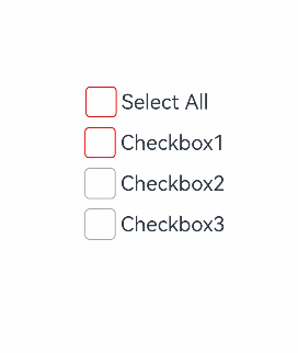
Example 1
// xxx.ets
@Entry
@Component
struct CheckboxExample {
  build() {
    Scroll() {
      Column() {
        // Select All button
        Flex({ justifyContent: FlexAlign.Start, alignItems: ItemAlign.Center }) {
          CheckboxGroup({ group: 'checkboxGroup' })
            .selectedColor('#007DFF')
            .onChange((itemName: CheckboxGroupResult) => {
              console.info("checkbox group content" + JSON.stringify(itemName))
            })
          Text('Select All').fontSize(14).lineHeight(20).fontColor('#182431').fontWeight(500)
        }

        // Option 1
        Flex({ justifyContent: FlexAlign.Start, alignItems: ItemAlign.Center }) {
          Checkbox({ name: 'checkbox1', group: 'checkboxGroup' })
            .selectedColor('#007DFF')
            .shape(CheckBoxShape.ROUNDED_SQUARE)
            .onChange((value: boolean) => {
              console.info('Checkbox1 change is' + value)
            })
          Text('Checkbox1').fontSize(14).lineHeight(20).fontColor('#182431').fontWeight(500)
        }.margin({ left: 36 })

        // Option 2
        Flex({ justifyContent: FlexAlign.Start, alignItems: ItemAlign.Center }) {
          Checkbox({ name: 'checkbox2', group: 'checkboxGroup' })
            .selectedColor('#007DFF')
            .shape(CheckBoxShape.ROUNDED_SQUARE)
            .onChange((value: boolean) => {
              console.info('Checkbox2 change is' + value)
            })
          Text('Checkbox2').fontSize(14).lineHeight(20).fontColor('#182431').fontWeight(500)
        }.margin({ left: 36 })

        // Option 3
        Flex({ justifyContent: FlexAlign.Start, alignItems: ItemAlign.Center }) {
          Checkbox({ name: 'checkbox3', group: 'checkboxGroup' })
            .selectedColor('#007DFF')
            .shape(CheckBoxShape.ROUNDED_SQUARE)
            .onChange((value: boolean) => {
              console.info('Checkbox3 change is' + value)
            })
          Text('Checkbox3').fontSize(14).lineHeight(20).fontColor('#182431').fontWeight(500)
        }.margin({ left: 36 })
      }
    }
  }
}
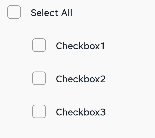
Example 2
// xxx.ets
@Entry
@Component
struct Index {

  build() {
    Row() {
      Column() {
        Flex({ justifyContent: FlexAlign.Center, alignItems: ItemAlign.Center }) {
          CheckboxGroup({ group: 'checkboxGroup' })
            .selectedColor(Color.Orange)
            .onChange((itemName: CheckboxGroupResult) => {
              console.info("checkbox group content" + JSON.stringify(itemName))
            })
            .mark({
              strokeColor:Color.Black,
              size: 40,
              strokeWidth: 5
            })
            .unselectedColor(Color.Red)
            .width(30)
            .height(30)
          Text('Select All').fontSize(20)
        }.margin({right:15})
        Flex({ justifyContent: FlexAlign.Center, alignItems: ItemAlign.Center }) {
          Checkbox({ name: 'checkbox1', group: 'checkboxGroup' })
            .selectedColor(0x39a2db)
            .shape(CheckBoxShape.ROUNDED_SQUARE)
            .onChange((value: boolean) => {
              console.info('Checkbox1 change is'+ value)
            })
            .mark({
              strokeColor:Color.Black,
              size: 50,
              strokeWidth: 5
            })
            .unselectedColor(Color.Red)
            .width(30)
            .height(30)
          Text('Checkbox1').fontSize(20)
        }
        Flex({ justifyContent: FlexAlign.Center, alignItems: ItemAlign.Center }) {
          Checkbox({ name: 'checkbox2', group: 'checkboxGroup' })
            .selectedColor(0x39a2db)
            .shape(CheckBoxShape.ROUNDED_SQUARE)
            .onChange((value: boolean) => {
              console.info('Checkbox2 change is' + value)
            })
            .width(30)
            .height(30)
          Text('Checkbox2').fontSize(20)
        }
        Flex({ justifyContent: FlexAlign.Center, alignItems: ItemAlign.Center }) {
          Checkbox({ name: 'checkbox3', group: 'checkboxGroup' })
            .selectedColor(0x39a2db)
            .shape(CheckBoxShape.ROUNDED_SQUARE)
            .onChange((value: boolean) => {
              console.info('Checkbox3 change is' + value)
            })
            .width(30)
            .height(30)
          Text('Checkbox3').fontSize(20)
        }
      }
      .width('100%')
    }
    .height('100%')
  }
}