Shared Element Transition
Shared element transition is a type of transition achieved by animating the size and position between styles of the same or similar elements during page switching.
Let's look at an example. After an image is clicked, it disappears, and a new image appears in another position. Because the two images have the same content, we can add shared element transition to them. The figures below show the results with and without a shared element transition. Clearly, the presence of the shared element transition renders the transition natural and smooth.
 |
 |
|---|
There are multiple methods to implement shared element transition. Choose one that is appropriate to your use case.
Using GeometryTransition to Implement Shared Element Transition
This example implements shared element transition with geometryTransition, which is used for implicit shared element transitions during component switching.
To use geometryTransition, you need to bind the same ID to the target components. This way, when one component enters and the other component exits, the system applies shared element transition to these two components.
Simple Use of geometryTransition
Below is a simple example of using geometryTransition to implement shared element transition for two elements on the same page:
import curves from '@ohos.curves';

@Entry
@Component
struct IfElseGeometryTransition {
  @State isShow: boolean = false;

  build() {
    Stack({ alignContent: Alignment.Center }) {
      if (this.isShow) {
        Image($r('app.media.spring'))
          .autoResize(false)
          .clip(true)
          .width(200)
          .height(200)
          .borderRadius(100)
          .geometryTransition("picture")
          .transition(TransitionEffect.OPACITY)
          // If a new transition is triggered during the animation, ghosting occurs when id is not specified.
          // With id specified, the new spring image reuses the previous spring image node instead of creating a new node. Therefore, ghosting does not occur.
          // id needs to be added to the first node under if and else. If there are multiple parallel nodes, id needs to be added for all of them.
          .id('item1')
      } else {
        // geometryTransition is bound to a container. Therefore, a relative layout must be configured for the child components of the container.
        // The multiple levels of containers here are used to demonstrate passing of relative layout constraints.
        Column() {
          Column() {
            Image($r('app.media.sky'))
              .size({ width: '100%', height: '100%' })
          }
          .size({ width: '100%', height: '100%' })
        }
        .width(100)
        .height(100)
        // geometryTransition synchronizes rounded corner settings, but only for the bound component, which is the container in this example.
        // In other words, rounded corner settings of the container are synchronized, and those of the child components are not.
        .borderRadius(50)
        .clip(true)
        .geometryTransition("picture")
        // transition ensures that the component is not destroyed immediately when it exits. You can customize the transition effect.
        .transition(TransitionEffect.OPACITY)
        .position({ x: 40, y: 40 })
        .id('item2')
      }
    }
    .onClick(() => {
      animateTo({
        curve: curves.springMotion()
      }, () => {
        this.isShow = !this.isShow;
      })
    })
    .size({ width: '100%', height: '100%' })
  }
}

Combining geometryTransition with Modal Transition
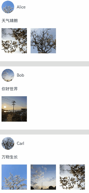
By combining geometryTransition with a modal transition API, you can implement a shared element transition between two elements on different pages. The following example implements a demo where clicking a profile picture displays the corresponding profile page.
class PostData {
  avatar: Resource = $r('app.media.flower');
  name: string = '';
  message: string = '';
  images: Resource[] = [];
}

@Entry
@Component
struct Index {
  @State isPersonalPageShow: boolean = false;
  @State selectedIndex: number = 0;
  @State alphaValue: number = 1;

  private allPostData: PostData[] = [
    { avatar: $r('app.media.flower'), name: 'Alice', message: 'It's sunny.',
      images: [$r('app.media.spring'), $r('app.media.tree')] },
    { avatar: $r('app.media.sky'), name: 'Bob', message: 'Hello World',
      images: [$r('app.media.island')] },
    { avatar: $r('app.media.tree'), name: 'Carl', message: 'Everything grows.',
      images: [$r('app.media.flower'), $r('app.media.sky'), $r('app.media.spring')] }];

  private onAvatarClicked(index: number): void {
    this.selectedIndex = index;
    animateTo({
      duration: 350,
      curve: Curve.Friction
    }, () => {
      this.isPersonalPageShow = !this.isPersonalPageShow;
      this.alphaValue = 0;
    });
  }

  private onPersonalPageBack(index: number): void {
    animateTo({
      duration: 350,
      curve: Curve.Friction
    }, () => {
      this.isPersonalPageShow = !this.isPersonalPageShow;
      this.alphaValue = 1;
    });
  }

  @Builder
  PersonalPageBuilder(index: number) {
    Column({ space: 20 }) {
      Image(this.allPostData[index].avatar)
        .size({ width: 200, height: 200 })
        .borderRadius(100)
        // Apply a shared element transition to the profile picture by its ID.
        .geometryTransition(index.toString())
        .clip(true)
        .transition(TransitionEffect.opacity(0.99))

      Text(this.allPostData[index].name)
        .font({ size: 30, weight: 600 })
        // Apply a transition effect to the text.
        .transition(TransitionEffect.asymmetric(
          TransitionEffect.OPACITY
            .combine(TransitionEffect.translate({ y: 100 })),
          TransitionEffect.OPACITY.animation({ duration: 0 })
        ))

      Text('Hello, this is' + this.allPostData[index].name)
        // Apply a transition effect to the text.
        .transition(TransitionEffect.asymmetric(
          TransitionEffect.OPACITY
            .combine(TransitionEffect.translate({ y: 100 })),
          TransitionEffect.OPACITY.animation({ duration: 0 })
        ))
    }
    .padding({ top: 20 })
    .size({ width: 360, height: 780 })
    .backgroundColor(Color.White)
    .onClick(() => {
      this.onPersonalPageBack(index);
    })
    .transition(TransitionEffect.asymmetric(
      TransitionEffect.opacity(0.99),
      TransitionEffect.OPACITY
    ))
  }

  build() {
    Column({ space: 20 }) {
      ForEach(this.allPostData, (postData: PostData, index: number) => {
        Column() {
          Post({ data: postData, index: index, onAvatarClicked: (index: number) => { this.onAvatarClicked(index) } })
        }
        .width('100%')
      }, (postData: PostData, index: number) => index.toString())
    }
    .size({ width: '100%', height: '100%' })
    .backgroundColor('#40808080')
    .bindContentCover(this.isPersonalPageShow,
      this.PersonalPageBuilder(this.selectedIndex), { modalTransition: ModalTransition.NONE })
    .opacity(this.alphaValue)
  }
}

@Component
export default struct  Post {
  @Prop data: PostData;
  @Prop index: number;

  @State expandImageSize: number = 100;
  @State avatarSize: number = 50;

  private onAvatarClicked: (index: number) => void = (index: number) => { };

  build() {
    Column({ space: 20 }) {
      Row({ space: 10 }) {
        Image(this.data.avatar)
          .size({ width: this.avatarSize, height: this.avatarSize })
          .borderRadius(this.avatarSize / 2)
          .clip(true)
          .onClick(() => {
            this.onAvatarClicked(this.index);
          })
          // ID of the shared element transition bound to the profile picture.
          .geometryTransition(this.index.toString(), {follow:true})
          .transition(TransitionEffect.OPACITY.animation({ duration: 350, curve: Curve.Friction }))

        Text(this.data.name)
      }
      .justifyContent(FlexAlign.Start)

      Text(this.data.message)

      Row({ space: 15 }) {
        ForEach(this.data.images, (imageResource: Resource, index: number) => {
          Image(imageResource)
            .size({ width: 100, height: 100 })
        }, (imageResource: Resource, index: number) => index.toString())
      }
    }
    .backgroundColor(Color.White)
    .size({ width: '100%', height: 250 })
    .alignItems(HorizontalAlign.Start)
    .padding({ left: 10, top: 10 })
  }
}
After a profile picture on the home page is clicked, the corresponding profile page is displayed in a modal, and there is a shared element transition between the profile pictures on the two pages.
Combining transition with a Property Animation
In addition to geometryTransition, you can also implement a shared element transition by combining transition with a property animation。
This example implements a shared element transition for the scenario where, as a component is expanded, sibling components in the same container disappear or appear. Specifically, property animations are applied to width and height changes of a component before and after the expansion; enter/exit animations are applied to the sibling components as they disappear or disappear. The basic procedure is as follows:
-
Build the component to be expanded, and build two pages for it through state variables: one for the normal state and one for the expanded state.
class Tmp{ set(item:CradData):CradData{ return item } } // Build two pages for the normal and expanded states of the same component, which are then used based on the declared state variables. @Component export struct MyExtendView { // Declare the isExpand variable to be synced with the parent component. @Link isExpand: boolean; @State cardList: Array<CardData> = xxxx; build() { List() { // Customize the expanded component as required. if (this.isExpand) { Text('expand') .transition(TransitionEffect.translate({y:300}).animation({ curve: curves.springMotion(0.6, 0.8) })) } ForEach(this.cardList, (item: CradData) => { let Item:Tmp = new Tmp() let Imp:Tmp = Item.set(item) let Mc:Record<string,Tmp> = {'cardData':Imp} MyCard(Mc) // Encapsulated widget, which needs to be implemented by yourself. }) } .width(this.isExpand? 200:500) // Define the attributes of the expanded component as required. .animation({ curve: curves.springMotion()}) // Bind an animation to component attributes. } } ... -
Expand the component to be expanded. Use state variables to control the disappearance or appearance of sibling components, and apply the enter/exit transition to the disappearance and appearance.
class Tmp{
  isExpand: boolean = false;
  set(){
    this.isExpand = !this.isExpand;
  }
}
let Exp:Record<string,boolean> = {'isExpand': false}
  @State isExpand: boolean = false

  ...
  List() {
    // Control the appearance or disappearance of sibling components through the isExpand variable, and configure the enter/exit transition.
    if (!this.isExpand) {
      Text ('Collapse')
        .transition(TransitionEffect.translate({y:300}).animation({ curve: curves.springMotion(0.6, 0.9) }))
    }

    MyExtendView(Exp)
      .onClick(() => {
        let Epd:Tmp = new Tmp()
        Epd.set()
      })

    // Control the appearance or disappearance of sibling components through the isExpand variable, and configure the enter/exit transition.
    if (this.isExpand) {
      Text ('Expand')
        .transition(TransitionEffect.translate({y:300}).animation({ curve: curves.springMotion() }))
    }
  }
...
Below is the complete sample code and effect.
class PostData {
  avatar: Resource = $r('app.media.flower');
  name: string = '';
  message: string = '';
  images: Resource[] = [];
}

@Entry
@Component
struct Index {
  @State isExpand: boolean = false;
  @State @Watch('onItemClicked') selectedIndex: number = -1;

  private allPostData: PostData[] = [
    { avatar: $r('app.media.flower'), name: 'Alice', message: 'It's sunny.',
      images: [$r('app.media.spring'), $r('app.media.tree')] },
    { avatar: $r('app.media.sky'), name: 'Bob', message: 'Hello World',
      images: [$r('app.media.island')] },
    { avatar: $r('app.media.tree'), name: 'Carl', message: 'Everything grows.',
      images: [$r('app.media.flower'), $r('app.media.sky'), $r('app.media.spring')] }];

  private onItemClicked(): void {
    if (this.selectedIndex < 0) {
      return;
    }
    animateTo({
      duration: 350,
      curve: Curve.Friction
    }, () => {
      this.isExpand = !this.isExpand;
    });
  }

  build() {
    Column({ space: 20 }) {
      ForEach(this.allPostData, (postData: PostData, index: number) => {
        // When a post is clicked, other posts disappear from the tree.
        if (!this.isExpand || this.selectedIndex === index) {
          Column() {
            Post({ data: postData, selecteIndex: this.selectedIndex, index: index })
          }
          .width('100%')
          // Apply opacity and translate transition effects to the disappearing posts.
          .transition(TransitionEffect.OPACITY
            .combine(TransitionEffect.translate({ y: index < this.selectedIndex ? -250 : 250 }))
            .animation({ duration: 350, curve: Curve.Friction}))
        }
      }, (postData: PostData, index: number) => index.toString())
    }
    .size({ width: '100%', height: '100%' })
    .backgroundColor('#40808080')
  }
}

@Component
export default struct  Post {
  @Link selecteIndex: number;

  @Prop data: PostData;
  @Prop index: number;

  @State itemHeight: number = 250;
  @State isExpand: boolean = false;
  @State expandImageSize: number = 100;
  @State avatarSize: number = 50;

  build() {
    Column({ space: 20 }) {
      Row({ space: 10 }) {
        Image(this.data.avatar)
          .size({ width: this.avatarSize, height: this.avatarSize })
          .borderRadius(this.avatarSize / 2)
          .clip(true)

        Text(this.data.name)
      }
      .justifyContent(FlexAlign.Start)

      Text(this.data.message)

      Row({ space: 15 }) {
        ForEach(this.data.images, (imageResource: Resource, index: number) => {
          Image(imageResource)
            .size({ width: this.expandImageSize, height: this.expandImageSize })
        }, (imageResource: Resource, index: number) => index.toString())
      }

      if (this.isExpand) {
        Column() {
          Text('Comments')
            // Apply enter/exit transition effects to the text in the comments area.
            .transition( TransitionEffect.OPACITY
              .animation({ duration: 350, curve: Curve.Friction }))
            .padding({ top: 10 })
        }
        .transition(TransitionEffect.asymmetric(
          TransitionEffect.opacity(0.99)
            .animation({ duration: 350, curve: Curve.Friction }),
          TransitionEffect.OPACITY.animation({ duration: 0 })
        ))
        .size({ width: '100%'})
      }
    }
    .backgroundColor(Color.White)
    .size({ width: '100%', height: this.itemHeight })
    .alignItems(HorizontalAlign.Start)
    .padding({ left: 10, top: 10 })
    .onClick(() => {
      this.selecteIndex = -1;
      this.selecteIndex = this.index;
      animateTo({
        duration: 350,
        curve: Curve.Friction
      }, () => {
        // Animate the width and height of the expanded post, and apply animations to the profile picture and image sizes.
        this.isExpand = !this.isExpand;
        this.itemHeight = this.isExpand ? 780 : 250;
        this.avatarSize = this.isExpand ? 75: 50;
        this.expandImageSize = (this.isExpand && this.data.images.length > 0)
          ? (360 - (this.data.images.length + 1) * 15) / this.data.images.length : 100;
      })
    })
  }
}
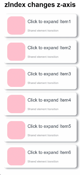
Combining transition and zIndex
This example implements a shared element transition for the scenario where, as a component is expanded, it is displayed on the top of the container while sibling components in the same container stay. This is achieved with the use of zIndex. Specifically:
-
Build two pages for the normal and expanded states of the same component, which are then used based on the declared state variables.
-
Change the display level of components through the zIndex attribute. Set this attribute to 1 for the component in the expanded state and retain the default value 0 for other sibling components. In this way, the component in the expanded state will be displayed over the sibling components.
-
With the translate attribute, move the component to the top of the parent container when it is expanded.
-
Use a placeholder container so that the location of the sibling components remains unchanged. The outer container is placed as a placeholder, and the internal container changes the size.
Below is the complete sample code and effect.
// utils.ets
import curves from '@ohos.curves';

// Build two pages for the normal and expanded states of the same component, which are then used based on the declared state variables.
@Component
export struct share_zIndex_expand {
  // Declare the isExpand variable to be synced with the parent component.
  @State isExpand: boolean = false;
  @State curIndex: number = 0;
  @State listArray: Array<number> = [1, 2, 3, 4, 5, 6];
  private parentScroller: Scroller = new Scroller(); // Upper-layer scroller

  build() {
    Column() {
      List() {
        ForEach(this.listArray, (item:number, index?:number|undefined) => {
          // Customize the expanded component as required.
          if (!this.isExpand || this.curIndex == index) {
            ListItem() {
              Column() {
                Row() {
                  Row()
                    .backgroundColor(Color.Pink)
                    .borderRadius(20)
                    .width(80)
                    .height(80)

                  Column() {
                    Text ('Click to expand Item' + item)
                      .fontSize(20)
                    Text ('Shared element transition')
                      .fontSize(12)
                      .fontColor(0x909399)
                  }
                  .alignItems(HorizontalAlign.Start)
                  .justifyContent(FlexAlign.SpaceAround)
                  .margin({ left: 10 })
                  .height(80)
                }
                .width('90%')
                .height(100)

                if (this.isExpand && this.curIndex == index) {
                  Row() {
                    Text('Expanded state')
                      .fontSize(28)
                      .fontColor(0x909399)
                      .textAlign(TextAlign.Center)
                      .transition(TransitionEffect.OPACITY.animation({ curve: curves.springMotion(0.6, 0.9) }))
                  }
                  .width('90%')
                  .justifyContent(FlexAlign.Center)
                }
              }
              .width('90%')
              .height(this.isExpand && this.curIndex == index ? 750 : 100)
              .alignItems(HorizontalAlign.Center)
              .borderRadius(10)
              .margin({ top: 15 })
              .backgroundColor(Color.White)
              .shadow({ radius: 20, color: 0x909399, offsetX: 20, offsetY: 10 })
            }
            .onClick(() => {
              // Define the animation parameters for expanding and collapsing.
              animateTo({ curve: curves.springMotion(0.6, 0.9) }, () => {
                if(index != undefined){
                  this.curIndex = index;
                }
                this.isExpand = !this.isExpand;
              })
            })
            .zIndex(this.curIndex == index? 1: 0) // When the current list item is selected, its zIndex attribute is set to 1, and it is displayed over other sibling components whose zIndex is 0.
            .translate({ // Move the list item to the top of the parent container through translate.
                y: this.isExpand && this.curIndex == index ? -60 - this.parentScroller.currentOffset()['yOffset'] : 0
            })
          }
        })
      }
      .clip(false)
      .height('100%') // Fixed size of the placeholder container.
      .alignListItem(ListItemAlign.Center)
    }
    .zIndex(1)
    .width('100%')
    .height('100%')
    .justifyContent(FlexAlign.Start)
  }
}
// Index.ets
import { share_zIndex_expand } from './utils'
@Entry
@Component
struct ShareZIndexDemo {
  @State isExpand: boolean = false;
  @State curIndex: number = 0;
  private scroller: Scroller = new Scroller();
  @State Sze:Record<string,boolean|number|Scroller> = { 'isExpand': this.isExpand, 'curIndex': this.curIndex, 'parentScroller': this.scroller }

  build() {
    Scroll(this.scroller) {
      Column() {
        Text ('zIndex changes z-axis')
          .fontWeight(FontWeight.Bold)
          .fontSize(30)
          .fontColor(Color.Black)
          .zIndex(0)
          .margin(10)

        share_zIndex_expand(this.Sze)
      }
      .width('100%')
      .height('100%')
      .justifyContent(FlexAlign.Start)
    }
  }
}
Using the Property Animation
The property animation can also be used to implement a shared element transition. This example shows how to apply a shared element transition between component A and component B with the property animation. The procedure is as follows:
-
- Obtain the location of component A and place component C that has the same content as component A in that location.
-
- Obtain the location of component B, and add a property animation to component C from location A to location B.
-
- At the end of the animation or at any other time as appropriate, hide component C and display component B to achieve the shared element transition.
Compared with other implementation modes, this mode allows for more flexibility and custom component behavior during the process. Below is the sample code and effect.
import curves from '@ohos.curves';

class RectJson {
  $rect: Array<number> = []
}

class RectInfo {
  left: number = 0;
  top: number = 0;
  right: number = 0;
  bottom: number = 0;
}

const LARGE_IMAGE_SIZE = 240;
const SMALL_IMAGE_SIZE = 40;
const LARGE_IMAGE_RADIUS = 30;
const SMALL_IMAGE_RADIUS = 15;

@Entry
@Component
struct Index {
  @State showImage: Resource = $r('app.media.flower');
  @State isTempImageShow: boolean = false;
  @State clickedImage: Resource = $r('app.media.flower');
  @State translateX: number = 0;
  @State translateY: number = 0;
  @State positionX: number = 0;
  @State positionY: number = 0;
  @State showImageAlphaValue: number = 1;
  @State tempImageSize: number = SMALL_IMAGE_SIZE;
  @State imageList: Resource[] = [$r('app.media.island'), $r('app.media.sky'),
    $r('app.media.spring'), $r('app.media.tree')];
  @State radius: number = SMALL_IMAGE_RADIUS;
  // Control whether the four images in the lower part respond to clicks.
  @State isEnabled: boolean = true;

  private calculatedTranslateX: number = 0;
  private calculatedTranslateY: number = 0;
  private animationCount: number = 0;
  private formerImageSource: Resource = $r('app.media.flower');

  private calculateData(key: string): void {
    // Obtain the locations of the two components that require page switching and of their common parent node.
    let clickedImageInfo = this.getRectInfoById(key);
    let showImageInfo = this.getRectInfoById('showImage');
    let rootStackInfo = this.getRectInfoById('rootStack');
    this.positionX = px2vp(clickedImageInfo.left - rootStackInfo.left);
    this.positionY = px2vp(clickedImageInfo.top - rootStackInfo.top);
    this.calculatedTranslateX = px2vp(showImageInfo.left - clickedImageInfo.left);
    this.calculatedTranslateY = px2vp(showImageInfo.top - clickedImageInfo.top);
  }

  // Obtain the component location based on the component key.
  private getRectInfoById(key: string): RectInfo {
    try {
      let strJson: string = getInspectorByKey(key);
      let rect: RectJson = JSON.parse(strJson);
      let rectInfo: Array<object> = JSON.parse('[' + rect.$rect + ']');
      let rect_left: number = Number(JSON.parse('[' + rectInfo[0] + ']')[0]);
      let rect_top: number = Number(JSON.parse('[' + rectInfo[0] + ']')[1]);
      let rect_right: number = Number(JSON.parse('[' + rectInfo[1] + ']')[0]);
      let rect_bottom: number = Number(JSON.parse('[' + rectInfo[1] + ']')[1]);
      return { left: rect_left, top: rect_top, right: rect_right, bottom: rect_bottom };
    } catch (err) {
      console.log(`getPositionById error ${err}`);
    }
    return { left: 0, top: 0, right: 0, bottom: 0 };
  }

  private onTouchDown(index: number): void {
    this.radius = SMALL_IMAGE_RADIUS;
    this.clickedImage = this.imageList[index];
    this.calculateData(index.toString());
    this.isTempImageShow = true;
    this.formerImageSource = this.imageList[index];
  }

  private onTouchUp(index: number): void {
    this.imageList[index] = this.showImage;
    this.animationCount++;
    this.doOneShotAnimation();
    this.isEnabled = false;
  }

  private doOneShotAnimation(): void {
    animateTo({
      curve: curves.springMotion(),
      onFinish: () => {
        if (this.animationCount === 1) {
          this.onAnimationFinish();
        }
      }
    }, () => {
      this.tempImageSize = LARGE_IMAGE_SIZE;
      this.translateX = this.calculatedTranslateX;
      this.translateY = this.calculatedTranslateY;
      this.showImageAlphaValue = 0;
      this.radius = LARGE_IMAGE_RADIUS;
    });
  }

  private onAnimationFinish(): void {
    this.showImage = this.formerImageSource;
    this.showImageAlphaValue = 1.0;
    this.isTempImageShow = false;
    this.translateX = 0;
    this.translateY = 0;
    this.positionX = 0;
    this.positionY = 0;
    this.tempImageSize = SMALL_IMAGE_SIZE;
    this.animationCount--;
    this.isEnabled = true;
  }

  build() {
    Stack() {
      Column() {
        Column({ space: 40 }) {
          Image(this.showImage)
            .size({ width: 240, height: 240 })
            .syncLoad(true)
            .opacity(this.showImageAlphaValue)
            .key('showImage')
            .borderRadius(30)

          Row() {
            Image($r('app.media.back'))
              .size({ width: 20, height: 20 })

            Image($r('app.media.play'))
              .size({ width: 20, height: 20 })

            Image($r('app.media.forward'))
              .size({ width: 20, height: 20 })
          }
          .justifyContent(FlexAlign.SpaceEvenly)
          .width(240)
        }
        .margin({ top: 20 })
        .padding({ top: 20 })
        .clip(true)
        .borderRadius(30)
        .backgroundColor('#40808080')
        .size({ width: 320, height: 360 })

        Column({ space: 20 }) {
          ForEach(this.imageList, (imageResource: Resource, index: number) => {
            Row({ space: 20 }) {
              Image(imageResource)
                .size({ width: SMALL_IMAGE_SIZE, height: SMALL_IMAGE_SIZE })
                // Add the .key API to all components involved in page switching to set their keys (used to obtain component location).
                .key(index.toString())
                .margin({ left: 10 })
                .borderRadius(15)

              Text('Album' + (index + 1))
                .size({ width: 200 })
            }
            .size({ width: '90%', height: 60 })
            .borderRadius(20)
            .backgroundColor('#40808080')
            .enabled(this.isEnabled)
            .onTouch((event: TouchEvent) => {
              if (event.type === TouchType.Down) {
                this.onTouchDown(index);
              } else if (event.type === TouchType.Up) {
                this.onTouchUp(index);
              }
            })
          })
        }
        .width('100%')
        .justifyContent(FlexAlign.Center)
        .margin({ top: 40 })
      }
      .size({ width: '100%', height: '100%' })

      //T emporary image used to make the shared element transition
      if (this.isTempImageShow) {
        Image(this.clickedImage)
          .size({ width: this.tempImageSize, height: this.tempImageSize })
          .translate({ x: this.translateX, y: this.translateY })
          .position({ x: this.positionX, y: this.positionY })
          .borderRadius(this.radius)
      }
    }
    .size({ width: '100%', height: '100%' })
    .key('rootStack')
  }
}