ContainerSpan
As a child of the <Text> component, the <ContainerSpan> component is used to manage the background colors and rounded corners of multiple <Span> and <ImageSpan> components in a unified manner.
NOTE
This component is supported since API version 11. Updates will be marked with a superscript to indicate their earliest API version.
Child Components
This component can contain the <Span> and <ImageSpan> child components.
APIs
ContainerSpan()
Attributes
Only the TextBackgroundStyle attribute is supported.
| Name | Type | Description |
|---|---|---|
| textBackgroundStyle | TextBackgroundStyle | Text background style. Default value: { color: Color.Transparent, radius: 0 } NOTE If this attribute is not separately set for a child component, the child component inherits the settings from the component. |
TextBackgroundStyle
| Name | Type | Mandatory | Description |
|---|---|---|---|
| color | ResourceColor | No | Text background color. |
| radius | Dimension | BorderRadiuses | No | Rounded corner radius of the text background. |
Events
The universal events are not supported.
Example
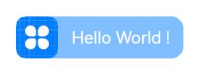
Example 1
// xxx.ets
@Component
@Entry
struct Index {
  build() {
    Column() {
      Text() {
        ContainerSpan() {
          ImageSpan($r('app.media.app_icon'))
            .width('40vp')
            .height('40vp')
            .verticalAlign(ImageSpanAlignment.CENTER)
          Span('   Hello World !   ').fontSize('16fp').fontColor(Color.White)
        }.textBackgroundStyle({color: "#7F007DFF", radius: "12vp"})
      }
    }.width('100%').alignItems(HorizontalAlign.Center)
  }
}