Background
You can set the background for a component.
NOTE
The APIs of this module are supported since API version 7. Updates will be marked with a superscript to indicate their earliest API version.
background10+
background(builder: CustomBuilder, options?: { align?: Alignment })
Sets the background color of the component.
System capability: SystemCapability.ArkUI.ArkUI.Full
Parameters
| Name | Type | Mandatory | Description |
|---|---|---|---|
| builder | CustomBuilder | Yes | Custom background. |
| options | {align?:Alignment} | No | Alignment mode between the custom background and the component. If background, backgroundColor, and backgroundImage are set at the same time, they will all take effect, with background at the top layer. |
NOTE
The custom background takes some time to render, during which it cannot respond to events, or be dynamically updated. This attribute cannot be nested or be previewed in the previewer.
backgroundColor
backgroundColor(value: ResourceColor)
Sets the background color of the component.
Widget capability: Since API version 9, this API is supported in ArkTS widgets.
System capability: SystemCapability.ArkUI.ArkUI.Full
Parameters
| Name | Type | Mandatory | Description |
|---|---|---|---|
| value | ResourceColor | Yes | Background color of the component. |
backgroundImage
backgroundImage(src: ResourceStr, repeat?: ImageRepeat)
Sets the background image of the component.
Widget capability: Since API version 9, this API is supported in ArkTS widgets.
System capability: SystemCapability.ArkUI.ArkUI.Full
Parameters
| Name | Type | Mandatory | Description |
|---|---|---|---|
| src | ResourceStr | Yes | Image address, which can be the address of an online, a local, or a Base64 encoded image. SVG images are not supported. |
| repeat | ImageRepeat | No | Whether the background image is repeated. By default, the background image is not repeated. If the set image has a transparent background and backgroundColor is set, the image is overlaid on the background color. |
backgroundImageSize
backgroundImageSize(value: SizeOptions | ImageSize)
Sets the width and height of the component background image.
Widget capability: Since API version 9, this API is supported in ArkTS widgets.
System capability: SystemCapability.ArkUI.ArkUI.Full
Parameters
| Name | Type | Mandatory | Description |
|---|---|---|---|
| value | SizeOptions | ImageSize | Yes | Width and height of the background image. If the input is a {width: Length, height: Length} object and only one attribute is set, the other attribute is the set value multiplied by the original aspect ratio of the image. By default, the original image aspect ratio remains unchanged. The value range of width and height is [0, +∞). Default value: ImageSize.Auto Since API version 9, this API is supported in ArkTS widgets. NOTE A value less than 0 evaluates to the value 0. If height is set but width is not, the image width is adjusted based on the original aspect ratio of the image. |
backgroundImagePosition
backgroundImagePosition(value: Position | Alignment)
Sets the position of the component background image.
Widget capability: Since API version 9, this API is supported in ArkTS widgets.
System capability: SystemCapability.ArkUI.ArkUI.Full
Parameters
| Name | Type | Mandatory | Description |
|---|---|---|---|
| value | Position | Alignment | Yes | Position of the background image in the component, that is, the coordinates relative to the upper left corner of the component. Default value: { x: 0, y: 0 } When x and y are set in percentage, the offset is calculated based on the width and height of the component. Since API version 9, this API is supported in ArkTS widgets. |
backgroundBlurStyle9+
backgroundBlurStyle(value: BlurStyle, options?: BackgroundBlurStyleOptions)
Sets the background blur style applied between the content and the background.
Widget capability: Since API version 9, this API is supported in ArkTS widgets.
System capability: SystemCapability.ArkUI.ArkUI.Full
Parameters
| Name | Type | Mandatory | Description |
|---|---|---|---|
| value | BlurStyle | Yes | Settings of the background blur style, including the blur radius, mask color, mask opacity, saturation, and brightness. |
| options10+ | BackgroundBlurStyleOptions | No | Background blur options. |
backgroundEffect11+
backgroundEffect(options: BackgroundEffectOptions)
Sets the background effect of the component.
System capability: SystemCapability.ArkUI.ArkUI.Full
Parameters
| Name | Type | Mandatory | Description |
|---|---|---|---|
| options | BackgroundEffectOptions | No | Background effect, including saturation, brightness, and color. |
BackgroundBlurStyleOptions10+
Inherited from BlurStyleOptions.
Example
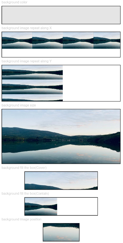
Example 1
// xxx.ets
@Entry
@Component
struct BackgroundExample {

  build() {
    Column({ space: 5 }) {
      Text('background color').fontSize(9).width('90%').fontColor(0xCCCCCC)
      Row().width('90%').height(50).backgroundColor(0xE5E5E5).border({ width: 1 })

      Text('background image repeat along X').fontSize(9).width('90%').fontColor(0xCCCCCC)
      Row()
        .backgroundImage('/comment/bg.jpg', ImageRepeat.X)
        .backgroundImageSize({ width: '250px', height: '140px' })
        .width('90%')
        .height(70)
        .border({ width: 1 })

      Text('background image repeat along Y').fontSize(9).width('90%').fontColor(0xCCCCCC)
      Row()
        .backgroundImage('/comment/bg.jpg', ImageRepeat.Y)
        .backgroundImageSize({ width: '500px', height: '120px' })
        .width('90%')
        .height(100)
        .border({ width: 1 })

      Text('background image size').fontSize(9).width('90%').fontColor(0xCCCCCC)
      Row()
        .width('90%').height(150)
        .backgroundImage('/comment/bg.jpg', ImageRepeat.NoRepeat)
        .backgroundImageSize({ width: 1000, height: 500 })
        .border({ width: 1 })

      Text('background fill the box(Cover)').fontSize(9).width('90%').fontColor(0xCCCCCC)
      // Occupy all the space of the container, without ensuring that the image is completely displayed.
      Row()
        .width(200)
        .height(50)
        .backgroundImage('/comment/bg.jpg', ImageRepeat.NoRepeat)
        .backgroundImageSize(ImageSize.Cover)
        .border({ width: 1 })

      Text('background fill the box(Contain)').fontSize(9).width('90%').fontColor(0xCCCCCC)
      // Maximize the image while ensuring that it can be completely displayed.
      Row()
        .width(200)
        .height(50)
        .backgroundImage('/comment/bg.jpg', ImageRepeat.NoRepeat)
        .backgroundImageSize(ImageSize.Contain)
        .border({ width: 1 })

      Text('background image position').fontSize(9).width('90%').fontColor(0xCCCCCC)
      Row()
        .width(100)
        .height(50)
        .backgroundImage('/comment/bg.jpg', ImageRepeat.NoRepeat)
        .backgroundImageSize({ width: 1000, height: 560 })
        .backgroundImagePosition({ x: -500, y: -300 })
        .border({ width: 1 })
    }
    .width('100%').height('100%').padding({ top: 5 })
  }
}
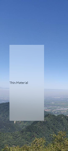
Example 2
// xxx.ets
@Entry
@Component
struct BackgroundBlurStyleDemo {
  build() {
    Column() {
      Row() {
        Text("Thin Material")
      }
      .width('50%')
      .height('50%')
      .backgroundBlurStyle(BlurStyle.Thin, { colorMode: ThemeColorMode.LIGHT, adaptiveColor: AdaptiveColor.DEFAULT, scale: 1.0 })
      .position({ x: '15%', y: '30%' })
    }
    .height('100%')
    .width('100%')
    .backgroundImage($r('app.media.bg'))
    .backgroundImageSize(ImageSize.Cover)
  }
}
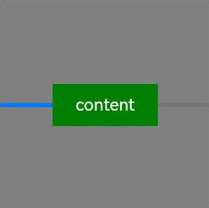
Example 3
// xxx.ets
@Entry
@Component
struct BackgroundExample {
  @Builder renderBackground() {
    Column() {
      Progress({value : 50})
    }
  }

  build() {
    Column() {
      Text("content")
        .width(100)
        .height(40)
        .fontColor("#FFF")
        .position({x:50, y:80})
        .textAlign(TextAlign.Center)
        .backgroundColor(Color.Green)
    }
    .width(200).height(200)
    .background(this.renderBackground)
    .backgroundColor(Color.Gray)
  }
}
Example 4
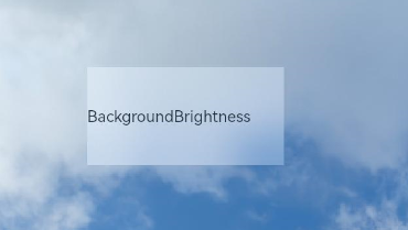
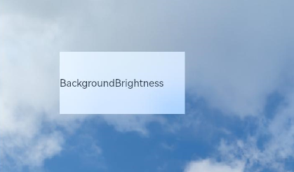
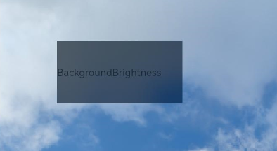
Example of setting the background brightness for the component:
// xxx.ets
@Entry
@Component
struct BackgroundBrightnessDemo {
  build() {
    Column() {
      Row() {
        Text("BackgroundBrightness")
      }
      .width(200)
      .height(100)
      .position({ x: 100, y: 100 })
      .backgroundBlurStyle(BlurStyle.Thin, { colorMode: ThemeColorMode.LIGHT, adaptiveColor: AdaptiveColor.DEFAULT})
      .backgroundBrightness({rate:0.5,lightUpDegree:0.5}) // Background brightness
    }
    .width('100%')
    .height('100%')
    .backgroundImage($r('app.media.image'))
    .backgroundImageSize(ImageSize.Cover)
  }
}
The following figures show how the component looks with the background brightness set.
When rate and lightUpDegree are both set to 0.5
When rate is set to 0.5 and lightUpDegree -0.1
The following figure shows how the component looks without the background brightness set.