TextClock
The <TextClock> component displays the current system time in text format for different time zones. The time is accurate to seconds.
NOTE
This component is supported since API version 8. Updates will be marked with a superscript to indicate their earliest API version.
Child Components
Not supported
APIs
TextClock(options?: { timeZoneOffset?: number, controller?: TextClockController })
Since API version 11, this API is supported in ArkTS widgets.
Parameters
| Name | Type | Mandatory | Description |
|---|---|---|---|
| timeZoneOffset | number | No | Time zone offset. The value range is [-14, 12], indicating UTC+12 to UTC-12. A negative value indicates Eastern Standard Time, and a positive value indicates Western Standard Time. For example, -8 indicates UTC+8. For countries or regions crossing the International Date Line, use -13 (UTC+13) and -14 (UTC+14) to ensure consistent time within the entire country or region. If the set value is not within the valid range, the time zone offset of the current system will be used. Default value: time zone offset of the current system |
| controller | TextClockController | No | Controller to control the status of the <TextClock> component. |
Attributes
In addition to the universal attributes, the following attributes are supported.
| Name | Type | Description |
|---|---|---|
| format | string | Time format. y: year (yyyy indicates the complete year, and yy indicates the last two digits of the year.) M: month (To display 01 for January, use MM instead.) d: day (To display 01 for the first day, use dd instead.) E: day of week (To display the full name, use EEEE; to display the abbreviation, use E, EE, or EEE.) H: hour (24-hour format) h: hour (12-hour format) m: minute s: second SS: centisecond (If the number of the uppercase letter S is less than 3, the part is processed as centiseconds.) SSS: millisecond (If the number of the uppercase letter S is greater than or equal to 3, the part is processed as milliseconds.) a: morning/afternoon (This parameter does not take effect when the hour part is set to H.) Separators: slashes (/), hyphens (-), dots (.), or any custom characters (which cannot be letters) used to separate the parts of the date The parts of the date can be used alone or combined with each other as needed. The time can be updated as frequent as once per second. As such, whenever possible, avoid setting the centisecond and millisecond parts separately. When an invalid letter is set, the letter is ignored. If the value contains only invalid letters, the time will be displayed in the format of yyyy/MM/dd aa hh:mm:ss.SSS. If format is left empty or set to undefined, the default value will be used. - Default value for non-widgets: aa hh:mm:ss - Default value for widgets: hh:mm - When used in a widget, the minimum time unit is minute. In this case, if the format contains seconds or centiseconds, the default value will be used. Since API version 11, this API is supported in ArkTS widgets. |
| textShadow11+ | ShadowOptions | Array<ShadowOptions> | Text shadow. It supports input parameters in an array to implement multiple text shadows. NOTE This API does not work with the fill attribute or coloring strategy. Since API version 11, this API is supported in ArkTS widgets. |
| fontFeature11+ | string | Font feature, for example, monospaced digits. Format: normal | <feature-tag-value> - The format of <feature-tag-value> is <string> [ <integer>| on | off ] - There can be multiple <feature-tag-value> values, which are separated by commas (,). For example, the input format of the monospaced clock numbers is "ss01" on. Since API version 11, this API is supported in ArkTS widgets. |
The following table shows how different settings of format work out.
| Input Format | Display Effect |
|---|---|
| EEEE, M, d, yyyy | Saturday, February 4, 2023 |
| MMM d, yyyy | February 4, 2023 |
| EEEE, M, d | Saturday, February 4 |
| MMM dd | February 4 |
| MM/dd/yyyy | 02/04/2023 |
| EEEE MM dd | Saturday February 04 |
| yyyy | 2023 |
| yy | 23 |
| MM | February |
| M | February |
| dd (complete date) | 04 |
| d | 4 |
| EEEE (full name) | Saturday |
| E, EE, EEE (abbreviation) | Sat |
| MMM d, yyyy | February 4, 2023 |
| yyyy/M/d | 2023/2/4 |
| yyyy-M-d | 2023-2-4 |
| yyyy.M.d | 2023.2.4 |
| HH:mm:ss | 17:00:04 |
| aa hh:mm:ss | 5:00:04 AM |
| hh:mm:ss | 5:00:04 |
| HH:mm | 17:00 |
| aa hh:mm | 5:00 AM |
| hh:mm | 5:00 |
| mm:ss | 00:04 |
| mm:ss.SS | 00:04.91 |
| mm:ss.SSS | 00:04.536 |
| hh:mm:ss aa | 5:00:04 AM |
| HH | 17 |
Events
In addition to the universal events, the following events are supported.
| Name | Description |
|---|---|
| onDateChange(event: (value: number) => void) | Triggered when the time changes. - value: Unix time stamp, which is the number of seconds that have elapsed since the Unix epoch. - This event is not triggered when the component is invisible. - If the event is not used in a widget, it is triggered when the change occurs in seconds. - If the event is used in a widget, it is triggered when the change occurs in minutes. Since API version 11, this API is supported in ArkTS widgets. |
TextClockController
Implements the controller of the <TextClock> component. You can bind the controller to the component to control its start and stop. A <TextClock> component can be bound to only one controller.
Since API version 11, this API is supported in ArkTS widgets.
Objects to Import
controller: TextClockController = new TextClockController();
start
start()
Starts the <TextClock> component.
Since API version 11, this API is supported in ArkTS widgets.
stop
stop()
Stops the <TextClock> component.
Since API version 11, this API is supported in ArkTS widgets.
Example
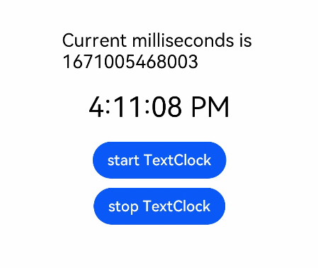
Example 1
@Entry
@Component
struct Second {
  @State accumulateTime: number = 0
  // Objects to import
  controller: TextClockController = new TextClockController()
  build() {
    Flex({ direction: FlexDirection.Column, alignItems: ItemAlign.Center, justifyContent: FlexAlign.Center }) {
      Text('Current milliseconds is ' + this.accumulateTime)
        .fontSize(20)
      // Display the system time in 12-hour format for the UTC+8 time zone, accurate to seconds.
      TextClock({ timeZoneOffset: -8, controller: this.controller })
        .format('aa hh:mm:ss')
        .onDateChange((value: number) => {
          this.accumulateTime = value
        })
        .margin(20)
        .fontSize(30)
      Button("start TextClock")
        .margin({ bottom: 10 })
        .onClick(() => {
          // Start the text clock.
          this.controller.start()
        })
      Button("stop TextClock")
        .onClick(() => {
          // Stop the text clock.
          this.controller.stop()
        })
    }
    .width('100%')
    .height('100%')
  }
}
Example 2
@Entry
@Component
struct TextClockExample {
  @State textShadows : ShadowOptions | Array<ShadowOptions> = [{ radius: 10, color: Color.Red, offsetX: 10, offsetY: 0 },{ radius: 10, color: Color.Black, offsetX: 20, offsetY: 0 },
      { radius: 10, color: Color.Brown, offsetX: 30, offsetY: 0 },{ radius: 10, color: Color.Green, offsetX: 40, offsetY: 0 },
      { radius: 10, color: Color.Yellow, offsetX: 100, offsetY: 0 }]
  build() {
    Column({ space: 8 }) {
      TextClock().fontSize(50).textShadow(this.textShadows)
    }
  }
}