Cursor Control
Cursor control attributes control how the cursor is displayed when the mouse pointer is placed over an element.
NOTE
This feature is supported since API version 11. Updates will be marked with a superscript to indicate their earliest API version.
cursorControl
setCursor
setCursor(value: PointerStyle): void
Sets the cursor style. This API is a global API.
Parameters
| Name | Type | Mandatory | Description |
|---|---|---|---|
| value | PointerStyle | All consistent | Cursor style. |
restoreDefault
restoreDefault(): void
Restores the cursor to its default style. This API is a global API.
Example
// xxx.ets
import pointer from '@ohos.multimodalInput.pointer';
@Entry
@Component
struct CursorControlExample {
@State text: string = ''
controller: TextInputController = new TextInputController()
build() {
Column() {
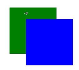
Row().height(200).width(200).backgroundColor(Color.Green).position({x: 150 ,y:70})
.onHover((flag) => {
if (flag) {
cursorControl.setCursor(pointer.PointerStyle.EAST)
} else {
cursorControl.restoreDefault()
}
})
Row().height(200).width(200).backgroundColor(Color.Blue).position({x: 220 ,y:120})
.onHover((flag) => {
if (flag) {
cursorControl.setCursor(pointer.PointerStyle.WEST)
} else {
cursorControl.restoreDefault()
}
})
}.width('100%')
}
}
Diagram:
When the mouse pointer is placed over the blue area, the west arrow cursor is displayed.
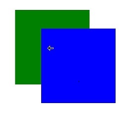
When the mouse pointer is placed over the green area, the east arrow cursor is displayed.