图像效果 (系统接口)
设置组件的模糊、阴影、球面效果以及设置图片的图像效果。
说明:
从API Version 7开始支持。后续版本如有新增内容,则采用上角标单独标记该内容的起始版本。
当前页面仅包含本模块的系统接口,其他公开接口参见图像效果。
sphericalEffect10+
sphericalEffect(value: number)
设置组件的图像球面化程度。
系统能力: SystemCapability.ArkUI.ArkUI.Full
系统接口: 此接口为系统接口
参数:
| 参数名 | 类型 | 必填 | 说明 |
|---|---|---|---|
| value | number | 是 | 设置组件的图像球面化程度。 取值范围:[0,1]。 说明: 1. 如果value等于0则图像保持原样,如果value等于1则图像为完全球面化效果。在0和1之间,数值越大,则球面化程度越高。 value < 0 或者 value > 1为异常情况,value < 0按0处理,value > 1按1处理。2. 如果组件的图像使用异步加载,则不支持球面效果。例如Image组件默认使用异步加载,如果要使用球面效果,就要设置 syncLoad为true,但是这种做法不推荐。backgroundImage也是使用异步加载,所以如果设置了backgroundImage,不支持球面效果。3. 如果组件设置了阴影,不支持球面效果。 4. 设置value大于0时,组件冻屏不更新并且把组件内容绘制到透明离屏buffer上,如果要更新组件属性则需要把value设置为0。 |
lightUpEffect10+
lightUpEffect(value: number)
设置组件图像亮起程度。
系统能力: SystemCapability.ArkUI.ArkUI.Full
系统接口: 此接口为系统接口
参数:
| 参数名 | 类型 | 必填 | 说明 |
|---|---|---|---|
| value | number | 是 | 设置组件图像亮起程度。 取值范围:[0,1]。 如果value等于0则图像为全黑,如果value等于1则图像为全亮效果。0到1之间数值越大,表示图像亮度越高。 value < 0 或者 value > 1为异常情况,value < 0按0处理,value > 1按1处理。 |
pixelStretchEffect10+
pixelStretchEffect(options: PixelStretchEffectOptions)
设置组件的图像边缘像素扩展距离。
系统能力: SystemCapability.ArkUI.ArkUI.Full
系统接口: 此接口为系统接口
参数:
| 参数名 | 类型 | 必填 | 说明 |
|---|---|---|---|
| options | PixelStretchEffectOptions | 是 | 设置组件的图像边缘像素扩展距离。 参数 options包括上下左右四个方向的边缘像素扩展距离。说明: 1. 如果距离为正值,表示向外扩展,放大原来图像大小。上下左右四个方向分别用边缘像素填充,填充的距离即为设置的边缘扩展的距离。 2. 如果距离为负值,表示内缩,但是最终图像大小不变。 内缩方式: 图像根据 options的设置缩小,缩小大小为四个方向边缘扩展距离的绝对值。图像用边缘像素扩展到原来大小。 3. 对 options的输入约束:上下左右四个方向的扩展统一为非正值或者非负值。即四个边同时向外扩或者内缩,方向一致。 所有方向的输入均为百分比或者具体值,不支持百分比和具体值混用。 所有异常情况下,显示为{0,0,0,0}效果,即跟原图保持一致。 |
示例
示例1
设置组件的图像球面效果。
// xxx.ets
@Entry
@Component
struct SphericalEffectExample {
  build() {
    Stack() {
      TextInput({ placeholder: "请输入变化范围百分比([0%,100%])"})
        .width('50%')
        .height(35)
        .type(InputType.Number)
        .enterKeyType(EnterKeyType.Done)
        .caretColor(Color.Red)
        .placeholderColor(Color.Blue)
        .placeholderFont({
          size: 20,
          style: FontStyle.Italic,
          weight: FontWeight.Bold
        })
        .sphericalEffect(0.5)
    }.alignContent(Alignment.Center).width("100%").height("100%")
  }
}
效果图如下:

去掉sphericalEffect的设置,效果如下:

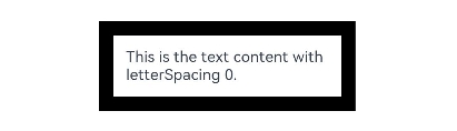
示例2
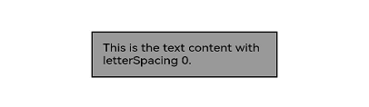
设置组件的图像渐亮效果。
// xxx.ets
@Entry
@Component
struct LightUpExample {
  build() {
    Stack() {
      Text('This is the text content with letterSpacing 0.')
        .letterSpacing(0)
        .fontSize(12)
        .border({ width: 1 })
        .padding(10)
        .width('50%')
        .lightUpEffect(0.6)
    }.alignContent(Alignment.Center).width("100%").height("100%")
  }
}
效果图如下:
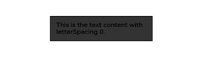
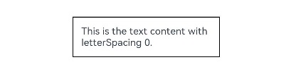
修改lightUpEffect参数值为0.2:
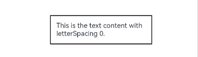
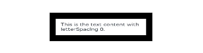
去掉lightUpEffect的设置,效果如下:
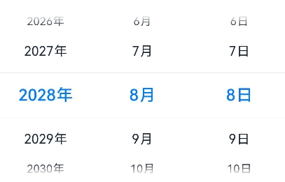
示例3
// xxx.ets
@Entry
@Component
struct LightUpExample {
  @State isLunar: boolean = false
  private selectedDate: Date = new Date('2028-08-08')
  build() {
    Stack() {
      DatePicker({
        start: new Date('1970-1-1'),
        end: new Date('2100-1-1'),
        selected: this.selectedDate
      })
        .lunar(this.isLunar)
        .onDateChange((value: Date) => {
          this.selectedDate = value
          console.info('select current date is: ' + value.toString())
        })
        .lightUpEffect(0.6)

    }.alignContent(Alignment.Center).width("100%").height("100%")
  }
}
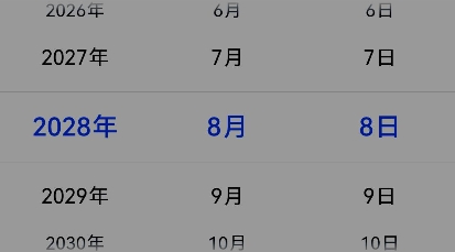
去掉lightUpEffect的设置,效果如下:
示例4
设置组件的图像边缘像素扩展效果。
// xxx.ets
@Entry
@Component
struct PixelStretchExample {
  build() {
    Stack() {
      Text('This is the text content with letterSpacing 0.')
        .letterSpacing(0)
        .fontSize(12)
        .border({ width: 1 })
        .padding(10)
        .clip(false)
        .width('50%')
        .pixelStretchEffect({top:10,left:10,right:10,bottom:10 })
    }.alignContent(Alignment.Center).width("100%").height("100%")
  }
}
效果图如下:
去掉pixelStretchEffect的设置,原图效果如下:
示例5
基于示例4,现在把边缘扩展距离改为非正值。
// xxx.ets
@Entry
@Component
struct PixelStretchExample {
  build() {
    Stack() {
      Text('This is the text content with letterSpacing 0.')
        .letterSpacing(0)
        .fontSize(12)
        .border({ width: 1 })
        .padding(10)
        .width('50%')
        .pixelStretchEffect({top:-10,left:-10,right:-10,bottom:-10 })
    }.alignContent(Alignment.Center).width("100%").height("100%")
  }
}
效果图如下:
跟原图对比发现,效果图分两步实现:
1、原图大小缩小,缩小后的大小为原图大小减去像素
收缩的距离。例如,原图大小为100*100,设置了pixelStretchEffect({top:-10,left:-10, right:-10,bottom:-10 }),则缩小后的大小为(100-10-10)*(100-10-10),即80*80。
2、使用边缘像素扩展,将图像扩展为原图大小。