TextInput
单行文本输入框组件。
说明:
该组件从API Version 7开始支持。后续版本如有新增内容,则采用上角标单独标记该内容的起始版本。
子组件
无
接口
TextInput(value?: TextInputOptions)
参数:
| 参数名 | 类型 | 必填 | 说明 |
|---|---|---|---|
| value | TextInputOptions | 否 | TextInput组件参数。 |
TextInputOptions对象说明
| 参数名 | 参数类型 | 必填 | 参数描述 |
|---|---|---|---|
| placeholder | ResourceStr | 否 | 设置无输入时的提示文本。 |
| text | ResourceStr | 否 | 设置输入框当前的文本内容。建议通过onChange事件将状态变量与文本实时绑定,避免组件刷新时TextInput中的文本内容异常。 从API version 10开始,该参数支持$$双向绑定变量。 |
| controller8+ | TextInputController | 否 | 设置TextInput控制器。 |
属性
除支持通用属性和文本通用属性的fontColor、fontSize、fontStyle、fontWeight、fontFamily外,还支持以下属性:
| 名称 | 参数类型 | 描述 |
|---|---|---|
| type | InputType | 设置输入框类型。 默认值:InputType.Normal |
| placeholderColor | ResourceColor | 设置placeholder文本颜色。 默认值跟随主题。 |
| placeholderFont | Font | 设置placeholder文本样式。 |
| enterKeyType | EnterKeyType | 设置输入法回车键类型。 默认值:EnterKeyType.Done |
| caretColor | ResourceColor | 设置输入框光标颜色。 默认值:'#007DFF'。 |
| maxLength | number | 设置文本的最大输入字符数。 默认值:Infinity,可以无限输入。 说明: 当不设置该属性或设置异常值时,取默认值,设置小数时,取整数部分。 |
| inputFilter8+ | { value: ResourceStr, error?: (value: string) => void } |
正则表达式,匹配表达式的输入允许显示,不匹配的输入将被过滤。目前仅支持单个字符匹配,不支持字符串匹配。 - value:设置正则表达式。 - error:正则匹配失败时,返回被过滤的内容。 从API version 11开始,设置inputFilter且输入的字符不为空字符,会导致设置输入框类型(即type接口)附带的文本过滤效果失效。 |
| copyOption9+ | CopyOptions | 设置输入的文本是否可复制。 默认值:CopyOptions.LocalDevice,支持设备内复制。 设置CopyOptions.None时,当前TextInput中的文字无法被复制或剪切,仅支持粘贴。 说明: copyOption对于拖拽,只限制是否选中,不涉及拖拽范围。 |
| showPasswordIcon9+ | boolean | 密码输入模式时,输入框末尾的图标是否显示。 默认值:true |
| style9+ | TextInputStyle | TextContentStyle | 设置输入框为默认风格或内联输入风格(内联输入风格只支持InputType.Normal类型)。 默认值:TextInputStyle.Default |
| textAlign9+ | TextAlign | 设置文本在输入框中的水平对齐方式。 默认值:TextAlign.Start 说明: 仅支持TextAlign.Start、TextAlign.Center和TextAlign.End。 可通过align属性控制文本段落在垂直方向上的位置,此组件中不可通过align属性控制文本段落在水平方向上的位置,即align属性中Alignment.TopStart、Alignment.Top、Alignment.TopEnd效果相同,控制内容在顶部,Alignment.Start、Alignment.Center、Alignment.End效果相同,控制内容垂直居中,Alignment.BottomStart、Alignment.Bottom、Alignment.BottomEnd效果相同,控制内容在底部。 |
| selectedBackgroundColor10+ | ResourceColor | 设置文本选中底板颜色。 如果未设置不透明度,默认为20%不透明度。 |
| caretStyle10+ | CaretStyle | 设置光标风格。 |
| caretPosition10+ | number | 设置光标位置。 |
| showUnit10+ | CustomBuilder | 设置控件作为文本框单位。 默认无单位。 需搭配showUnderline使用,当showUnderline为true时生效。 |
| showError10+ | string | undefined | 设置错误状态下提示的错误文本或者不显示错误状态。 默认不显示错误状态。 说明: 当参数类型为string并且输入内容不符合定义规范时,提示错误文本,当提示错误单行文本超长时,末尾以省略号显示。当参数类型为undefined时,不显示错误状态。请参考示例2 |
| showUnderline10+ | boolean | 设置是否开启下划线。下划线默认颜色为'#33182431',默认粗细为1px,文本框尺寸48vp(下划线只支持InputType.Normal类型)。 默认值:false |
| passwordIcon10+ | PasswordIcon | 密码输入模式时,设置输入框末尾的图标。 默认为系统提供的密码图标。 |
| enableKeyboardOnFocus10+ | boolean | TextInput通过点击以外的方式获焦时,是否绑定输入法。 默认值:true。从API version 10开始,获焦默认绑定输入法。 |
| selectionMenuHidden10+ | boolean | 设置长按、双击输入框或者右键输入框时,是否弹出文本选择菜单。 默认值:false |
| barState10+ | BarState | 设置内联输入风格编辑态时滚动条的显示模式。 默认值:BarState.Auto |
| maxLines10+ | number | 设置内联输入风格编辑态时文本可显示的最大行数。 默认值:3 说明: 取值范围:(0, +∞)。 |
| customKeyboard10+ | CustomBuilder | 设置自定义键盘。 说明: 当设置自定义键盘时,输入框激活后不会打开系统输入法,而是加载指定的自定义组件,针对系统键盘的enterKeyType属性设置将无效。 自定义键盘的高度可以通过自定义组件根节点的height属性设置,宽度不可设置,使用系统默认值。 自定义键盘采用覆盖原始界面的方式呈现,不会对应用原始界面产生压缩或者上提。 自定义键盘无法获取焦点,但是会拦截手势事件。 默认在输入控件失去焦点时,关闭自定义键盘,开发者也可以通过TextInputController.stopEditing方法控制键盘关闭。 如果设备支持拍摄输入,设置自定义键盘后,该输入框会不支持拍摄输入。 |
| enableAutoFill11+ | boolean | 设置是否启用自动填充。true表示启用,false表示不启用。默认值为true。 |
| passwordRules11+ | string | 定义生成密码的规则。在触发自动填充时,所设置的密码规则会透传给密码保险箱,用于新密码的生成。 |
| cancelButton11+ | { style? : CancelButtonStyle icon?: IconOptions } |
设置右侧清除按钮样式。 默认值: { style: CancelButtonStyle.INPUT } 不支持内联模式。 |
| selectAll11+ | boolean | 初始状态,是否全选文本。 默认值:false 不支持内联模式。 |
| showCounter11+ | value: boolean, options?: InputCounterOptions | 参数value为true时,才能设置options,文本框开启计数下标功能,需要配合maxLength(设置最大字符限制)一起使用。字符计数器显示的效果是当前输入字符数/最大可输入字符数。当输入字符数大于最大字符数乘百分比值时,显示字符计数器。如果用户设置计数器时不设置InputCounterOptions,那么当前输入字符数超过最大字符数时,边框和计数器下标将变为红色。用户同时设置参数value为true和InputCounterOptions,当thresholdPercentage数值在有效区间内,且输入字符超过最大字符数时,边框和计数器下标将变为红色,框体抖动。highlightBorder设置为false,则不显示红色边框,计数器默认显示红色,框体抖动。TextInput组件显示边框需要设置为下划线模式,内联模式和密码模式下字符计数器不显示。 |
说明:
默认情况下,通用属性padding的默认值为:
{
top: '8vp',
right: '16vp',
bottom: '8vp',
left: '16vp'
}输入框开启下划线模式时,通用属性padding的默认值为:
{
top: '12vp',
right: '0vp',
bottom: '12vp',
left: '0vp'
}从API version 10开始,单行输入框可设置.width('auto')使组件宽度自适应文本宽度,自适应时组件宽度受constraintSize属性以及父容器传递的最大最小宽度限制,其余使用方式参考尺寸设置。
SubmitEvent11+
定义用户提交事件。
| 名称 | 类型 | 必填 | 描述 |
|---|---|---|---|
| keepEditableState | () => void | 否 | 用户自定义输入框编辑状态。 调用时保持编辑态。 |
| text | string | 否 | 输入框文本内容。 |
CaretStyle10+对象说明
| 参数名 | 类型 | 必填 | 说明 |
|---|---|---|---|
| width | Length | 否 | 光标尺寸,不支持百分比设置。 |
EnterKeyType枚举说明
| 名称 | 描述 |
|---|---|
| Go | 显示为开始样式。 |
| Search | 显示为搜索样式。 |
| Send | 显示为发送样式。 |
| Next | 显示为下一步样式。 |
| Done | 显示为完成样式。 |
| PREVIOUS11+ | 显示为上一步样式。 |
| NEW_LINE11+ | 显示为换行样式。 |
InputType枚举说明
| 名称 | 描述 |
|---|---|
| Normal | 基本输入模式,无特殊限制。 |
| Password | 密码输入模式。 支持输入数字、字母、下划线、空格、特殊字符。密码显示小眼睛图标并且默认会将文字变成圆点。密码输入模式不支持下划线样式。在已启用密码保险箱的情况下,支持用户名、密码的自动保存和自动填充。 |
| 邮箱地址输入模式。 支持数字,字母,下划线,小数点,以及@字符(只能存在一个@字符)。 |
|
| Number | 纯数字输入模式。 |
| PhoneNumber9+ | 电话号码输入模式。 支持输入数字、+ 、-、*、#,长度不限。 |
| USER_NAME11+ | 用户名输入模式。 在已启用密码保险箱的情况下,支持用户名、密码的自动保存和自动填充。 |
| NEW_PASSWORD11+ | 新密码输入模式。 在已启用密码保险箱的情况下,支持自动生成新密码。 |
| NUMBER_PASSWORD11+ | 纯数字密码输入模式。 密码显示小眼睛图标并且默认会将文字变成圆点。密码输入模式不支持下划线样式。 |
| NUMBER_DECIMAL11+ | 带小数点的数字输入模式。 支持数字,小数点(只能存在一个小数点)。 |
TextInputStyle9+枚举说明
| 名称 | 描述 |
|---|---|
| Default | 默认风格,光标宽1.5vp,光标高度与文本选中底板高度和字体大小相关。 |
| Inline | 内联输入风格。文本选中底板高度与输入框高度相同。 内联输入是在有明显的编辑态/非编辑态的区分场景下使用,例如:文件列表视图中的重命名。 不支持showError属性。 |
PasswordIcon10+对象说明
| 名称 | 类型 | 必填 | 描述 |
|---|---|---|---|
| onIconSrc | string | Resource | 否 | 密码输入模式时,能够切换密码隐藏的显示状态的图标。 |
| offIconSrc | string | Resource | 否 | 密码输入模式时,能够切换密码显示的隐藏状态的图标。 |
事件
除支持通用事件外,还支持以下事件:
| 名称 | 功能描述 |
|---|---|
| onChange(callback: (value: string) => void) | 输入内容发生变化时,触发该回调。 value:输入的文本内容。 触发该事件的条件: 1、键盘输入。 2、粘贴、剪切。 3、键盘快捷键Ctrl+v。 |
| onSubmit(callback: (enterKey: EnterKeyType, event11+: SubmitEvent) => void) | 按下输入法回车键触发该回调。 enterKey:输入法回车键类型。类型为EnterKeyType.NEW_LINE且输入框为内联输入模式时不触发onSubmit。具体类型见EnterKeyType枚举说明。 event:提交事件,具体类型见SubmitEvent事件说明。 |
| onEditChanged(callback: (isEditing: boolean) => void)(deprecated) | 输入状态变化时,触发该回调。从API 8开始,建议使用onEditChange。 |
| onEditChange(callback: (isEditing: boolean) => void)8+ | 输入状态变化时,触发该回调。有光标时为编辑态,无光标时为非编辑态。isEditing为true表示正在输入。 |
| onCopy(callback:(value: string) => void)8+ | 长按输入框内部区域弹出剪贴板后,点击剪切板复制按钮,触发该回调。 value:复制的文本内容。 |
| onCut(callback:(value: string) => void)8+ | 长按输入框内部区域弹出剪贴板后,点击剪切板剪切按钮,触发该回调。 value:剪切的文本内容。 |
| onPaste(callback:(value: string, event11+: PasteEvent) => void) | 长按输入框内部区域弹出剪贴板后,点击剪切板粘贴按钮,触发该回调。 value:粘贴的文本内容。 event:用户自定义的粘贴事件。 |
| onTextSelectionChange(callback: (selectionStart: number, selectionEnd: number) => void)10+ | 文本选择的位置发生变化时,触发该回调。 selectionStart:文本选择区域起始位置,文本框中文字的起始位置为0。 selectionEnd:文本选择区域结束位置。 |
| onContentScroll(callback: (totalOffsetX: number, totalOffsetY: number) => void)10+ | 文本内容滚动时,触发该回调。 totalOffsetX:文本在内容区的横坐标偏移,单位px。 totalOffsetY:文本在内容区的纵坐标偏移,单位px。 |
TextInputController8+
TextInput组件的控制器。
导入对象
controller: TextInputController = new TextInputController()
caretPosition8+
caretPosition(value: number): void
设置输入光标的位置。
参数:
| 参数名 | 参数类型 | 必填 | 参数描述 |
|---|---|---|---|
| value | number | 是 | 从字符串开始到光标所在位置的字符长度。 |
setTextSelection10+
setTextSelection(selectionStart: number, selectionEnd: number): void
设置文本选择区域并高亮显示。
参数:
| 参数名 | 参数类型 | 必填 | 参数描述 |
|---|---|---|---|
| selectionStart | number | 是 | 文本选择区域起始位置,文本框中文字的起始位置为0。 |
| selectionEnd | number | 是 | 文本选择区域结束位置。 |
说明:
如果selectionStart或selectionEnd被赋值为undefined时,当作0处理。
stopEditing10+
stopEditing(): void
退出编辑态。
getTextContentRect10+
getTextContentRect(): RectResult
获取已编辑文本内容区域相对组件的位置和大小,返回值单位为像素。
返回值:
| 类型 | 说明 |
|---|---|
| RectResult | 已编辑文本内容的相对组件的位置和大小。 |
说明:
- 初始不输入文本时,返回值中有相对组件的位置信息,大小为0。
- 返回值中的位置信息是第一个字符相对于可编辑组件的位置。
RectResult10+
位置和大小,单位均为像素。
| 参数 | 类型 | 描述 |
|---|---|---|
| x | number | 水平方向横坐标。 |
| y | number | 竖直方向纵坐标。 |
| width | number | 内容宽度大小。 |
| height | number | 内容高度大小。 |
getTextContentLineCount10+
getTextContentLineCount(): number
获取已编辑文本内容的行数。
返回值:
| 类型 | 说明 |
|---|---|
| number | 已编辑文本内容行数。 |
getCaretOffset11+
getCaretOffset(): CaretOffset
返回当前光标所在位置信息。
返回值:
| 类型 | 说明 |
|---|---|
| CaretOffset | 光标相对输入框的位置。 |
说明:
- 在当前帧更新光标位置同时调用该接口,该接口不生效。
CaretOffset11+对象说明
| 参数名 | 类型 | 描述 |
|---|---|---|
| index | number | 光标所在位置的索引值。 |
| x | number | 光标相对输入框的x坐标位值,单位px。 |
| y | number | 光标相对输入框的y坐标位值,单位px。 |
InputCounterOptions11+对象说明
| 参数名 | 类型 | 描述 |
|---|---|---|
| thresholdPercentage | number | thresholdPercentage是可输入字符数占最大字符限制的百分比值。字符计数器显示的样式为当前输入字符数/最大字符数。当输入字符数大于最大字符数乘百分比值时,显示字符计数器。thresholdPercentage值的有效值区间为[1,100],如果设置的number超出有效值区间内,不显示字符计数器。thresholdPercentage设置为undefined,显示字符计数器,但此参数不生效。 |
| highlightBorder | boolean | 如果用户设置计数器时不设置InputCounterOptions,那么当前输入字符数达到最大字符数时,边框和计数器下标将变为红色。如果用户设置显示字符计数器同时thresholdPercentage参数数值在有效区间内,那么当输入字符数超过最大字符数时,边框和计数器下标将变成红色。如果此参数为true,则显示红色边框。计数器默认显示红色边框。 |
示例
示例1
// xxx.ets
@Entry
@Component
struct TextInputExample {
@State text: string = ''
@State positionInfo: CaretOffset = { index: 0, x: 0, y: 0 }
controller: TextInputController = new TextInputController()
build() {
Column() {
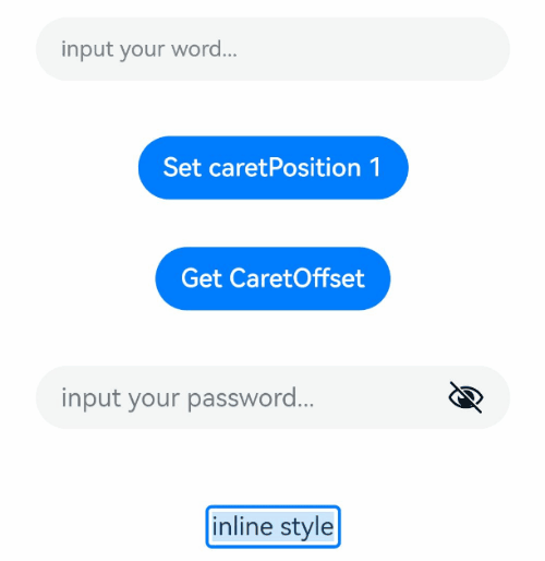
TextInput({ text: this.text, placeholder: 'input your word...', controller: this.controller })
.placeholderColor(Color.Grey)
.placeholderFont({ size: 14, weight: 400 })
.caretColor(Color.Blue)
.width('95%')
.height(40)
.margin(20)
.fontSize(14)
.fontColor(Color.Black)
.inputFilter('[a-z]', (e) => {
console.log(JSON.stringify(e))
})
.onChange((value: string) => {
this.text = value
})
Text(this.text)
Button('Set caretPosition 1')
.margin(15)
.onClick(() => {
// 将光标移动至第一个字符后
this.controller.caretPosition(1)
})
Button('Get CaretOffset')
.margin(15)
.onClick(() => {
this.positionInfo = this.controller.getCaretOffset()
})
// 密码输入框
TextInput({ placeholder: 'input your password...' })
.width('95%')
.height(40)
.margin(20)
.type(InputType.Password)
.maxLength(9)
.showPasswordIcon(true)
// 内联风格输入框
TextInput({ text: 'inline style' })
.width('95%')
.height(50)
.margin(20)
.borderRadius(0)
.style(TextInputStyle.Inline)
}.width('100%')
}
}
示例2
@Entry
@Component
struct TextInputExample {
@State PassWordSrc1: Resource = $r('app.media.onIcon')
@State PassWordSrc2: Resource = $r('app.media.offIcon')
@State TextError: string = ''
@State Text: string = ''
@State NameText: string = 'test'
@Builder itemEnd() {
Select([{ value: 'KB' },
{ value: 'MB' },
{ value: 'GB' },
{ value: 'TB', }])
.height("48vp")
.borderRadius(0)
.selected(2)
.align(Alignment.Center)
.value('MB')
.font({ size: 20, weight: 500 })
.fontColor('#182431')
.selectedOptionFont({ size: 20, weight: 400 })
.optionFont({ size: 20, weight: 400 })
.backgroundColor(Color.Transparent)
.responseRegion({ height: "40vp", width: "80%", x: '10%', y: '6vp' })
.onSelect((index: number) => {
console.info('Select:' + index)
})
}
build() {
Column({ space: 20 }) {
// 自定义密码显示图标
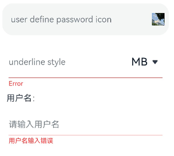
TextInput({ placeholder: 'user define password icon' })
.type(InputType.Password)
.width(380)
.height(60)
.passwordIcon({ onIconSrc: this.PassWordSrc1, offIconSrc: this.PassWordSrc2 })
// 下划线模式
TextInput({ placeholder: 'underline style' })
.showUnderline(true)
.width(380)
.height(60)
.showError('Error')
.showUnit(this.itemEnd)
Text(`用户名:${this.Text}`)
.width('95%')
TextInput({ placeholder: '请输入用户名', text: this.Text })
.showUnderline(true)
.width(380)
.showError(this.TextError)
.onChange((value: string) => {
this.Text = value
})
.onSubmit(() => { // 用户名不正确会清空输入框和用户名并提示错误文本
if (this.Text == this.NameText) {
this.TextError = ''
} else {
this.TextError = '用户名输入错误'
this.Text = ''
}
})
}.width('100%')
}
}
示例3
// xxx.ets
@Entry
@Component
struct TextInputExample {
controller: TextInputController = new TextInputController()
@State inputValue: string = ""
// 自定义键盘组件
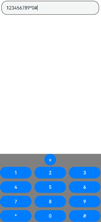
@Builder CustomKeyboardBuilder() {
Column() {
Button('x').onClick(() => {
// 关闭自定义键盘
this.controller.stopEditing()
})
Grid() {
ForEach([1, 2, 3, 4, 5, 6, 7, 8, 9, '*', 0, '#'], (item:number|string) => {
GridItem() {
Button(item + "")
.width(110).onClick(() => {
this.inputValue += item
})
}
})
}.maxCount(3).columnsGap(10).rowsGap(10).padding(5)
}.backgroundColor(Color.Gray)
}
build() {
Column() {
TextInput({ controller: this.controller, text: this.inputValue })
// 绑定自定义键盘
.customKeyboard(this.CustomKeyboardBuilder()).margin(10).border({ width: 1 }).height('48vp')
}
}
}
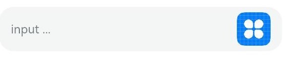
示例4
// xxx.ets
@Entry
@Component
struct ClearNodeExample {
  @State text: string = ''
  controller: TextInputController = new TextInputController()

  build() {
    Column() {
      TextInput({ placeholder: 'input ...', controller: this.controller })
        .width(380)
        .height(60)
        .cancelButton({
          style: CancelButtonStyle.CONSTANT,
          icon: {
            size: 45,
            src: $r('app.media.icon'),
            color: Color.Blue
          }
        })
        .onChange((value: string) => {
          this.text = value
        })
    }
  }
}
示例5
// xxx.ets
@Entry
@Component
struct TextInputExample {
@State text: string = ''
controller: TextInputController = new TextInputController()
build() {
Column() {
TextInput({ text: this.text, controller: this.controller })
.placeholderFont({ size: 16, weight: 400 })
.width(336)
.height(56)
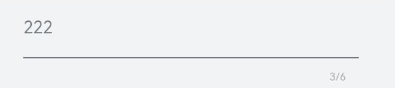
.maxLength(6)
.showUnderline(true)
.showCounter(true, { thresholdPercentage: 50, highlightBorder: true })
//计数器显示效果为用户当前输入字符数/最大字符限制数。最大字符限制数通过maxLength()接口设置。
//如果用户当前输入字符数达到最大字符限制乘50%(thresholdPercentage)。字符计数器显示。
//用户设置highlightBorder为false时,配置取消红色边框。不设置此参数时,默认为true。
.onChange((value: string) => {
this.text = value
})
}.width('100%').height('100%').backgroundColor('#F1F3F5')
}
}