Flex Layout
NOTE
flexBasis
flexBasis(value: number | string)
Sets the base size of the component.
Widget capability: Since API version 9, this API is supported in ArkTS widgets.
System capability: SystemCapability.ArkUI.ArkUI.Full
Parameters
| Name | Type | Mandatory | Description |
|---|---|---|---|
| value | number | string | Yes | Base size of the component in the main axis of the parent container. Default value: 'auto' (indicating that the base size of the component in the main axis is the original size of the component) This attribute cannot be set in percentage. |
flexGrow
flexGrow(value: number)
Sets the percentage of the parent container's remaining space that is allocated to the component.
Widget capability: Since API version 9, this API is supported in ArkTS widgets.
System capability: SystemCapability.ArkUI.ArkUI.Full
Parameters
| Name | Type | Mandatory | Description |
|---|---|---|---|
| value | number | Yes | Percentage of the parent container's remaining space that is allocated to the component. Default value: 0 |
flexShrink
flexShrink(value: number)
Sets the percentage of the parent container's shrink size that is allocated to the component.
Widget capability: Since API version 9, this API is supported in ArkTS widgets.
System capability: SystemCapability.ArkUI.ArkUI.Full
Parameters
| Name | Type | Mandatory | Description |
|---|---|---|---|
| value | number | Yes | Percentage of the parent container's shrink size that is allocated to the component. If the parent container is <Column> or <Row>, the default value is 0. If the parent container is <Flex>, the default value is 1. |
alignSelf
alignSelf(value: ItemAlign)
Sets the alignment mode of the child components along the cross axis of the parent container.
Widget capability: Since API version 9, this API is supported in ArkTS widgets.
System capability: SystemCapability.ArkUI.ArkUI.Full
Parameters
| Name | Type | Mandatory | Description |
|---|---|---|---|
| value | ItemAlign | Yes | Alignment mode of the child components along the cross axis of the parent container. The setting overwrites the alignItems setting of the parent container (<Flex>, <Column>](ts-container-column.md), <Row>](ts-container-row.md), or <GridRow>). <GridCol> can have the alignsSelf attribute bound to change its own layout along the cross axis. Default value: ItemAlign.Auto |
Example
// xxx.ets
@Entry
@Component
struct FlexExample {
build() {
Column({ space: 5 }) {
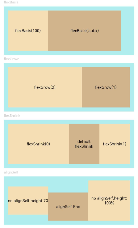
Text('flexBasis').fontSize(9).fontColor(0xCCCCCC).width('90%')
// Base size in the main axis
// The value of flexBasis() can be 'auto' or a number, which is equivalent to .width()/.height().
Flex() {
Text('flexBasis(100)')
.flexBasis(100) // The width is 100 vp.
.height(100)
.backgroundColor(0xF5DEB3)
.textAlign(TextAlign.Center)
Text(`flexBasis('auto')`)
.flexBasis('auto') // The width is 60% of the original width.
.width('60%')
.height(100)
.backgroundColor(0xD2B48C)
.textAlign(TextAlign.Center)
}.width('90%').height(120).padding(10).backgroundColor(0xAFEEEE)
Text('flexGrow').fontSize(9).fontColor(0xCCCCCC).width('90%')
// flexGrow() indicates the percentage of the remaining space allocated to the component.
Flex() {
Text('flexGrow(2)')
.flexGrow(2) // The width allocated to the <Text> component is 2/3 of the remaining width of the parent container.
.height(100)
.backgroundColor(0xF5DEB3)
.textAlign(TextAlign.Center)
Text('flexGrow(1)')
.flexGrow(1) // The width allocated to the <Text> component is 1/3 of the remaining width of the parent container.
.height(100)
.backgroundColor(0xD2B48C)
.textAlign(TextAlign.Center)
}.width('90%').height(120).padding(10).backgroundColor(0xAFEEEE)
Text('flexShrink').fontSize(9).fontColor(0xCCCCCC).width('90%')
// flexShrink() indicates the percentage of the shrink size allocated to the component.
// The value is 0 for the first <Text> component and 1 for the other two <Text> components. This means that, if the components cannot be completely displayed in the parent container, the latter two are shrunk proportionally, while the former is not shrunk.
Flex({ direction: FlexDirection.Row }) {
Text('flexShrink(0)')
.flexShrink(0)
.width('50%')
.height(100)
.backgroundColor(0xF5DEB3)
.textAlign(TextAlign.Center)
Text('default flexShrink') // The default value is 1.
.width('40%')
.height(100)
.backgroundColor(0xD2B48C)
.textAlign(TextAlign.Center)
Text('flexShrink(1)')
.flexShrink(1)
.width('40%')
.height(100)
.backgroundColor(0xF5DEB3)
.textAlign(TextAlign.Center)
}.width('90%').height(120).padding(10).backgroundColor(0xAFEEEE)
Text('alignSelf').fontSize(9).fontColor(0xCCCCCC).width('90%')
// The alignSelf setting overrides the alignItems setting of the parent container.
Flex({ direction: FlexDirection.Row, alignItems: ItemAlign.Center }) {
Text('no alignSelf,height:70')
.width('33%')
.height(70)
.backgroundColor(0xF5DEB3)
.textAlign(TextAlign.Center)
Text('alignSelf End')
.alignSelf(ItemAlign.End)
.width('33%')
.height(70)
.backgroundColor(0xD2B48C)
.textAlign(TextAlign.Center)
Text('no alignSelf,height:100%')
.width('34%')
.height('100%')
.backgroundColor(0xF5DEB3)
.textAlign(TextAlign.Center)
}.width('90%').height(120).padding(10).backgroundColor(0xAFEEEE)
}.width('100%').margin({ top: 5 })
}
}