TextInput
The <TextInput> component provides single-line text input.
NOTE
This component is supported since API version 7. Updates will be marked with a superscript to indicate their earliest API version.
Child Components
Not supported
APIs
TextInput(value?: TextInputOptions)
Parameters
| Name | Type | Mandatory | Description |
|---|---|---|---|
| value | TextInputOptions | No | Parameters of the <TextInput> component. |
TextInputOptions
| Name | Type | Mandatory | Description |
|---|---|---|---|
| placeholder | ResourceStr | No | Text displayed when there is no input. |
| text | ResourceStr | No | Current text input. You are advised to bind the state variable to the text in real time through the onChange event, so as to prevent display errors when the component is updated. Since API version 10, this parameter supports two-way binding through $$. |
| controller8+ | TextInputController | No | Text input controller. |
Attributes
Among the universal attributes and universal text attributes, fontColor, fontSize, fontStyle, fontWeight, and fontFamily are supported. In addition, the following attributes are supported.
| Name | Type | Description |
|---|---|---|
| type | InputType | Text box type. Default value: InputType.Normal |
| placeholderColor | ResourceColor | Placeholder text color. The default value follows the theme. |
| placeholderFont | Font | Placeholder text font. |
| enterKeyType | EnterKeyType | Type of the Enter key. Default value: EnterKeyType.Done |
| caretColor | ResourceColor | Color of the caret in the text box. Default value: '#007DFF' |
| maxLength | number | Maximum number of characters in the text input. |
| inputFilter8+ | { value: ResourceStr, error?: (value: string) => void } |
Regular expression for input filtering. Only inputs that comply with the regular expression can be displayed. Other inputs are filtered out. The regular expression can match single characters, but not strings. - value: regular expression to set. - error: filtered-out content to return when regular expression matching fails. Since API version 11, setting inputFilter will invalidate the text filtering effect brought by setting the type attribute. |
| copyOption9+ | CopyOptions | Whether copy and paste is allowed. Default value: CopyOptions.LocalDevice If this attribute is set to CopyOptions.None, the paste operation is allowed, but not the copy or cut operation. NOTE For dragging, copyOption only restricts whether text is selected and does not involve the dragging scope. |
| showPasswordIcon9+ | boolean | Whether to display the password icon at the end of the password text box. Default value: true |
| style9+ | TextInputStyle | TextContentStyle | Text input style. For the inline input style, only InputType.Normal is supported. Default value: TextInputStyle.Default |
| textAlign9+ | TextAlign | Horizontal alignment of the text. Default value: TextAlign.Start NOTE Available options are TextAlign.Start, TextAlign.Center, and TextAlign.End. To set vertical alignment for the text, use the align attribute. The align attribute alone does not control the horizontal position of the text. In other words, Alignment.TopStart, Alignment.Top, and Alignment.TopEnd produce the same effect, top-aligning the text; Alignment.Start, Alignment.Center, and Alignment.End produce the same effect, centered-aligning the text vertically; Alignment.BottomStart, Alignment.Bottom, and Alignment.BottomEnd produce the same effect, bottom-aligning the text. |
| selectedBackgroundColor10+ | ResourceColor | Background color of the selected text. If the opacity is not set, a 20% opacity will be used. |
| caretStyle10+ | CaretStyle | Caret style. |
| caretPosition10+ | number | Caret position. |
| showUnit10+ | CustomBuilder | Unit for content in the component. By default, there is no unit. This attribute must be used together with showUnderline. It is effective only when showUnderline is set to true. |
| showError10+ | string | undefined | Error message displayed when an error occurs. By default, no error message is displayed. NOTE If the parameter type is string and the input content does not comply with specifications, the error message is displayed. If the parameter type is undefined, no error message is displayed. See Example 2. |
| showUnderline10+ | boolean | Whether to show an underline. By default, the underline comes in the color of '#33182431', thickness of 1 px, and text box size of 48 vp. The underline supports only the InputType.Normal type. Default value: false |
| passwordIcon10+ | PasswordIcon | Password icon to display at the end of the password text box. By default, the system-provided icon is used. |
| enableKeyboardOnFocus10+ | boolean | Whether to enable the input method when the component obtains focus in a way other than clicking. Default value: true |
| selectionMenuHidden10+ | boolean | Whether to display the text selection menu when the text box is long-pressed or right-clicked. Default value: false |
| barState10+ | BarState | Scrollbar state when the inline input style is used. Default value: BarState.Auto |
| maxLines10+ | number | Maximum number of lines that can be displayed when the inline input style is used. Default value: 3 NOTE Value range: (0, +∞) |
| customKeyboard10+ | CustomBuilder | Custom keyboard. NOTE When a custom keyboard is set, activating the text box opens the specified custom component, instead of the system input method, and the enterKeyType attribute setting for the system keyboard will not take effect. The custom keyboard's height can be set through the height attribute of the custom component's root node, and its width is fixed at the default value. The custom keyboard is displayed on top of the current page, without compressing or raising the page. The custom keyboard cannot obtain the focus, but it blocks gesture events. By default, the custom keyboard is closed when the input component loses the focus. You can also use the TextInputController.stopEditing API to close the keyboard. When a custom keyboard is set, the text box does not support camera input, even when the device supports. |
| enableAutoFill11+ | boolean | Whether to enable autofill. true: enable false: disable Default value: true |
| passwordRules11+ | string | Rules for generating passwords. When autofill is used, these rules are transparently transmitted to Password Vault for generating a new password. |
| cancelButton11+ | { style? : CancelButtonStyle icon?: IconOptions } |
Style of the Cancel button on the right. Default value: { style: CancelButtonStyle.INPUT } The inline mode is not supported. |
| selectAll11+ | boolean | Whether to select all text in the initial state. Default value: false The inline mode is not supported. |
| showCounter11+ | value: boolean, options?: InputCounterOptions | Counter settings. options can be set only when value is set to true, in which case a character counter is displayed below the text box. This attribute must be used together with maxLength. The character counter is displayed in this format: Number of characters that have been entered/Maximum number of characters allowed. It is visible when the number of characters that have been entered is greater than the maximum number of characters multiplied by the threshold percentage value. If options is not set, the text box border turns red when the number of entered characters reaches the maximum. If value is set to true and options is set, the text box border turns red and the text box shakes when the number of entered characters reaches the maximum, provided that the value of thresholdPercentage is valid. If highlightBorder is set to false, the text box border does not turn red. By default, highlightBorder is set to true. For the <TextInput> component to show the border, configure it to show an underline. When the component is in inline or password input style, the counter is not displayed. |
NOTE
The default value of the universal attribute padding is as follows:
{
top: 8 vp,
right: 16 vp,
bottom: 8 vp,
left: 16 vp
}Since API version 10, .width('auto') can be set for the <TextInput> component. Under this setting, the component auto-adapts its width to the text width, while respecting the constraintSize configuration and the maximum and minimum width restrictions received by the parent container. For details, see Size.
SubmitEvent11+
Defines the user submission event.
| Name | Type | Mandatory | Description |
|---|---|---|---|
| keepEditableState | () => void | No | Editing status of the text box. When this API is called, the text box remains in editing state. |
| text | string | No | Text in the text box. |
CaretStyle10+
| Name | Type | Mandatory | Description |
|---|---|---|---|
| width | Length | No | Caret size. It cannot be set in percentage. |
EnterKeyType
| Name | Description |
|---|---|
| Go | The Enter key is labeled "Go." |
| Search | The Enter key is labeled "Search." |
| Send | The Enter key is labeled "Send." |
| Next | The Enter key is labeled "Next." |
| Done | The Enter key |
| PREVIOUS11+ | The Enter key is labeled "Previous." |
| NEW_LINE11+ | The Enter key is labeled "Return." |
InputType
| Name | Description |
|---|---|
| Normal | Normal input mode. In this mode, there is no special restriction on the input characters. |
| Password | Password input mode. This mode accepts only digits, letters, underscores (_), spaces, and special characters. An eye icon is used to show or hide the password, and the password is hidden behind dots by default. The password input mode does not support underlines. If Password Vault is enabled, autofill is available for the username and password. |
| Email address input mode. This mode accepts only digits, letters, underscores (_), dots (.), and one at sign (@). | |
| Number | Digit input mode. |
| PhoneNumber9+ | Phone number input mode. This mode accepts only digits, plus signs (+), hyphens (-), asterisks (*), and number signs (#). The length is not limited. |
| USER_NAME11+ | Username input mode. If Password Vault is enabled, autofill is available for the username and password. |
| NEW_PASSWORD11+ | New password input mode. If Password Vault is enabled, a new password can be automatically generated. |
| NUMBER_PASSWORD11+ | Numeric password input mode. An eye icon is used to show or hide the password, and the password is hidden behind dots by default. The password input mode does not support underlines. |
| NUMBER_DECIMAL11+ | Number input mode with a decimal point. The value can contain digits and one decimal point. |
TextInputStyle9+
| Name | Description |
|---|---|
| Default | Default style. The caret width is fixed at 1.5 vp, and the caret height is subject to the background height and font size of the selected text. |
| Inline | Inline input style. The background height of the selected text is the same as the height of the text box. This style is used in scenarios where editing and non-editing states are obvious, for example, renaming in the file list view. The showError attribute is not supported for this style. |
PasswordIcon10+
| Name | Type | Mandatory | Description |
|---|---|---|---|
| onIconSrc | string | Resource | No | Icon that can be used to hide the password in password input mode. |
| offIconSrc | string | Resource | No | Icon that can be used to show the password in password input mode. |
Events
In addition to the universal events, the following events are supported.
| Name | Description |
|---|---|
| onChange(callback: (value: string) => void) | Triggered when the input in the text box changes. value: text content. This event is triggered when any of the following conditions is met: 1. Keyboard input is received. 2. Paste and cut is performed. 3. Ctrl+V is pressed. |
| onSubmit(callback: (enterKey: EnterKeyType, event11+: SubmitEvent) => void) | Triggered when the Enter key on the keyboard is pressed. enterKey: type of the Enter key. If it is EnterKeyType.NEW_LINE and the text box is in inline input style, onSubmit is not triggered. For details, see EnterKeyType. event: submission event. For details, see SubmitEvent. |
| onEditChanged(callback: (isEditing: boolean) => void)(deprecated) | Triggered when the input status changes. Since API version 8, onEditChange is recommended. |
| onEditChange(callback: (isEditing: boolean) => void)8+ | Triggered when the input status changes. The text box is in the editing state when the caret is placed in it. If the value of isEditing is true, text input is in progress. |
| onCopy(callback:(value: string) => void)8+ | Triggered when the copy button on the pasteboard, which displays when the text box is long pressed, is clicked. value: text that is copied. |
| onCut(callback:(value: string) => void)8+ | Triggered when the cut button on the pasteboard, which displays when the text box is long pressed, is clicked. value: text that is cut. |
| onPaste(callback:(value: string, event11+: PasteEvent) => void) | Triggered when the paste button on the pasteboard, which displays when the text box is long pressed, is clicked. value: text that is pasted. event: custom paste event. |
| onTextSelectionChange(callback: (selectionStart: number, selectionEnd: number) => void)10+ | Triggered when the text selection position changes. selectionStart: start position of the text selection area. The start position of text in the text box is 0. selectionEnd: end position of the text selection area. |
| onContentScroll(callback: (totalOffsetX: number, totalOffsetY: number) => void)10+ | Triggered when the text content is scrolled. totalOffsetX: offset in the X coordinate of the text in the content area, in px. totalOffsetY: offset in the Y coordinate of the text in the content area, in px. |
TextInputController8+
Implements the controller of the <TextInput> component.
Objects to Import
controller: TextInputController = new TextInputController()
caretPosition8+
caretPosition(value: number): void
Sets the position of the caret.
Parameters
| Name | Type | Mandatory | Description |
|---|---|---|---|
| value | number | Yes | Length from the start of the string to the position where the caret is located. |
setTextSelection10+
setTextSelection(selectionStart: number, selectionEnd: number): void
Sets the text selection area, which will be highlighted.
Parameters
| Name | Type | Mandatory | Description |
|---|---|---|---|
| selectionStart | number | Yes | Start position of the text selection range. The start position of text in the text box is 0. |
| selectionEnd | number | Yes | End position of the text selection range. |
NOTE
If selectionStart or selectionEnd is set to undefined, the value 0 will be used.
stopEditing10+
stopEditing(): void
Exits the editing state.
getTextContentRect10+
getTextContentRect(): RectResult
Obtains the position of the edited text area relative to the component and its size. The unit of the return value is pixel.
Return value
| Type | Description |
|---|---|
| RectResult | Position of the edited text area relative to the component and its size. |
NOTE
- If no text is entered, the return value contains the position information, but the size is 0.
- The position information is the offset of the first character relative to the editable area.
RectResult10+
Sets the position and size, in pixels.
| Parameter | Type | Description |
|---|---|---|
| x | number | X coordinate. |
| y | number | Y coordinate. |
| width | number | Content width. |
| height | number | Content height. |
getTextContentLineCount10+
getTextContentLineCount(): number
Obtains the number of lines of the edited text.
Return value
| Type | Description |
|---|---|
| number | Number of lines of the edited text. |
getCaretOffset11+
getCaretOffset(): CaretOffset
Returns the position information of the caret.
Return value
| Type | Description |
|---|---|
| CaretOffset | Position of the caret relative to the text box. |
NOTE
- If this API is called when the caret position is updated in the current frame, it will not take effect.
CaretOffset11+
| Name | Type | Description |
|---|---|---|
| index | number | Index of the caret position. |
| x | number | X coordinate of the caret relative to the text box, in px. |
| y | number | Y coordinate of the caret relative to the text box, in px. |
InputCounterOptions11+
| Name | Type | Description |
|---|---|---|
| thresholdPercentage | number | Threshold percentage for displaying the character counter. The character counter is displayed when the number of characters that have been entered is greater than the maximum number of characters multiplied by the threshold percentage value. When displayed, the character counter is in the following format: Number of characters that have been entered/Maximum number of characters allowed. Value range: [1,100] If the value exceeds the valid value range, the character counter is not displayed. If the value is undefined, the character counter is displayed, but this parameter has no effect. |
| highlightBorder | boolean | If options is not set, the text box border turns red when the number of entered characters reaches the maximum. If the character counter is displayed and thresholdPercentage is set to a valid value, the text box border turns red when the number of entered characters reaches the maximum. The value true (default) means that the text box border turns red when the number of entered characters reaches the maximum. |
Example
Example 1
// xxx.ets
@Entry
@Component
struct TextInputExample {
@State text: string = ''
@State positionInfo: CaretOffset = { index: 0, x: 0, y: 0 }
controller: TextInputController = new TextInputController()
build() {
Column() {
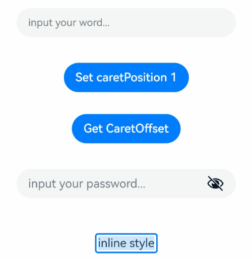
TextInput({ text: this.text, placeholder: 'input your word...', controller: this.controller })
.placeholderColor(Color.Grey)
.placeholderFont({ size: 14, weight: 400 })
.caretColor(Color.Blue)
.width('95%')
.height(40)
.margin(20)
.fontSize(14)
.fontColor(Color.Black)
.inputFilter('[a-z]', (e) => {
console.log(JSON.stringify(e))
})
.onChange((value: string) => {
this.text = value
})
Text(this.text)
Button('Set caretPosition 1')
.margin(15)
.onClick(() => {
// Move the caret to after the first entered character.
this.controller.caretPosition(1)
})
Button('Get CaretOffset')
.margin(15)
.onClick(() => {
this.positionInfo = this.controller.getCaretOffset()
})
// Password text box.
TextInput({ placeholder: 'input your password...' })
.width('95%')
.height(40)
.margin(20)
.type(InputType.Password)
.maxLength(9)
.showPasswordIcon(true)
// Inline-style text box.
TextInput({ text: 'inline style' })
.width('95%')
.height(50)
.margin(20)
.borderRadius(0)
.style(TextInputStyle.Inline)
}.width('100%')
}
}
Example 2
@Entry
@Component
struct TextInputExample {
@State PassWordSrc1: Resource = $r('app.media.onIcon')
@State PassWordSrc2: Resource = $r('app.media.offIcon')
@State TextError: string = ''
@State Text: string = ''
@State NameText: string = 'test'
@Builder itemEnd() {
Select([{ value: 'KB' },
{ value: 'MB' },
{ value: 'GB' },
{ value: 'TB', }])
.height("48vp")
.borderRadius(0)
.selected(2)
.align(Alignment.Center)
.value('MB')
.font({ size: 20, weight: 500 })
.fontColor('#182431')
.selectedOptionFont({ size: 20, weight: 400 })
.optionFont({ size: 20, weight: 400 })
.backgroundColor(Color.Transparent)
.responseRegion({ height: "40vp", width: "80%", x: '10%', y: '6vp' })
.onSelect((index: number) => {
console.info('Select:' + index)
})
}
build() {
Column({ space: 20 }) {
// Customize the password icon.
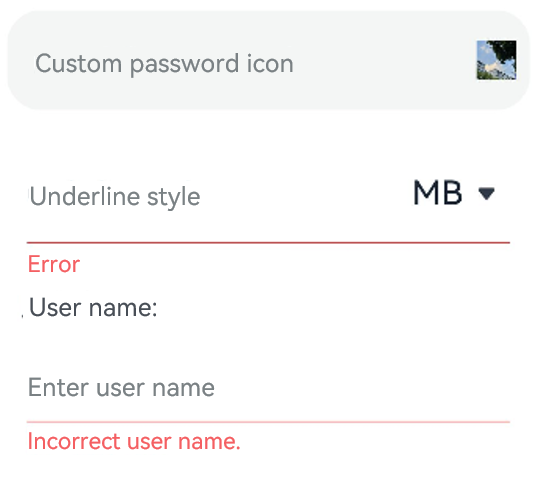
TextInput({ placeholder: 'Custom password icon' })
.type(InputType.Password)
.width(380)
.height(60)
.passwordIcon({ onIconSrc: this.PassWordSrc1, offIconSrc: this.PassWordSrc2 })
// Show an underline.
TextInput({ placeholder: 'Underline style' })
.showUnderline(true)
.width(380)
.height(60)
.showError('Error')
.showUnit(this.itemEnd)
Text (`User name: ${this.Text}`)
.width('95%')
TextInput({ placeholder: 'Enter user name', text: this.Text })
.showUnderline(true)
.width(380)
.showError(this.TextError)
.onChange((value: string) => {
this.Text = value
})
.onSubmit(() => {// If the entered user name is incorrect, the text box will be cleared and the error message will be displayed.
if (this.Text == this.NameText) {
this.TextError = ''
} else {
this.TextError ='Incorrect user name.'
this.Text = ''
}
})
}.width('100%')
}
}
Example 3
// xxx.ets
@Entry
@Component
struct TextInputExample {
controller: TextInputController = new TextInputController()
@State inputValue: string = ""
// Create a custom keyboard component.
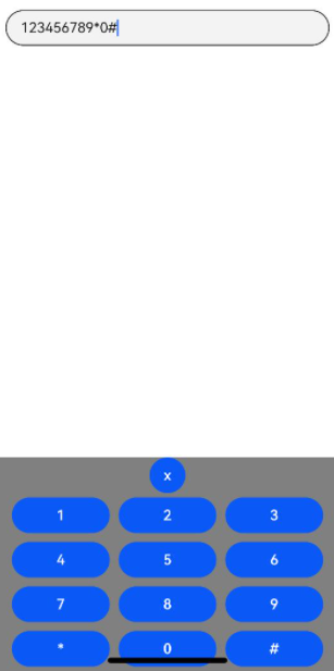
@Builder CustomKeyboardBuilder() {
Column() {
Button('x').onClick(() => {
// Disable the custom keyboard.
this.controller.stopEditing()
})
Grid() {
ForEach([1, 2, 3, 4, 5, 6, 7, 8, 9, '*', 0, '#'], (item:number|string) => {
GridItem() {
Button(item + "")
.width(110).onClick(() => {
this.inputValue += item
})
}
})
}.maxCount(3).columnsGap(10).rowsGap(10).padding(5)
}.backgroundColor(Color.Gray)
}
build() {
Column() {
TextInput({ controller: this.controller, text: this.inputValue })
// Bind the custom keyboard.
.customKeyboard(this.CustomKeyboardBuilder()).margin(10).border({ width: 1 })
}
}
}
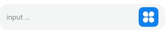
Example 4
// xxx.ets
@Entry
@Component
struct ClearNodeExample {
  @State text: string = ''
  controller: TextInputController = new TextInputController()

  build() {
    Column() {
      TextInput({ placeholder: 'input ...', controller: this.controller })
        .width(380)
        .height(60)
        .cancelButton({
          style: CancelButtonStyle.CONSTANT,
          icon: {
            size: 45,
            src: $r('app.media.icon'),
            color: Color.Blue
          }
        })
        .onChange((value: string) => {
          this.text = value
        })
    }
  }
}
Example 5
// xxx.ets
@Entry
@Component
struct TextInputExample {
@State text: string = ''
controller: TextInputController = new TextInputController()
build() {
Column() {
TextInput({ text: this.text, controller: this.controller })
.placeholderFont({ size: 16, weight: 400 })
.width(336)
.height(56)
.maxLength(6)
.showUnderline(true)
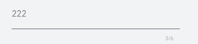
.showCounter(true, { thresholdPercentage: 50, highlightBorder: true })
// The character counter is in this format: Number of characters that have been entered/Maximum number of characters allowed, which is specified by maxLength().
// The character counter is displayed when the number of characters that have been entered is greater than the maximum number of characters multiplied by 50% (threshold percentage).
// When highlightBorder is set to false, the text box border turns red when the number of entered characters reaches the maximum. The default value is true.
.onChange((value: string) => {
this.text = value
})
}.width('100%').height('100%').backgroundColor('#F1F3F5')
}
}