Popup
You can bind the Popup attribute to a component to create a popup, specifying its content and interaction logic, and display state. It is mainly used for screen recording and message notification.
Popups can be defined with PopupOptions or CustomPopupOptions. In PopupOptions, you can set primaryButton and secondaryButton to include buttons in the popup. In CustomPopupOptions, you can create a custom popup through the builder parameter.
Text Popup
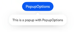
Text popups are usually used to display text only and do not allow for user interactions. Bind the Popup attribute to a component. When the show parameter in the bindPopup attribute is set to true, a popup is displayed.
If you bind the Popup attribute to a <Button> component, each time the <Button> button is clicked, the Boolean value of handlePopup changes. When it changes to true, the popup is displayed.
@Entry
@Component
struct PopupExample {
  @State handlePopup: boolean = false

  build() {
    Column() {
      Button('PopupOptions')
        .onClick(() => {
          this.handlePopup = !this.handlePopup
        })
        .bindPopup(this.handlePopup, {
          message: 'This is a popup with PopupOptions',
        })
    }.width('100%').padding({ top: 5 })
  }
}
Adding an Event for Popup State Changes
You can use the onStateChange parameter to add an event callback for popup state changes, so as to determine the current state of the popup.
@Entry
@Component
struct PopupExample {
  @State handlePopup: boolean = false

  build() {
    Column() {
      Button('PopupOptions')
        .onClick(() => {
          this.handlePopup = !this.handlePopup
        })
        .bindPopup(this.handlePopup, {
          message: 'This is a popup with PopupOptions',
          onStateChange: (e)=> {// Return the current popup state.
            if (!e.isVisible) {
              this.handlePopup = false
            }
          }
        })
    }.width('100%').padding({ top: 5 })
  }
}
Popup with a Button
You can add a maximum of two buttons to a popup through the primaryButton and secondaryButton attributes. For each of the buttons, you can set the action parameter to specify the operation to be triggered.
@Entry
@Component
struct PopupExample22 {
  @State handlePopup: boolean = false

  build() {
    Column() {
      Button('PopupOptions').margin({ top: 200 })
        .onClick(() => {
          this.handlePopup = !this.handlePopup
        })
        .bindPopup(this.handlePopup, {
          message: 'This is a popup with PopupOptions',
          primaryButton: {
            value: 'Confirm',
            action: () => {
              this.handlePopup = !this.handlePopup
              console.info('confirm Button click')
            }
          },
          secondaryButton: {
            value: 'Cancel',
            action: () => {
              this.handlePopup = !this.handlePopup
            }
          },
          onStateChange: (e) => {
            if (!e.isVisible) {
              this.handlePopup = false
            }
          }
        })
    }.width('100%').padding({ top: 5 })
  }
}

Custom Popup
You can create a custom popup with CustomPopupOptions, defining custom content in @Builder. In addition, you can use parameters such as popupColor to control the popup style.
@Entry
@Component
struct Index {
  @State customPopup: boolean = false
  // Define the popup content in the popup builder.
  @Builder popupBuilder() {
    Row({ space: 2 }) {
      Image($r("app.media.icon")).width(24).height(24).margin({ left: 5 })
      Text('This is Custom Popup').fontSize(15)
    }.width(200).height(50).padding(5)
  }
  build() {
    Column() {
      Button('CustomPopupOptions')
        .position({x:100,y:200})
        .onClick(() => {
          this.customPopup = !this.customPopup
        })
        .bindPopup(this.customPopup, {
          builder: this.popupBuilder, // Content of the popup.
          placement:Placement.Bottom, // Position of the popup.
          popupColor:Color.Pink // Background color of the popup.
          onStateChange: (e) => {
            console.info(JSON.stringify(e.isVisible))
            if (!e.isVisible) {
              this.customPopup = false
            }
          }
        })
    }
    .height('100%')
  }
}
To place the popup in a specific position, set the placement parameter. The popup builder triggers a popup message to instruct the user to complete the operation.
