TextTimer
通过文本显示计时信息并控制其计时器状态的组件。
说明:
该组件从API Version 8开始支持。后续版本如有新增内容,则采用上角标单独标记该内容的起始版本。
子组件
无
接口
TextTimer(options?: TextTimerOptions)
参数:
| 参数名 | 参数类型 | 必填 | 参数描述 |
|---|---|---|---|
| options | TextTimerOptions | 否 | 通过文本显示计时信息并控制其计时器状态的组件参数。 |
TextTimerOptions对象说明
| 参数名 | 参数类型 | 必填 | 参数描述 |
|---|---|---|---|
| isCountDown | boolean | 否 | 是否倒计时。 默认值:false |
| count | number | 否 | 倒计时时间(isCountDown为true时生效),单位为毫秒。最长不超过86400000毫秒(24小时)。 0<count<86400000时,count值为倒计时初始值。否则,使用默认值为倒计时初始值。 默认值:60000 |
| controller | TextTimerController | 否 | TextTimer控制器。 |
属性
除支持通用属性和文本通用属性的fontColor、fontSize、fontStyle、fontWeight、fontFamily外,还支持以下属性:
| 名称 | 参数类型 | 描述 |
|---|---|---|
| format | string | 自定义格式,需至少包含一个HH、mm、ss、SS中的关键字。如使用yy、MM、dd等日期格式,则使用默认值。 默认值:'HH:mm:ss.SS' |
| textShadow11+ | ShadowOptions | Array<ShadowOptions> | 设置文字阴影效果。该接口支持以数组形式入参,实现多重文字阴影。 说明: 不支持fill字段, 不支持智能取色模式。 |
事件
| 名称 | 功能描述 |
|---|---|
| onTimer(event: (utc: number, elapsedTime: number) => void) | 时间文本发生变化时触发。 utc:Linux时间戳,即自1970年1月1日起经过的时间,单位为设置格式的最小单位。 elapsedTime:计时器经过的时间,单位为设置格式的最小单位。 说明: 锁屏状态和应用后台状态下不会触发该事件。 |
TextTimerController
TextTimer组件的控制器,用于控制文本计时器。一个TextTimer组件仅支持绑定一个控制器。
导入对象
textTimerController: TextTimerController = new TextTimerController()
start
start()
计时开始。
pause
pause()
计时暂停。
reset
reset()
重置计时器。
示例
示例1
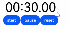
// xxx.ets
@Entry
@Component
struct TextTimerExample {
  textTimerController: TextTimerController = new TextTimerController()
  @State format: string = 'mm:ss.SS'

  build() {
    Column() {
      TextTimer({ isCountDown: true, count: 30000, controller: this.textTimerController })
        .format(this.format)
        .fontColor(Color.Black)
        .fontSize(50)
        .onTimer((utc: number, elapsedTime: number) => {
          console.info('textTimer notCountDown utc is:' + utc + ', elapsedTime: ' + elapsedTime)
        })
      Row() {
        Button("start").onClick(() => {
          this.textTimerController.start()
        })
        Button("pause").onClick(() => {
          this.textTimerController.pause()
        })
        Button("reset").onClick(() => {
          this.textTimerController.reset()
        })
      }
    }
  }
}
示例2
@Entry
@Component
struct TextTimerExample {
  @State textShadows : ShadowOptions | Array<ShadowOptions> = [{ radius: 10, color: Color.Red, offsetX: 10, offsetY: 0 },{ radius: 10, color: Color.Black, offsetX: 20, offsetY: 0 },
      { radius: 10, color: Color.Brown, offsetX: 30, offsetY: 0 },{ radius: 10, color: Color.Green, offsetX: 40, offsetY: 0 },
      { radius: 10, color: Color.Yellow, offsetX: 100, offsetY: 0 }]
  build() {
    Column({ space: 8 }) {
      TextTimer().fontSize(50).textShadow(this.textShadows)
    }
  }
}