Gauge
The <Gauge> component is used to display data in a ring chart.
NOTE
This component is supported since API version 8. Updates will be marked with a superscript to indicate their earliest API version.
Child Components
This component can contain only one child component.
NOTE
You are advised to use the <Text> component to build the current value and auxiliary text.
If the width and height of a child component are in percentage, the reference range is the rectangle whose outer ring is used as the inscribed circle.
APIs
Gauge(options:{value: number, min?: number, max?: number})
Since API version 9, this API is supported in ArkTS widgets.
Parameters
| Name | Type | Mandatory | Description |
|---|---|---|---|
| value | number | Yes | Current value of the chart, that is, the position to which the pointer points in the chart. It is used as the initial value of the chart when the component is created. NOTE If the value is not within the range defined by the min and max parameters, the value of min is used. |
| min | number | No | Minimum value of the current data segment. Default value: 0 |
| max | number | No | Maximum value of the current data segment. Default value: 100 NOTE If the value of max is less than that of min, the default values 0 and 100 are used. The values of max and min can be negative numbers. |
Attributes
In addition to the universal attributes, the following attributes are supported.
| Name | Type | Description |
|---|---|---|
| value | number | Value of the chart. It can be dynamically changed. Default value: 0 Since API version 9, this API is supported in ArkTS widgets. |
| startAngle | number | Start angle of the chart. The value 0 indicates 0 degrees, and a positive value indicates the clockwise direction. Default value: 0 Since API version 9, this API is supported in ArkTS widgets. |
| endAngle | number | End angle of the chart. The value 0 indicates 0 degrees, and a positive value indicates the clockwise direction. Default value: 360 Since API version 9, this API is supported in ArkTS widgets. |
| colors | ResourceColor11+ | LinearGradient11+ | Array<ColorStop> | Colors of the chart. Colors can be set for individual segments. Default value in API version 9: Color.Black Since API version 9, this API is supported in ArkTS widgets. Since API version 11, this API follows the following rules: If the parameter type is ResourceColor, the ring is of the monochrome type. If the parameter type is LinearGradient, the ring is of the gradient type. If the parameter type is array, the ring is of the gradient type. A ring of the gradient type contains a maximum of nine color segments. If there are more than nine segments, the excess is not displayed. Default value in API version 11: If no color is passed or the passed array is empty, the ring will be a gradient consisting of the following colors: 0xFF64BB5C, 0xFFF7CE00, and 0xFFE84026. If a color is passed but the color value is invalid, the ring will be in the color of 0xFFE84026. |
| strokeWidth | Length | Stroke width of the chart. Default value: 4 Unit: vp Since API version 9, this API is supported in ArkTS widgets. NOTE A value less than 0 evaluates to the default value. The value cannot be in percentage. |
| description11+ | CustomBuilder | Description of the chart. NOTE You need to customize the content – text or imagery recommended – in @Builder. If the width and height of the custom content are in percentage, the reference range is a rectangle whose area is 44.4% x 25.4% of the ring diameter (28.6% x 28.6% for imagery), 0 vp away from the bottom of the ring, and centered horizontally. If this parameter is set to null, no description is displayed. If this parameter is not set, what's displayed is subject to the maximum and minimum value settings. If either or both of the maximum and minimum values are set, they are displayed. If neither maximum nor minimum values are set, no description is displayed. The maximum and minimum values are displayed at the bottom of the ring and cannot be relocated. They may be blocked by the ring if the ring's start and end angles are not set properly. |
| trackShadow11+ | GaugeShadowOptions | Shadow style of the chart. NOTE The shadow color is the same as the ring color. If this attribute is set to null, the shadow effect is disabled. |
| indicator11+ | GaugeIndicatorOptions | Indicator style of the chart. NOTE If this attribute is set to null, no indicator is displayed. |
ColorStop
Describes the gradient color stop.
Since API version 9, this API is supported in ArkTS widgets.
| Name | Type | Description |
|---|---|---|
| ColorStop | [ResourceColor | LinearGradient11+, number] | Gradient color stop. The first parameter indicates the color value. If it is set to a non-color value, the color of 0xFFE84026 is used. The second parameter indicates the color weight. If it is set to a negative number or a non-numeric value, the color weight is 0. |
GaugeShadowOptions11+
| Name | Type | Mandatory | Description |
|---|---|---|---|
| radius | number | Resource | No | Shadow blur radius. Default value: 20 Unit: vp NOTE A value less than or equal to 0 evaluates to the default value. |
| offsetX | number | Resource | No | Offset on the x-axis. Default value: 5 Unit: vp |
| offsetY | number | Resource | No | Offset on the y-axis. Default value: 5 Unit: vp |
GaugeIndicatorOptions11+
| Name | Type | Mandatory | Description |
|---|---|---|---|
| icon | Resource | No | Image path of the icon. NOTE If this parameter is not set, the default triangle style indicator is used. Icons in SVG format are supported. If icons in other formats are used, the default triangle style indicator is used. |
| space | Dimension | No | Distance between the indicator and the outer edge of the ring. The value cannot be in percentage. Default value: 8 Unit: vp NOTE For the default triangle style indicator, the distance is the amount of space between the triangle and the outer edge of the ring. If this parameter is set to a value less than 0, the default value will be used. If this parameter is set to a value greater than the ring radius, the default value will be used. |
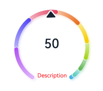
Example
Example 1
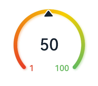
This example sets the current value, description, and auxiliary text.
@Entry
@Component
struct Gauge1 {
  @Builder descriptionBuilder() {
    Text('Description')
      .maxFontSize('30sp')
      .minFontSize("10.0vp")
      .fontColor("#fffa2a2d")
      .fontWeight(FontWeight.Medium)
      .width('100%')
      .height("100%")
      .textAlign(TextAlign.Center)
  }

  build() {
    Column() {
      Gauge({ value: 50, min: 1, max: 100 }) {
        Column() {
          Text('50')
            .fontWeight(FontWeight.Medium)
            .width('62%')
            .fontColor("#ff182431")
            .maxFontSize("60.0vp")
            .minFontSize("30.0vp")
            .textAlign(TextAlign.Center)
            .margin({ top: '35%' })
            .textOverflow({ overflow: TextOverflow.Ellipsis })
            .maxLines(1)
          Text('Auxiliary text')
            .maxFontSize("16.0fp")
            .minFontSize("10.0vp")
            .fontColor($r('sys.color.ohos_id_color_text_secondary'))
            .fontColor($r('sys.color.ohos_id_color_text_secondary'))
            .fontWeight(FontWeight.Regular)
            .width('67.4%')
            .height('9.5%')
            .textAlign(TextAlign.Center)
        }.width('100%').height('100%')
      }
      .value(50)
      .startAngle(210)
      .endAngle(150)
      .colors([[new LinearGradient([{ color: "#deb6fb", offset: 0 }, { color: "#ac49f5", offset: 1 }]), 9],
        [new LinearGradient([{ color: "#bbb7fc", offset: 0 }, { color: "#564af7", offset: 1 }]), 8],
        [new LinearGradient([{ color: "#f5b5c2", offset: 0 }, { color: "#e64566", offset: 1 }]), 7],
        [new LinearGradient([{ color: "#f8c5a6", offset: 0 }, { color: "#ed6f21", offset: 1 }]), 6],
        [new LinearGradient([{ color: "#fceb99", offset: 0 }, { color: "#f7ce00", offset: 1 }]), 5],
        [new LinearGradient([{ color: "#dbefa5", offset: 0 }, { color: "#a5d61d", offset: 1 }]), 4],
        [new LinearGradient([{ color: "#c1e4be", offset: 0 }, { color: "#64bb5c", offset: 1 }]), 3],
        [new LinearGradient([{ color: "#c0ece5", offset: 0 }, { color: "#61cfbe", offset: 1 }]), 2],
        [new LinearGradient([{ color: "#b5e0f4", offset: 0 }, { color: "#46b1e3", offset: 1 }]), 1]])
      .width('80%')
      .height('80%')
      .strokeWidth(18)
      .trackShadow({ radius: 7, offsetX: 7, offsetY: 7 })
      .description(this.descriptionBuilder)
      .padding(18)
    }.margin({ top: 40 }).width('100%').height('100%')
  }
}

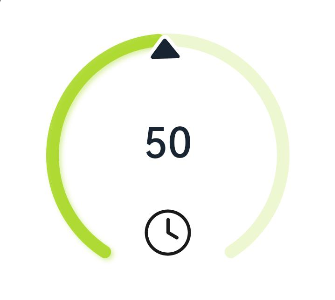
Example 2
This example sets the current value and icon.
@Entry
@Component
struct Gauge2 {
  @Builder descriptionBuilderImage() {
    Image($r('sys.media.ohos_ic_public_clock')).width(72).height(72)
  }

  build() {
    Column() {
      Gauge({ value: 50, min: 1, max: 100 }) {
        Column() {
          Text('50')
            .fontWeight(FontWeight.Medium)
            .width('62%')
            .fontColor("#ff182431")
            .maxFontSize("60.0vp")
            .minFontSize("30.0vp")
            .textAlign(TextAlign.Center)
            .margin({ top: '35%' })
            .textOverflow({ overflow: TextOverflow.Ellipsis })
            .maxLines(1)
        }.width('100%').height('100%')
      }
      .startAngle(210)
      .endAngle(150)
      .colors('#cca5d61d')
      .width('80%')
      .height('80%')
      .strokeWidth(18)
      .description(this.descriptionBuilderImage)
      .padding(18)
    }.margin({ top: 40 }).width('100%').height('100%')
  }
}
Example 3
This example sets the current value and description.
@Entry
@Component
struct Gauge3 {
  @Builder descriptionBuilder() {
    Text('Description')
      .maxFontSize('30sp')
      .minFontSize("10.0vp")
      .fontColor("#fffa2a2d")
      .fontWeight(FontWeight.Medium)
      .width('100%')
      .height("100%")
      .textAlign(TextAlign.Center)
  }

  build() {
    Column() {
      Column() {
        Gauge({ value: 50, min: 1, max: 100 }) {
          Column() {
            Text('50')
              .fontWeight(FontWeight.Medium)
              .width('62%')
              .fontColor("#ff182431")
              .maxFontSize("60.0vp")
              .minFontSize("30.0vp")
              .textAlign(TextAlign.Center)
              .margin({ top: '35%' })
              .textOverflow({ overflow: TextOverflow.Ellipsis })
              .maxLines(1)
          }.width('100%').height('100%')
        }
        .startAngle(210)
        .endAngle(150)
        .colors([[new LinearGradient([{ color: "#deb6fb", offset: 0 }, { color: "#ac49f5", offset: 1 }]), 9],
          [new LinearGradient([{ color: "#bbb7fc", offset: 0 }, { color: "#564af7", offset: 1 }]), 8],
          [new LinearGradient([{ color: "#f5b5c2", offset: 0 }, { color: "#e64566", offset: 1 }]), 7],
          [new LinearGradient([{ color: "#f8c5a6", offset: 0 }, { color: "#ed6f21", offset: 1 }]), 6],
          [new LinearGradient([{ color: "#fceb99", offset: 0 }, { color: "#f7ce00", offset: 1 }]), 5],
          [new LinearGradient([{ color: "#dbefa5", offset: 0 }, { color: "#a5d61d", offset: 1 }]), 4],
          [new LinearGradient([{ color: "#c1e4be", offset: 0 }, { color: "#64bb5c", offset: 1 }]), 3],
          [new LinearGradient([{ color: "#c0ece5", offset: 0 }, { color: "#61cfbe", offset: 1 }]), 2],
          [new LinearGradient([{ color: "#b5e0f4", offset: 0 }, { color: "#46b1e3", offset: 1 }]), 1]])
        .width('80%')
        .height('80%')
        .strokeWidth(18)
        .description(this.descriptionBuilder)
        .trackShadow({ radius: 7, offsetX: 7, offsetY: 7 })
        .padding(18)
      }.margin({ top: 40 }).width('100%').height('100%')
    }
  }
}
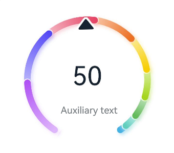
Example 4
This example sets the current value and auxiliary text.
@Entry
@Component
struct Gauge4 {
  build() {
    Column() {
      Gauge({ value: 50, min: 1, max: 100 }) {
        Column() {
          Text('50')
            .maxFontSize("72.0vp")
            .minFontSize("10.0vp")
            .fontColor("#ff182431")
            .width('40%')
            .textAlign(TextAlign.Center)
            .margin({ top: '35%' })
            .textOverflow({ overflow: TextOverflow.Ellipsis })
            .maxLines(1)
          Text('Auxiliary text')
            .maxFontSize("30.0vp")
            .minFontSize("18.0vp")
            .fontWeight(FontWeight.Medium)
            .fontColor($r('sys.color.ohos_id_color_text_secondary'))
            .width('62%')
            .height('15.9%')
            .textAlign(TextAlign.Center)
        }.width('100%').height('100%')
      }
      .startAngle(210)
      .endAngle(150)
      .colors([[new LinearGradient([{ color: "#deb6fb", offset: 0 }, { color: "#ac49f5", offset: 1 }]), 9],
        [new LinearGradient([{ color: "#bbb7fc", offset: 0 }, { color: "#564af7", offset: 1 }]), 8],
        [new LinearGradient([{ color: "#f5b5c2", offset: 0 }, { color: "#e64566", offset: 1 }]), 7],
        [new LinearGradient([{ color: "#f8c5a6", offset: 0 }, { color: "#ed6f21", offset: 1 }]), 6],
        [new LinearGradient([{ color: "#fceb99", offset: 0 }, { color: "#f7ce00", offset: 1 }]), 5],
        [new LinearGradient([{ color: "#dbefa5", offset: 0 }, { color: "#a5d61d", offset: 1 }]), 4],
        [new LinearGradient([{ color: "#c1e4be", offset: 0 }, { color: "#64bb5c", offset: 1 }]), 3],
        [new LinearGradient([{ color: "#c0ece5", offset: 0 }, { color: "#61cfbe", offset: 1 }]), 2],
        [new LinearGradient([{ color: "#b5e0f4", offset: 0 }, { color: "#46b1e3", offset: 1 }]), 1]])
      .width('80%')
      .height('80%')
      .strokeWidth(18)
      .description(null)
      .trackShadow({ radius: 7, offsetX: 7, offsetY: 7 })
      .padding(18)
    }.margin({ top: 40 }).width('100%').height('100%')
  }
}
Example 5
This example sets the current value, maximum value, and minimum value.
@Entry
@Component
struct Gauge5 {
  build() {
    Column() {
      Gauge({ value: 50, min: 1, max: 100 }) {
        Column() {
          Text('50')
            .maxFontSize("80sp")
            .minFontSize("60.0vp")
            .fontWeight(FontWeight.Medium)
            .fontColor("#ff182431")
            .width('40%')
            .height('30%')
            .textAlign(TextAlign.Center)
            .margin({ top: '22.2%' })
            .textOverflow({ overflow: TextOverflow.Ellipsis })
            .maxLines(1)
        }.width('100%').height('100%')
      }
      .startAngle(225)
      .endAngle(135)
      .colors(new LinearGradient([{ color: "#e84026", offset: 0 },
        { color: "#f7ce00", offset: 0.6 },
        { color: "#64bb5c", offset: 1 }]))
      .width('80%')
      .height('80%')
      .strokeWidth(18)
      .trackShadow({ radius: 7, offsetX: 7, offsetY: 7 })
      .padding(18)
    }.margin({ top: 40 }).width('100%').height('100%')
  }
}
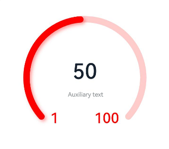
Example 6
This example sets the current value, maximum and minimum values, and auxiliary text.
@Entry
@Component
struct Gauge6 {
  build() {
    Column() {
      Gauge({ value: 50, min: 1, max: 100 }) {
        Column() {
          Text('50')
            .maxFontSize('60sp')
            .minFontSize('30.0vp')
            .fontWeight(FontWeight.Medium)
            .fontColor("#ff182431")
            .width('62%')
            .textAlign(TextAlign.Center)
            .margin({ top: '35%' })
            .textOverflow({ overflow: TextOverflow.Ellipsis })
            .maxLines(1)
          Text('Auxiliary text')
            .maxFontSize('16sp')
            .minFontSize("10.0vp")
            .fontColor($r('sys.color.ohos_id_color_text_secondary'))
            .fontWeight(FontWeight.Regular)
            .width('67.4%')
            .height('9.5%')
            .textAlign(TextAlign.Center)
        }.width('100%').height('100%')
      }
      .startAngle(225)
      .endAngle(135)
      .colors(Color.Red)
      .width('80%')
      .height('80%')
      .indicator(null)
      .strokeWidth(18)
      .trackShadow({ radius: 7, offsetX: 7, offsetY: 7 })
      .padding(18)
    }.margin({ top: 40 }).width('100%').height('100%')
  }
}
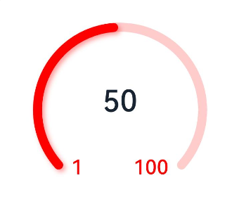
Example 7
This example sets the current value, maximum value, and minimum value.
@Entry
@Component
struct Gauge7 {
  build() {
    Column() {
      Gauge({ value: 50, min: 1, max: 100 }) {
        Column() {
          Text('50')
            .maxFontSize('60sp')
            .minFontSize('30.0vp')
            .fontWeight(FontWeight.Medium)
            .fontColor("#ff182431")
            .width('62%')
            .textAlign(TextAlign.Center)
            .margin({ top: '35%' })
            .textOverflow({ overflow: TextOverflow.Ellipsis })
            .maxLines(1)
        }.width('100%').height('100%')
      }
      .startAngle(225)
      .endAngle(135)
      .colors(Color.Red)
      .width('80%')
      .height('80%')
      .indicator(null)
      .strokeWidth(18)
      .trackShadow({ radius: 7, offsetX: 7, offsetY: 7 })
      .padding(18)
    }.margin({ top: 40 }).width('100%').height('100%')
  }
}