<button> Development
The <button> component can be used to set a capsule, circle, text, arc, or download button. For details, see button.
Creating a <button> Component
Create a <button> component in the .hml file under pages/index.
<!-- xxx.hml -->
<div class="container">
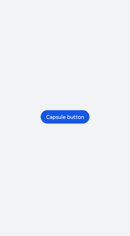
<button type="capsule" value="Capsule button"></button>
</div>
/* xxx.css */
.container {
  width: 100%;
  height: 100%;
  flex-direction: column;
  justify-content: center;
  align-items: center;
  background-color: #F1F3F5;
}
Setting the Button Type
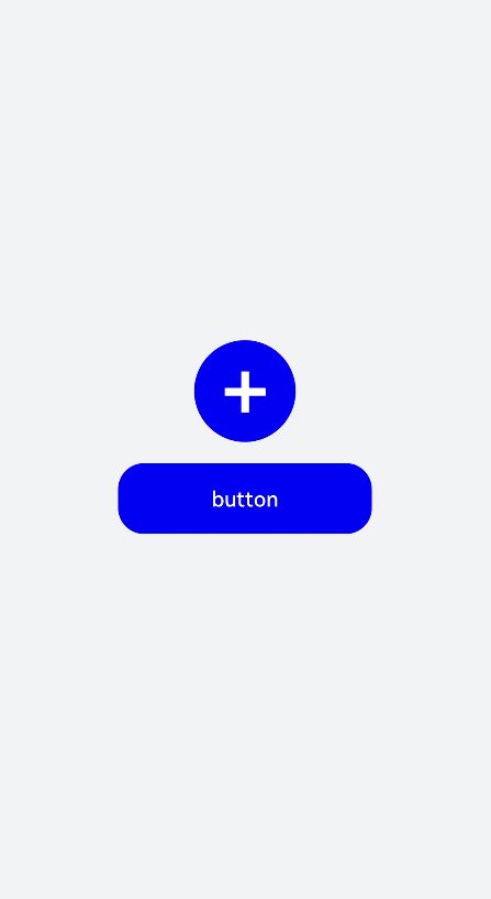
Set the type attribute of the <button> component to circle, text, or any other supported value.
<!-- xxx.hml -->
<div class="container">
  <button class="circle" type="circle" >+</button>
  <button class="text" type="text"> button</button>
</div>
/* xxx.css */
.container {
  width: 100%;
  height: 100%;
  background-color: #F1F3F5;
  flex-direction: column;
  align-items: center;
  justify-content: center;
}
.circle {
  font-size: 120px;
  background-color: blue;
  radius: 72px;
}
.text {
  margin-top: 30px;
  text-color: white;
  font-size: 30px;
  font-style: normal;
  background-color: blue;
  width: 50%;
  height: 100px;
}
NOTE
If the icon used by the <button> component is from the cloud, you must declare the ohos.permission.INTERNET permission in the config.json file under the resources folder.
Sample code for declaring the ohos.permission.INTERNET permission in the config.json file under the resources folder:
<!-- config.json -->
"module": {
  "reqPermissions": [{
    "name": "ohos.permission.INTERNET"
  }],
}
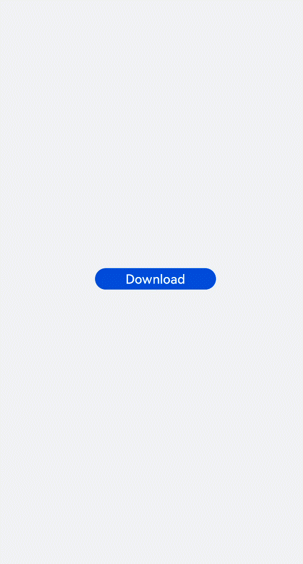
Showing the Download Progress
Add the progress method to the <button> component to display the download progress in real time.
<!-- xxx.hml -->
<div class="container">
  <button class="button download" type="download" id="download-btn" onclick="setProgress">{{downloadText}}</button>
</div>
/* xxx.css */
.container {
  width: 100%;
  height: 100%;
  background-color: #F1F3F5;
  flex-direction: column;
  align-items: center;
  justify-content: center;
}
.download {
  width: 280px;
  text-color: white;
  background-color: #007dff;
}
// xxx.js
import promptAction from '@ohos.promptAction';
export default {
  data: {
    percent: 0,
    downloadText: "Download",
    isPaused: true,
    intervalId : null,
  },
  start(){
    this.intervalId = setInterval(()=>{
      if(this.percent <100){
        this.percent += 1;
        this.downloadText = this.percent+ "%";
       } else{
         promptAction.showToast({
            message: "Download succeeded."
         })
         this.paused()
         this.downloadText = "Download";
         this.percent = 0;
         this.isPaused = true;
       }
    },100)
  },
  paused(){
    clearInterval(this.intervalId);
    this.intervalId = null;
  },
 setProgress(e) {
    if(this.isPaused){
      promptAction.showToast({
        message: "Started Downloading"
      })
      this.start();
      this.isPaused = false;
    }else{
      promptAction.showToast({
        message: "Paused."
      })
      this.paused();
      this.isPaused = true;
    }
  }
}
NOTE
The setProgress method supports only buttons of the download type.
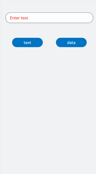
Example Scenario
Switch between the button types for different types of text.
<!-- xxx.hml -->
<div class="container">
  <div class="input-item">
    <input class="input-text" id="change" type="{{mytype}}"  placeholder="{{myholder}}"
      style="background-color:{{mystyle1}};
      placeholder-color:{{mystyle2}};flex-grow:{{myflex}};"name="{{myname}}" value="{{myvalue}}"></input>
  </div>
  <div class="input-item">
    <div class="doc-row">
      <input type="button" class="select-button color-3" value="text" onclick="changetype3"></input>
      <input type="button" class="select-button color-3" value="data" onclick="changetype4"></input>
    </div>
  </div>
</div>
/* xxx.css */
.container {
  flex-direction: column;
  align-items: center;
  background-color: #F1F3F5;
}
.input-item {
  margin-bottom: 80px;
  flex-direction: column;
}
.doc-row {
  justify-content: center;
  margin-left: 30px;
  margin-right: 30px;
  justify-content: space-around;
}
.input-text {
  height: 80px;
  line-height: 80px;
  padding-left: 30px;
  padding-right: 30px;
  margin-left: 30px;
  margin-right: 30px;
  margin-top:100px;
  border: 3px solid;
  border-color: #999999;
  font-size: 30px;
  background-color: #ffffff;
  font-weight: 400;
}
.select-button {
  width: 35%;
  text-align: center;
  height: 70px;
  padding-top: 10px;
  padding-bottom: 10px;
  margin-top: 30px;
  font-size: 30px;
  color: #ffffff;
}
.color-3 {
  background-color: #0598db;;
}
// xxx.js
export default {
  data: {
    myflex: '',
    myholder: 'Enter text.',
    myname: '',
    mystyle1: "#ffffff",
    mystyle2: "#ff0000",
    mytype: 'text',
    myvalue: '',
  },
  onInit() {
  },
  changetype3() {
    this.myflex = '';
    this.myholder = 'Enter text.';
    this.myname = '';
    this.mystyle1 = "#ffffff";
    this.mystyle2 = "#FF0000";
    this.mytype = 'text';
    this.myvalue = '';
  },
  changetype4() {
    this.myflex = '';
    this.myholder = 'Enter a date.';
    this.myname = '';
    this.mystyle1 = "#ffffff";
    this.mystyle2 = "#FF0000";
    this.mytype = 'date';
    this.myvalue = '';
  },
}