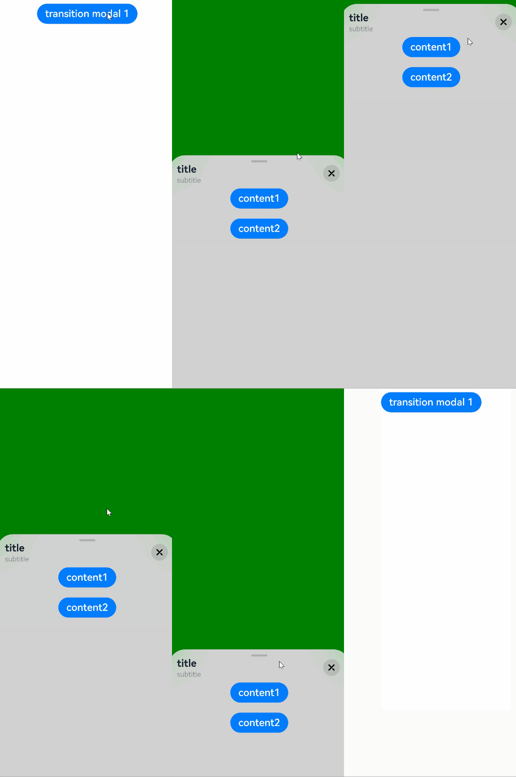
Sheet Transition
You can bind a sheet to a component through the bindSheet attribute. You can also set the sheet to the preset or custom height for when the component is inserted.
NOTE
This feature is supported since API version 10. Updates will be marked with a superscript to indicate their earliest API version.
Route hopping is not supported.
bindSheet
bindSheet(isShow: boolean, builder: CustomBuilder, options?: SheetOptions)
Binds a sheet to the component, which can be displayed when the component is touched.
System capability: SystemCapability.ArkUI.ArkUI.Full
Parameters
| Name | Type | Mandatory | Description |
|---|---|---|---|
| isShow | boolean | Yes | Whether to display the sheet. Since API version 10, this parameter supports two-way binding through $$. |
| builder | CustomBuilder | Yes | Content of the sheet. |
| options | SheetOptions | No | Optional attributes of the sheet. |
NOTE
When no two-way binding is set up for the isShow parameter, closing the sheet by dragging does not change the parameter value.
To synchronize the value of isShow with the actual state of the sheet, it is recommended that you use the $$ to set up two-way binding for isShow.
SheetOptions
Inherited from BindOptions.
| Name | Type | Mandatory | Description |
|---|---|---|---|
| height | SheetSize | Length | No | Height of the sheet. Default value: LARGE NOTE When the sheet is presented as a bottom sheet in portrait mode, this attribute has no effect if sheetDetents is set. When the sheet is presented as a bottom sheet in portrait mode, it is 8 vp away from the signal bar at its maximum height. When the sheet is presented as a bottom sheet in landscape mode, this attribute has no effect, and the sheet is 8 vp away from the top of the screen at its maximum height. When the sheet is presented as a center or popup sheet, the SheetSize.LARGE and SheetSize.MEDIUM values have no effect, and the default value 560 vp is used. The minimum height of the center and popup sheets is 320 vp, and the maximum height is 90% of the shorter edge of the window. If the height specified by Length or the auto-determined height with SheetSize.FIT_CONTENT is greater than the maximum height, the maximum height is used instead. If the height is less than the minimum height, the minimum height is used instead. |
| detents11+ | [(SheetSize | Length), ( SheetSize | Length)?, (SheetSize | Length)?] | No | Array of heights where the sheet can rest. NOTE This attribute takes effect only for the bottom sheet in portrait mode. The first height in the tuple is the initial height. The sheet can switch between heights by dragging. After the sheet is dragged and released, it switches to the target height or remains at the current height, depending on the velocity and distance. If the velocity exceeds the threshold, the sheet switches to the target height in the same direction as the velocity. If the velocity is less than the threshold, the displacement distance is used for judgement. If the displacement distance is greater than 1/2 of the distance between the current and target positions, the sheet switches to the target height in the same direction as the velocity; otherwise, the sheet remains at the current height. Velocity threshold: 1000; Distance threshold: 50%. |
| preferType11+ | SheetType.CENTER | SheetType.POPUP | No | Type of the sheet. NOTE preferType cannot be set to SheetType.BOTTOM. |
| showClose11+ | boolean | Resource | No | Whether to display the close icon. By default, the icon is displayed. NOTE The value of Resource must be of the Boolean type. |
| dragBar | boolean | No | Whether to display the drag bar. NOTE By default, the drag bar is displayed only when the sheet's dentents attribute is set to multiple heights and the settings take effect. |
| blurStyle11+ | BlurStyle | No | Background blur of the sheet. By default, there is no background blur. |
| maskColor | ResourceColor | No | Mask color of the sheet. |
| title11+ | SheetTitleOptions | CustomBuilder | No | Title of the sheet. |
| enableOutsideInteractive11+ | boolean | No | Whether to allow users to interact with the page pertaining to the sheet. NOTE The value true means that interactions are allowed, in which case no mask is not displayed. The value false means that interactions are not allowed, in which case a mask is displayed. If this parameter is not set, interactions are allowed for the popup sheet, but not for bottom and center sheets. If this parameter is set to true, the setting of maskColor does not take effect. |
| shouldDismiss11+ | (sheetDismiss: SheetDismiss) => void | No | Callback invoked when the user attempts to dismiss the sheet. NOTE When the user attempts to dismiss the sheet by a pull-down gesture or clicking the back button, the mask, or the close icon, the sheet is not dismissed; instead, the callback is executed. |
SheetSize
| Name | Description |
|---|---|
| MEDIUM | The sheet height is half of the screen height. |
| LARGE | The sheet height is almost the screen height. |
| FIT_CONTENT11+ | The sheet height automatically adapts to the content. |
BindOptions
| Name | Type | Mandatory | Description |
|---|---|---|---|
| backgroundColor | ResourceColor | No | Background color of the sheet. |
| onAppear | () => void | No | Callback invoked when the sheet is displayed. |
| onDisappear | () => void | No | Callback invoked when the sheet is hidden. |
SheetType11+
| Name | Description |
|---|---|
| BOTTOM | Bottom sheet. |
| CENTER | Center sheet. |
| POPUP | Popup sheet. The popup sheet cannot be closed by swiping down. |
SheetDismiss11+
| Name | Type | Mandatory | Description |
|---|---|---|---|
| dismiss | () => void | Yes | Callback invoked when the sheet is dismissed. Call this API only when you need the sheet to exit. |
SheetTitleOptions11+
| Name | Type | Mandatory | Description |
|---|---|---|---|
| title | ResourceStr | Yes | Main title of the sheet. |
| subtitle | ResourceStr | No | Subtitle of the sheet. |
Example 1
// xxx.ets
@Entry
@Component
struct SheetTransitionExample {
  @State isShow:boolean = false
  @State isShow2:boolean = false
  @State sheetHeight:number = 300;
  @State showDragBar:boolean = true;

  @Builder myBuilder() {
    Column() {
      Button("change height")
        .margin(10)
        .fontSize(20)
        .onClick(()=>{
          this.sheetHeight = 500;
        })

      Button("Set Illegal height")
        .margin(10)
        .fontSize(20)
        .onClick(()=>{
          this.sheetHeight = -1;
        })

      Button("close dragBar")
        .margin(10)
        .fontSize(20)
        .onClick(()=>{
          this.showDragBar = false;
        })

      Button("close modal 1")
        .margin(10)
        .fontSize(20)
        .onClick(()=>{
          this.isShow = false;
        })
    }
    .width('100%')
    .height('100%')
  }

  build() {
    Column() {
      Button("transition modal 1")
        .onClick(() => {
          this.isShow = true
        })
        .fontSize(20)
        .margin(10)
        .bindSheet($$this.isShow, this.myBuilder(), {height: this.sheetHeight, dragBar: this.showDragBar, backgroundColor: Color.Green, onAppear: () => {console.log("BindSheet onAppear.")}, onDisappear: () => {console.log("BindSheet onDisappear.")}})
    }
    .justifyContent(FlexAlign.Center)
    .width('100%')
    .height('100%')
  }
}

Example 2
// xxx.ets
@Entry
@Component
struct SheetTransitionExample {
  @State isShow:boolean = false
  @Builder myBuilder() {
    Column() {
      Button("content1")
        .margin(10)
        .fontSize(20)

      Button("content2")
        .margin(10)
        .fontSize(20)
    }
    .width('100%')
  }

  build() {
    Column() {
      Button("transition modal 1")
        .onClick(() => {
          this.isShow = true
        })
        .fontSize(20)
        .margin(10)
        .bindSheet($$this.isShow, this.myBuilder(),{
          detents:[SheetSize.MEDIUM,SheetSize.LARGE,200],
          backgroundColor:Color.Gray,
          blurStyle:BlurStyle.Thick,
          showClose:true,
          title:{title:"title", subtitle:"subtitle"},
          preferType: SheetType.CENTER,
          shouldDismiss:((sheetDismiss: SheetDismiss)=> {
            console.log("bind sheet shouldDismiss")
            sheetDismiss.dismiss()
          })
        })
    }
    .justifyContent(FlexAlign.Start)
    .width('100%')
    .height('100%')
  }
}
