Click Effect
You can set the click effect for a component to define how it behaves when clicked.
NOTE
The APIs of this module are supported since API version 10. Updates will be marked with a superscript to indicate their earliest API version.
clickEffect
clickEffect(value: ClickEffect | null)
Click effect of the component.
System capability: SystemCapability.ArkUI.ArkUI.Full
Parameters
| Name | Type | Mandatory | Description |
|---|---|---|---|
| value | ClickEffect | null | Yes | Click effect of the component. NOTE You can remove the click effect by setting this attribute to undefined or null. Avoid using this attribute in scenarios where the component size dynamically changes. This attribute is not supported when the component cannot trigger a universal event. |
ClickEffect
| Name | Type | Mandatory | Description |
|---|---|---|---|
| level | ClickEffectLevel | Yes | Click effect of the component. NOTE If level is set to undefined or null, the click effect corresponding to ClickEffectLevel.LIGHT will be used. For details about the zoom ratio, see the description of scale. |
| scale | number | No | Zoom ratio. This parameter works based on the setting of ClickEffectLevel. NOTE The default value of this parameter varies by the value of level. If level is set to ClickEffectLevel.LIGHT, the default value is 0.90. If level is set to ClickEffectLevel.MIDDLE or ClickEffectLevel.HEAVY, the default value is 0.95. If level is set to undefined or null (both of which evaluate to ClickEffectLevel.LIGHT), the default value is 0.90. If scale is set to undefined or null, the default zoom ratio for the set level will be used. |
Example
// xxx.ets
@Entry
@Component
struct ToggleExample {
build() {
Column({ space: 10 }) {
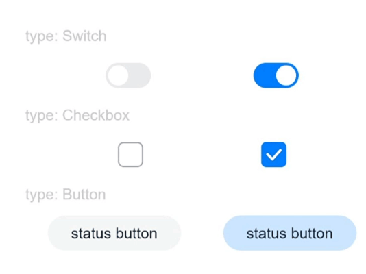
Text('type: Switch').fontSize(12).fontColor(0xcccccc).width('90%')
Flex({ justifyContent: FlexAlign.SpaceEvenly, alignItems: ItemAlign.Center }) {
Toggle({ type: ToggleType.Switch, isOn: false })
.clickEffect({level:ClickEffectLevel.LIGHT})
.selectedColor('#007DFF')
.switchPointColor('#FFFFFF')
.onChange((isOn: boolean) => {
console.info('Component status:' + isOn)
})
Toggle({ type: ToggleType.Switch, isOn: true })
.clickEffect({level:ClickEffectLevel.LIGHT, scale: 0.5})
.selectedColor('#007DFF')
.switchPointColor('#FFFFFF')
.onChange((isOn: boolean) => {
console.info('Component status:' + isOn)
})
}
Text('type: Checkbox').fontSize(12).fontColor(0xcccccc).width('90%')
Flex({ justifyContent: FlexAlign.SpaceEvenly, alignItems: ItemAlign.Center }) {
Toggle({ type: ToggleType.Checkbox, isOn: false })
.clickEffect({level:ClickEffectLevel.MIDDLE})
.size({ width: 20, height: 20 })
.selectedColor('#007DFF')
.onChange((isOn: boolean) => {
console.info('Component status:' + isOn)
})
Toggle({ type: ToggleType.Checkbox, isOn: true })
.clickEffect({level:ClickEffectLevel.MIDDLE, scale: 0.5})
.size({ width: 20, height: 20 })
.selectedColor('#007DFF')
.onChange((isOn: boolean) => {
console.info('Component status:' + isOn)
})
}
Text('type: Button').fontSize(12).fontColor(0xcccccc).width('90%')
Flex({ justifyContent: FlexAlign.SpaceEvenly, alignItems: ItemAlign.Center }) {
Toggle({ type: ToggleType.Button, isOn: false }) {
Text('status button').fontColor('#182431').fontSize(12)
}.width(106)
.clickEffect({level:ClickEffectLevel.HEAVY})
.selectedColor('rgba(0,125,255,0.20)')
.onChange((isOn: boolean) => {
console.info('Component status:' + isOn)
})
Toggle({ type: ToggleType.Button, isOn: true }) {
Text('status button').fontColor('#182431').fontSize(12)
}.width(106)
.clickEffect({level:ClickEffectLevel.HEAVY, scale: 0.5})
.selectedColor('rgba(0,125,255,0.20)')
.onChange((isOn: boolean) => {
console.info('Component status:' + isOn)
})
}
}.width('100%').padding(24)
}
}