<picker> Development
The <picker> component supports common, date, time, data and time, and multi-column text selectors. For details, see picker.
Creating a <picker> Component
Create a <picker> component in the .hml file under pages/index.
<!-- xxx.hml -->
<div class="container">
  <picker>    picker  </picker>
</div>
/* xxx.css */
.container {
  width: 100%;
  height: 100%;
  flex-direction: column;
  justify-content: center;
  align-items: center;
  background-color: #F1F3F5;
}
Setting the Picker Type
Set the type attribute of the <picker> component. For example, set it to date.
<!-- xxx.hml -->
<div class="container">
  <picker id="picker_text" type="text" value="{{textvalue}}"range="{{rangetext}}" class="pickertext" ></picker>
  <picker id="picker_date" type="date" value="{{datevalue}}" lunarswitch="true" start="2002-2-5" end="2030-6-5" class="pickerdate"></picker>
</div>
/* xxx.css */
.container {
  width: 100%;
  height: 100%;
  flex-direction: column;
  justify-content: center;
  align-items: center;
  background-color: #F1F3F5;
}
.pickertext{
  margin-bottom: 30px;
}
// xxx.js
export default {
  data: {
    rangetext:['15', "20", "25"],
    textvalue:'Select text',
    datevalue:'Select date',
  }
}
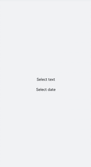
NOTE
When setting the value range of a common selector, you must use the data binding mode.
Setting the Time Format
Set the hours attribute to specify the time format used by the time picker. Available values include 12 and 24, indicating the 12-hour format and 24-hour format, respectively.
<!-- xxx.hml -->
<div class="container">
  <picker id="picker_time" type="time" value="12-hour format" hours="12" onchange="timeonchange"  class="pickertime"></picker>
  <picker id="picker_time" type="time" value="24-hour format" hours="24" onchange="timeonchange"  class="pickertime"></picker>
</div>
/* xxx.css */
.container {
  width: 100%;
  height: 100%;
  flex-direction: column;
  justify-content: center;
  align-items: center;
  background-color: #F1F3F5;
}
.pickertime {
  margin-bottom:50px;
  width: 300px;
  height: 50px;
}

NOTE
When hours is set to 12, the time is displayed in 12-hour format and distinguished by a.m. and p.m.
When hours is set to 24, the time is displayed in 24-hour format.
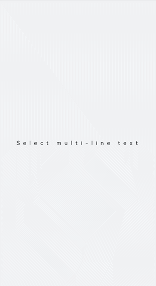
Adding Response Events
Add the change event to confirm selection and the cancel event to cancel selection.
<!-- xxx.hml -->
<div class="container">
  <picker id="picker_multi" type="multi-text" value="{{multitextvalue}}" columns="3" range="{{multitext}}" selected="
     {{multitextselect}}" onchange="multitextonchange" oncancel="multitextoncancel" class="pickermuitl"></picker>
</div>
/* xxx.css */
.container {
  width: 100%;
  height: 100%;
  flex-direction: column;
  justify-content: center;
  align-items: center;
  background-color: #F1F3F5;
}
.pickermuitl {
  margin-bottom:20px;
  width: 600px;
  height: 50px;
  font-size: 25px;
  letter-spacing:15px;
}
// xxx.js
import promptAction from '@ohos.promptAction';
export default {
  data: {
    multitext:[["a", "b", "c"], ["e", "f", "g"], ["h", "i"]],
    multitextvalue:'Select multi-line text',
    multitextselect:[0,0,0],
  },
  multitextonchange(e) {
    this.multitextvalue=e.newValue;
    promptAction.showToast({ message:"Multi-column text changed to:" + e.newValue })
  },
  multitextoncancel() {
    promptAction.showToast({ message:"multitextoncancel" })
  },
}
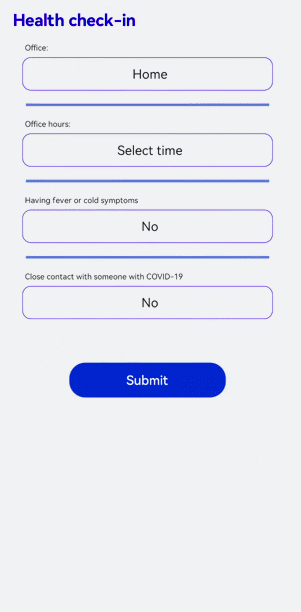
Example Scenario
Implement a health check-in application by using the <picker> component.
<!-- xxx.hml -->
<div class="doc-page">
  <text class="title">Health check-in</text>
  <div class="out-container">
    <text class="txt">Office:</text>
    <picker class="pick" focusable="true" type="text" value="{{pos}}" range="{{posarr}}" onchange="setPos"></picker>
  </div>
  <divider class="dvd"></divider>
  <div class="out-container">
    <text class="txt">Office hours:</text>
    <picker class="pick" type="date" value="{{datevalue}}"  start="2002-2-5" end="2030-6-5" selected="{{dateselect}}"
      lunarswitch="true" onchange="dateonchange"></picker>
  </div>
  <divider class="dvd"></divider>
  <div class="out-container">
    <text class="txt">Having fever or cold symptoms</text>
    <picker class="pick" type="text" value="{{yorn1}}" range="{{yesno}}" selected="1" onchange="isFever"></picker>
  </div>
  <divider class="dvd"></divider>
  <div class="out-container">
    <text class="txt">Close contact with someone with COVID-19</text>
    <picker class="pick" type="text" value="{{yorn2}}" range="{{yesno}}" selected="1" onchange="isTouch"></picker>
  </div>
  <div class="out-container">
    <button value="Submit" style="margin-top:100px;width:50%;font-color:#0000ff;height:80px" onclick="showtoast"></button>
  </div>
</div>
/* xxx.css */
.doc-page {
  flex-direction: column;
  background-color: #F1F3F5;
}
.title {
  margin-top: 30px;
  margin-bottom: 30px;
  margin-left: 50px;
  font-weight: bold;
  color: #0000ff;
  font-size: 38px;
}
.out-container {
  flex-direction: column;
  align-items: center;
}
.pick {
  width: 80%;
  height: 76px;
  border: 1px solid #0000ff;
  border-radius: 20px;
  padding-left: 12px;
}
.txt {
  width: 80%;
  font-size: 18px;
  text-align: left;
  margin-bottom: 12px;
  margin-left: 12px;
}
.dvd {
  margin-top: 30px;
  margin-bottom: 30px;
  margin-left: 80px;
  margin-right: 80px;
  color: #6495ED;
  stroke-width: 6px;
}
// xxx.js
import promptAction from '@ohos.promptAction'
export default {
  data: {
    yorn1:'No',
    yorn2:'No',
    pos:'Home',
    yesno:['Yes', 'No'],
    posarr:['Home', 'Company'],
    datevalue:'Select time',
    datetimeselect:'2012-5-6-11-25',
    dateselect:'2021-9-17',
    showbuild:true
  },
  onInit() {
  },
  isFever(e) {
    this.yorn1 = e.newValue
  },
  isTouch(e) {
    this.yorn2 = e.newValue
  },
  setPos(e) {
    this.pos = e.newValue
    if (e.newValue === 'Non-research center') {
      this.showbuild = false
    } else {
      this.showbuild = true
    }
  },
  setbuild(e) {
    this.build = e.newValue
  },
  dateonchange(e) {
    e.month=e.month+1;
    this.datevalue = e.year + "-" + e.month + "-" + e.day;
    promptAction.showToast({ message:"date:"+e.year+"-"+e.month+"-"+e.day })
  },
  showtoast() {
    promptAction.showToast({
      message: 'Submitted.',
      duration: 2000,
      gravity: 'center'
    })
  }
}