Keyboard and Mouse Event
Keyboard and mouse events refer to the input events of the peripheral keyboard and mouse.
Mouse Event
The supported mouse events include the events triggered by the peripheral mouse and touchpad.
Mouse events can trigger the following callbacks.
| Name | Description |
|---|---|
| onHover(event: (isHover: boolean) => void) | Triggered when the mouse pointer enters or leaves the component. isHover: whether the mouse pointer hovers over the component. The value true means that the mouse pointer enters the component, and the value false means that the mouse pointer leaves the component. |
| onMouse(event: (event?: MouseEvent) => void) | Triggered when the component is clicked by a mouse button or the mouse pointer moves on the component. The event parameter indicates the timestamp, mouse button, action, coordinates of the clicked point on the entire screen, and coordinates of the clicked point relative to the component when the event is triggered. |
When the component is bound to the onHover callback, you can use the hoverEffect attribute to set the hover effect of the component in hover state.
Figure 1 Mouse event data flow
When ArkUI receives the mouse event, it checks whether the mouse event concerns pressing, lifting, or moving of the left mouse button, and then responds accordingly.
-
Yes: The mouse event is first converted into a touch event in the same position, and a collision test, gesture judgment, and callback response of the touch event are performed. The collision test and callback response of the mouse event are then performed.
-
No: Only the collision test and callback response of the mouse event are performed.
NOTE
All touch events and gesture events that can be responded to by a single finger may be triggered and responded to by using the left mouse button. For example, to implement page redirection invoked by clicking a button with support for finger touches and left-clicks, you just need to bind one click event (onClick). If you want to implement different effects for the finger touch and the left-click, you can use the source parameter in the onClick callback to determine whether the current event is triggered by a finger or a mouse.
onHover
onHover(event: (isHover?: boolean) => void)
Triggered when the mouse pointer enters or leaves the component. The isHover parameter indicates whether the mouse pointer hovers over the component. This event does not support custom bubbling settings. By default, event bubbling occurs between parent and child components.
If this API is bound to a component, it is triggered when the mouse pointer enters the component from outside and the value of isHover is true, or when the mouse pointer leaves the component and the value of isHover is false.
NOTE
Event bubbling is an event propagation in the document object model (DOM) when an event is first handled by an element and then bubbles up to its parent element.
// xxx.ets
@Entry
@Component
struct MouseExample {
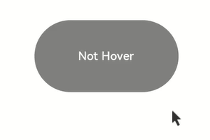
@State hoverText: string = 'Not Hover';
@State Color: Color = Color.Gray;
build() {
Column() {
Button(this.hoverText)
.width(200).height(100)
.backgroundColor(this.Color)
.onHover((isHover?: boolean) => { // Use the onHover API to listen for whether the mouse pointer is hovered over the button.
if (isHover) {
this.hoverText = 'Hovered!';
this.Color = Color.Green;
}
else {
this.hoverText = 'Not Hover';
this.Color = Color.Gray;
}
})
}.width('100%').height('100%').justifyContent(FlexAlign.Center)
}
}
In this example, a <Button component> is created, with the initial background color of gray and the content of Not Hover. The component is bound to the onHover callback. In the callback, this.isHovered is set to the callback parameter isHover.
When the mouse pointer moves from outside the button to inside the button, the callback is invoked, the value of isHover changes to true, the value of isHovered changes to true, the background color of the component changes to Color.Green, and the content changes to Hovered!.
When the mouse pointer moves from inside the button to outside the button, the callback is invoked, the value of isHover changes to false, and the component restores to its initial style.
onMouse
onMouse(event: (event?: MouseEvent) => void)
Triggered when a mouse event occurs. It is triggered each time a mouse pointer action (MouseAction) is detected in the component. The parameter is a MouseEvent object, which indicates the mouse event that triggers the callback. This event supports custom bubbling settings. By default, event bubbling occurs between parent and child components. It is commonly used for customized mouse behavior logic processing.
You can use the MouseEvent object in the callback to obtain information about the triggered event, including the coordinates (displayX, displayY, windowX, windowY, x, and y), button (MouseButton), action (MouseAction), timestamp (timestamp), display area of the object that triggers the event (EventTarget), and event source (SourceType). The stopPropagation callback of MouseEvent is used to set whether the current event blocks bubbling.
NOTE
MouseButton indicates the physical mouse button being pressed or released that triggers the mouse event. The values are Left, Right, Middle, Back, Forward, and None. None indicates that no button is pressed or released, which means that the event is triggered by the mouse pointer moving on the component.
// xxx.ets
@Entry
@Component
struct MouseExample {
@State buttonText: string = '';
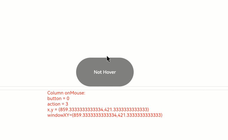
@State columnText: string = '';
@State hoverText: string = 'Not Hover';
@State Color: Color = Color.Gray;
build() {
Column() {
Button(this.hoverText)
.width(200)
.height(100)
.backgroundColor(this.Color)
.onHover((isHover?: boolean) => {
if (isHover) {
this.hoverText = 'Hovered!';
this.Color = Color.Green;
}
else {
this.hoverText = 'Not Hover';
this.Color = Color.Gray;
}
})
.onMouse((event?: MouseEvent) => { // Set the onMouse callback for the button.
if (event) {
this.buttonText = 'Button onMouse:\n' + '' +
'button = ' + event.button + '\n' +
'action = ' + event.action + '\n' +
'x,y = (' + event.x + ',' + event.y + ')' + '\n' +
'windowXY=(' + event.windowX + ',' + event.windowY + ')';
}
})
Divider()
Text(this.buttonText).fontColor(Color.Green)
Divider()
Text(this.columnText).fontColor(Color.Red)
}
.width('100%')
.height('100%')
.justifyContent(FlexAlign.Center)
.borderWidth(2)
.borderColor(Color.Red)
.onMouse((event?: MouseEvent) => { // Set the onMouse callback for the column.
if (event) {
this.columnText = 'Column onMouse:\n' + '' +
'button = ' + event.button + '\n' +
'action = ' + event.action + '\n' +
'x,y = (' + event.x + ',' + event.y + ')' + '\n' +
'windowXY=(' + event.windowX + ',' + event.windowY + ')';
}
})
}
}
Bind the onMouse API to the button based on the onHover example. In the callback, the values of the callback parameters, such as button and action, are displayed. The same settings are performed on the outer <Column> container. The entire process can be divided into the following two actions:
-
Moving the mouse pointer: When the mouse pointer is moved from outside the button to inside the button, only the onMouse callback of the <Column> is triggered. When the mouse pointer is moved to the button, as the onMouse event bubbles up by default, both the onMouse callbacks of the <Column> and <Button> components are invoked. In this process, the mouse pointer moves, but no mouse button is clicked. Therefore, in the displayed information, the value of button is 0 (enumerated value of MouseButton.None) and the value of action is 3 (enumerated value of MouseAction.Move).
-
Clicking the mouse button: After the mouse pointer enters the <Button> component, the <Button> component is clicked twice, namely, left-click and right-click. Left-clicked: button = 1 (enumerated value of MouseButton.Left); action = 1 (enumerated value of MouseAction.Press); action = 2 (enumerated value of MouseAction.Release).
Right-click: button = 2 (enumerated value of MouseButton.Right); action = 1 (enumerated value of MouseAction.Press); action = 2 (enumerated value of MouseAction.Release)
To prevent the mouse event from bubbling, call the stopPropagation() API.
class ish{
  isHovered:boolean = false
  set(val:boolean){
    this.isHovered = val;
  }
}
class butf{
  buttonText:string = ''
  set(val:string){
    this.buttonText = val
  }
}
@Entry
@Component
struct MouseExample {
  @State isHovered:ish = new ish()
  build(){
    Column(){
      Button(this.isHovered ? 'Hovered!' : 'Not Hover')
        .width(200)
        .height(100)
        .backgroundColor(this.isHovered ? Color.Green : Color.Gray)
        .onHover((isHover?: boolean) => {
          if(isHover) {
            let ishset = new ish()
            ishset.set(isHover)
          }
        })
        .onMouse((event?: MouseEvent) => {
          if (event) {
            if (event.stopPropagation) {
              event.stopPropagation(); // Prevent the onMouse event from bubbling.
            }
            let butset = new butf()
            butset.set('Button onMouse:\n' + '' +
              'button = ' + event.button + '\n' +
              'action = ' + event.action + '\n' +
              'x,y = (' + event.x + ',' + event.y + ')' + '\n' +
              'windowXY=(' + event.windowX + ',' + event.windowY + ')');
          }
        })
    }
  }
}
To prevent the mouse event of the child component (<Button>) from bubbling up to its parent component (<Column>), use the event parameter in the onMouse callback of <Button> to call the stopPropagation API.
event.stopPropagation()
With bubbling prevented, the mouse event on the <Button> component will trigger the onMouse callback of the <Button> component, but not the onMouse callback of the <Column> component.
hoverEffect
hoverEffect(value: HoverEffect)
Sets the hover effect of the component in hover state. The parameter value type is HoverEffect. The Auto, Scale, and Highlight effects are preset and do not support customization.
Table 1 HoverEffect
| Enum | Description |
|---|---|
| Auto | Default hover effect, which varies by component. |
| Scale | Scale effect. When the mouse pointer is placed over the component, the component is scaled up from 100% to 105%. When the mouse pointer is moved away, the component is scaled down from 105% to 100%. |
| Highlight | Background fade-in and fade-out effect. When the mouse pointer is placed over the component, a white layer with 5% opacity is applied to the background color of the component, resulting in a dimmed background. When the mouse pointer is moved away, the background color of the component is restored to the original style. |
| None | No effect. |
// xxx.ets
@Entry
@Component
struct HoverExample {
  build() {
    Column({ space: 10 }) {
      Button('Auto')
        .width(170).height(70)
      Button('Scale')
        .width(170).height(70)
        .hoverEffect(HoverEffect.Scale)
      Button('Highlight')
        .width(170).height(70)
        .hoverEffect(HoverEffect.Highlight)
      Button('None')
        .width(170).height(70)
        .hoverEffect(HoverEffect.None)
    }.width('100%').height('100%').justifyContent(FlexAlign.Center)
  }
}
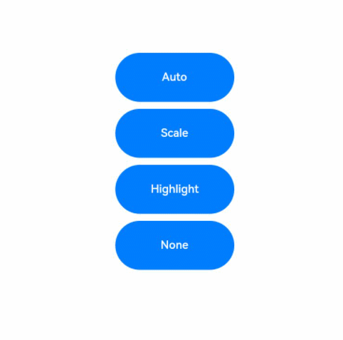
For the <Button> component, Auto creates the same effect as Scale.
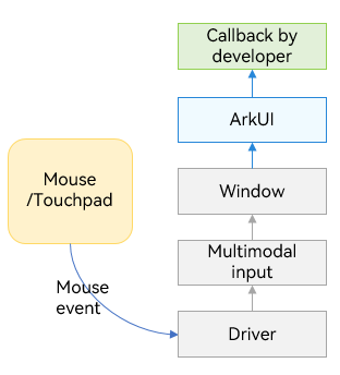
Key Event
Figure 2 Key event data flow
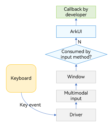
The key event is triggered by a device such as a peripheral keyboard, and is sent to the currently focused window after being converted by the driver and multi-mode processing. After obtaining the event, the window distributes the event to the input method (which consumes the key as the input). If the input method does not consume the key event, the window sends the event to the ArkUI framework. Therefore, when an input box component has focus and an input method is enabled, most key events are consumed by the input method. For example, a letter key is used by the input method to enter a letter in the input box, and an arrow key is used by the input method to switch to the desired candidate word.
After the key event is sent to the ArkUI framework, it first identifies the complete focus chain, and then sends the key event one by one from the leaf node to the root node.
onKeyEvent
onKeyEvent(event: (event?: KeyEvent) => void)
Triggered when the bound component has focus and a key event occurs on the component. The callback parameter KeyEvent can be used to obtain the information about the key event, including KeyType, keyCode, keyText, KeySource, deviceId, metaKey, timestamp, and stopPropagation.
// xxx.ets
@Entry
@Component
struct KeyEventExample {
@State buttonText: string = '';
@State buttonType: string = '';
@State columnText: string = '';
@State columnType: string = '';
build() {
Column() {
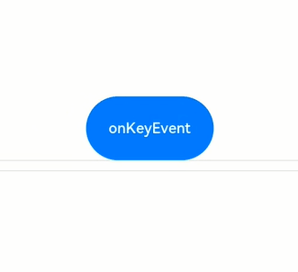
Button('onKeyEvent')
.defaultFocus(true)
.width(140).height(70)
.onKeyEvent((event?: KeyEvent) => { // Set the onKeyEvent event for the button.
if(event){
if (event.type === KeyType.Down) {
this.buttonType = 'Down';
}
if (event.type === KeyType.Up) {
this.buttonType = 'Up';
}
this.buttonText = 'Button: \n' +
'KeyType:' + this.buttonType + '\n' +
'KeyCode:' + event.keyCode + '\n' +
'KeyText:' + event.keyText;
}
})
Divider()
Text(this.buttonText).fontColor(Color.Green)
Divider()
Text(this.columnText).fontColor(Color.Red)
}.width('100%').height('100%').justifyContent(FlexAlign.Center)
.onKeyEvent((event?: KeyEvent) => { // Set the onKeyEvent event for the parent container <Column>.
if(event){
if (event.type === KeyType.Down) {
this.columnType = 'Down';
}
if (event.type === KeyType.Up) {
this.columnType = 'Up';
}
this.columnText = 'Column: \n' +
'KeyType:' + this.buttonType + '\n' +
'KeyCode:' + event.keyCode + '\n' +
'KeyText:' + event.keyText;
}
})
}
}
In the preceding example, onKeyEvent is bound to the <Button> component and its parent container <Column>. After the application opens and loads a page, the first focusable non-container component in the component tree automatically obtains focus. Set the <Button> component as the default focus of the current page. Because the <Button> component is a child node of the <Column> component, the <Column> component also obtains focus. For details about the focus obtaining mechanism, see Focus Event.

After the application is opened, press the following keys in sequence: Space, Enter, Left Ctrl, Left Shift, Letter A, and Letter Z.
-
Because the onKeyEvent event bubbles by default, the onKeyEvent callbacks of both <Button> and <Column> are invoked.
-
Each key has two callbacks, which correspond to KeyType.Down and KeyType.Up respectively, indicating that the key is pressed and then lifted.
To prevent the key event of the <Button> component from bubbling up to its parent container <Column>, add the event.stopPropagation() API to the onKeyEvent callback of <Button>.
// xxx.ets
@Entry
@Component
struct KeyEventExample {
  @State buttonText: string = '';
  @State buttonType: string = '';
  @State columnText: string = '';
  @State columnType: string = '';

  build() {
    Column() {
      Button('onKeyEvent')
        .defaultFocus(true)
        .width(140).height(70)
        .onKeyEvent((event?: KeyEvent) => {
          // Use stopPropagation to prevent the key event from bubbling up.
          if(event){
            if(event.stopPropagation){
              event.stopPropagation();
            }
            if (event.type === KeyType.Down) {
              this.buttonType = 'Down';
            }
            if (event.type === KeyType.Up) {
              this.buttonType = 'Up';
            }
            this.buttonText = 'Button: \n' +
              'KeyType:' + this.buttonType + '\n' +
              'KeyCode:' + event.keyCode + '\n' +
              'KeyText:' + event.keyText;
          }
        })

      Divider()
      Text(this.buttonText).fontColor(Color.Green)

      Divider()
      Text(this.columnText).fontColor(Color.Red)
    }.width('100%').height('100%').justifyContent(FlexAlign.Center)
    .onKeyEvent((event?: KeyEvent) => { //  Set the onKeyEvent event for the parent container <Column>.
      if(event){
        if (event.type === KeyType.Down) {
          this.columnType = 'Down';
        }
        if (event.type === KeyType.Up) {
          this.columnType = 'Up';
        }
        this.columnText = 'Column: \n' +
          'KeyType:' + this.buttonType + '\n' +
          'KeyCode:' + event.keyCode + '\n' +
          'KeyText:' + event.keyText;
      }
    })
  }
}