Rating
The <Rating> component provides a rating bar.
NOTE
This component is supported since API version 7. Updates will be marked with a superscript to indicate their earliest API version.
Child Components
Not supported
APIs
Rating(options?: { rating: number, indicator?: boolean })
Since API version 9, this API is supported in ArkTS widgets.
Parameters
| Name | Type | Mandatory | Description |
|---|---|---|---|
| rating | number | Yes | Value to rate. Default value: 0 Value range: [0, stars] A value less than 0 evaluates to the value 0. A value greater than the value of stars evaluates to the value of stars. Since API version 10, this parameter supports $$ for two-way binding of variables. |
| indicator | boolean | No | Whether the component is used only as an indicator. Default value: false NOTE When indicator is set to true, the default component height is 12.0 vp, and the component width is calculated as follows: Height x Value of stars. When indicator is set to false, the default component height is 28.0 vp, and the component width is calculated as follows: Height x Value of stars. |
Attributes
| Name | Type | Description |
|---|---|---|
| stars | number | Total number of ratings. Default value: 5 Since API version 9, this API is supported in ArkTS widgets. NOTE A value less than or equal to 0 evaluates to the default value. |
| stepSize | number | Step of an operation. Default value: 0.5 Since API version 9, this API is supported in ArkTS widgets. NOTE A value less than 0.1 evaluates to the default value. Value range: [0.1, stars] |
| starStyle | { backgroundUri: string, foregroundUri: string, secondaryUri?: string } |
Star style. backgroundUri: image path for the unselected star. You can use the default system image or a custom image. foregroundUri: image path for the selected star. You can use the default system image or a custom image. secondaryUri: image path for the partially selected star. You can use the default system image or a custom image. Since API version 9, this API is supported in ArkTS widgets. NOTE For details about the image types supported by the starStyle attribute, see Image. Local and online images are supported, but not PixelMap and Resource objects. By default, the image is loaded in asynchronous mode. Synchronous loading is not supported. If backgroundUri or foregroundUri is set to undefined or an empty string, the <Rating> component loads the default star image source. If secondaryUri is set to undefined or an empty string or is not set, backgroundUri is prioritized, which is equivalent to where only foregroundUri and backgroundUri are set. |
NOTE
The drawing area of each rating image is [width/stars, height], wherein width and height indicate the width and height of the <Rating> component, respectively.
To specify the drawing area as a square, you are advised to customize the width and height in this format: [height * stars, height], width = height * stars.
Events
| Name | Description |
|---|---|
| onChange(callback:(value: number) => void) | Triggered when the rating value changes. Since API version 9, this API is supported in ArkTS widgets. |
Sequential Keyboard Navigation Specifications
| Key | Description |
|---|---|
| Tab | Switch the focus between components. |
| Left and right arrow keys | Increase or decrease the rating on preview at the specified step, without changing the actual rating. |
| Home | Move the focus to the first star, without changing the actual rating. |
| End | Move the focus to the last star, without changing the actual rating. |
| Space/Enter | Submit the rating result based on the current rating. |
Example
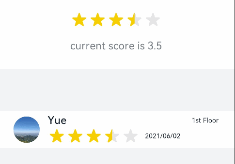
Example 1
// xxx.ets
@Entry
@Component
struct RatingExample {
  @State rating: number = 3.5

  build() {
    Column() {
      Column() {
        Rating({ rating: this.rating, indicator: false })
          .stars(5)
          .stepSize(0.5)
          .margin({ top: 24 })
          .onChange((value: number) => {
            this.rating = value
          })
        Text('current score is ' + this.rating)
          .fontSize(16)
          .fontColor('rgba(24,36,49,0.60)')
          .margin({ top: 16 })
      }.width(360).height(113).backgroundColor('#FFFFFF').margin({ top: 68 })

      Row() {
        Image('common/testImage.jpg')
          .width(40)
          .height(40)
          .borderRadius(20)
          .margin({ left: 24 })
        Column() {
          Text('Yue')
            .fontSize(16)
            .fontColor('#182431')
            .fontWeight(500)
          Row() {
            Rating({ rating: 3.5, indicator: false }).margin({ top: 1, right: 8 })
            Text('2021/06/02')
              .fontSize(10)
              .fontColor('#182431')
          }
        }.margin({ left: 12 }).alignItems(HorizontalAlign.Start)

        Text('1st Floor')
          .fontSize(10)
          .fontColor('#182431')
          .position({ x: 295, y: 8 })
      }.width(360).height(56).backgroundColor('#FFFFFF').margin({ top: 64 })
    }.width('100%').height('100%').backgroundColor('#F1F3F5')
  }
}
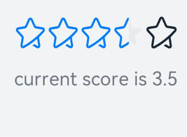
Example 2
// xxx.ets
@Entry
@Component
struct RatingExample {
  @State rating: number = 3.5

  build() {
    Column() {
      Rating({ rating: this.rating, indicator: false })
        .stars(5)
        .stepSize(0.5)
        .starStyle({
          backgroundUri: '/common/imag1.png', // The common folder is at the same level as pages.
          foregroundUri: '/common/imag2.png',
          secondaryUri: '/common/imag3.png'
        })
        .margin({ top: 24 })
        .onChange((value: number) => {
          this.rating = value
        })
      Text('current score is ' + this.rating)
        .fontSize(16)
        .fontColor('rgba(24,36,49,0.60)')
        .margin({ top: 16 })
    }.width('100%').height('100%').backgroundColor('#F1F3F5')
  }
}