@ohos.arkui.advanced.SelectTitleBar (Drop-down Title Bar)
The drop-down title bar is a title bar that contains a drop-down menu for switching between pages of different levels (configured with the Back button).
NOTE
This component is supported since API version 10. Updates will be marked with a superscript to indicate their earliest API version.
Modules to Import
import { SelectTitleBar } from "@ohos.arkui.advanced.SelectTitleBar"
Child Components
Not supported
Attributes
The universal attributes are not supported.
SelectTitleBar
SelectTitleBar({selected: number, options: Array<SelectOption>, menuItems?: Array<SelectTitleBarMenuItem>, subtitle?: ResourceStr, badgeValue?: number, hidesBackButton?: boolean, onSelected?: (index: number) => void})
Decorator: @Component
System capability: SystemCapability.ArkUI.ArkUI.Full
Parameters
| Name | Type | Mandatory | Decorator | Description |
|---|---|---|---|---|
| selected | number | Yes | @Prop | Index of the currently selected option. The index of the first option is 0. If this attribute is not set, the default value -1 will be used. |
| options | Array<SelectOption> | Yes | - | Options in the drop-down menu. |
| menuItems | Array<SelectTitleBarMenuItem> | No | - | List of menu items on the right of the title bar. |
| subtitle | ResourceStr | No | - | Subtitle. |
| badgeValue | number | No | - | Badge. |
| hidesBackButton | boolean | No | - | Whether to hide the back arrow on the left. Default value: false The value true means to hide the provider, and false means the opposite. |
| onSelected | (index: number) => void | No | - | Invoked when an option in the drop-down list box is selected. The index of the selected option is passed in. |
SelectTitleBarMenuItem
| Name | Type | Mandatory | Description |
|---|---|---|---|
| value | ResourceStr | Yes | Icon. |
| isEnabled | boolean | No | Whether to enable the item. Default value: false The value true means to enable the item, and false means the opposite. |
| action | () => void | No | Action to perform. |
Events
The universal events are not supported.
Example
import { SelectTitleBar } from "@ohos.arkui.advanced.SelectTitleBar"
import promptAction from '@ohos.promptAction'
interface menuItems {
value: Resource;
isEnabled?: boolean;
action?: () => void
}
@Entry
@Component
struct Index {
private menuItems:Array<menuItems> =
[
{
value:$r('app.media.ic_public_save'),
isEnabled:true,
action:() => promptAction.showToast({ message: "show toast index 1" })
},
{
value:$r('app.media.ic_public_reduce'),
isEnabled:true,
action:() => promptAction.showToast({ message: "show toast index 2" })
},
{
value:$r('app.media.ic_public_edit'),
isEnabled:true,
action:() => promptAction.showToast({ message: "show toast index 3" })
},
{
value:$r('app.media.ic_public_reduce'),
isEnabled:true,
action:() => promptAction.showToast({ message: "show toast index 4" })
}
]
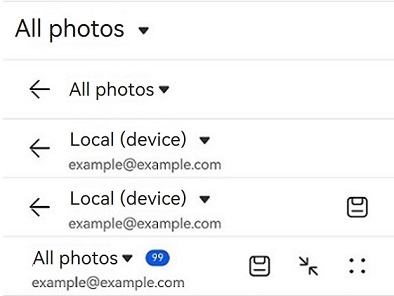
build() {
Row() {
Column() {
Divider().height(2).color(0xCCCCCC)
SelectTitleBar({
options: [
{ value: 'All photos' },
{ value:'Local (device)' },
{"value":"Local (memory card)"}
],
selected: 0,
onSelected: (index) => promptAction.showToast({ message: 'page index ' + index }),
hidesBackButton: true
})
Divider().height(2).color(0xCCCCCC)
SelectTitleBar({
options: [
{ value: 'All photos' },
{ value:'Local (device)' },
{"value":"Local (memory card)"}
],
selected: 0,
onSelected: (index) => promptAction.showToast({ message: 'page index ' + index }),
hidesBackButton: false
})
Divider().height(2).color(0xCCCCCC)
SelectTitleBar({
options: [
{ value: 'All photos' },
{ value:'Local (device)' },
{"value":"Local (memory card)"}
],
selected: 1,
onSelected: (index) => promptAction.showToast({ message: 'page index ' + index }),
subtitle: "example@example.com"
})
Divider().height(2).color(0xCCCCCC)
SelectTitleBar({
options: [
{ value: 'All photos' },
{ value:'Local (device)' },
{"value":"Local (memory card)"}
],
selected: 1,
onSelected: (index) => promptAction.showToast({ message: 'page index ' + index }),
subtitle: "example@example.com",
menuItems: [{ isEnabled: true, value: $r('app.media.ic_public_save'),
action: () => promptAction.showToast({ message: "show toast index 1" })
}]
})
Divider().height(2).color(0xCCCCCC)
SelectTitleBar({
options: [
{ value: 'All photos' },
{ value:'Local (device)' },
{"value":"Local (memory card)"}
],
selected: 0,
onSelected: (index) => promptAction.showToast({ message: 'page index ' + index }),
subtitle: "example@example.com",
menuItems: this.menuItems,
badgeValue: 99,
hidesBackButton: true
})
Divider().height(2).color(0xCCCCCC)
}.width('100%')
}.height('100%')
}
}