Dialog
A dialog is a modal window. Before it disappears, users cannot perform any operation.
How to Use
-
Use a dialog to display information or operations that users need or must pay attention to. In other cases, use a non-modal window such as a notification window.
-
Include a combination of different components, for example, text (in different formats, such as indentation, link, or bold), list, text box, grid, icon, and image, in a dialog. It is generally used to select or confirm information.
Category
-
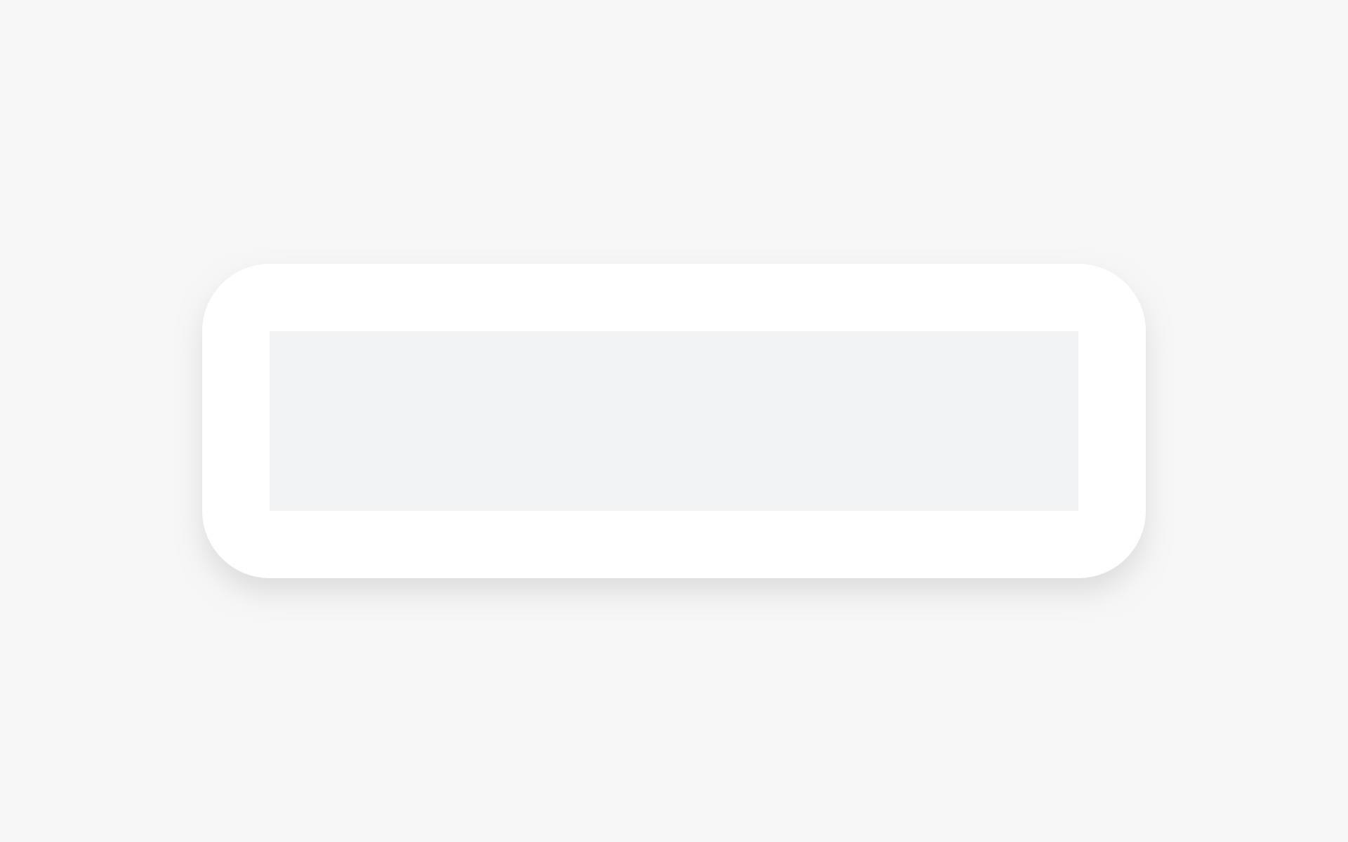
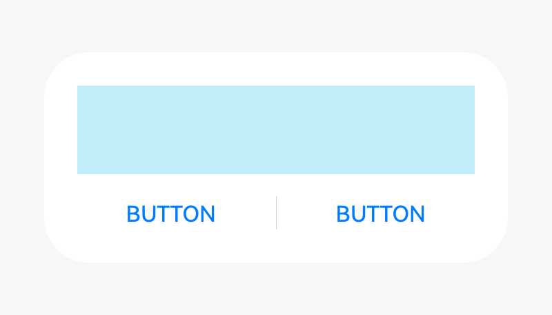
Dialog without a title
-
Dialog with a title
-
Dialog with text only
Dialog Without a Title
A dialog does not have a title.
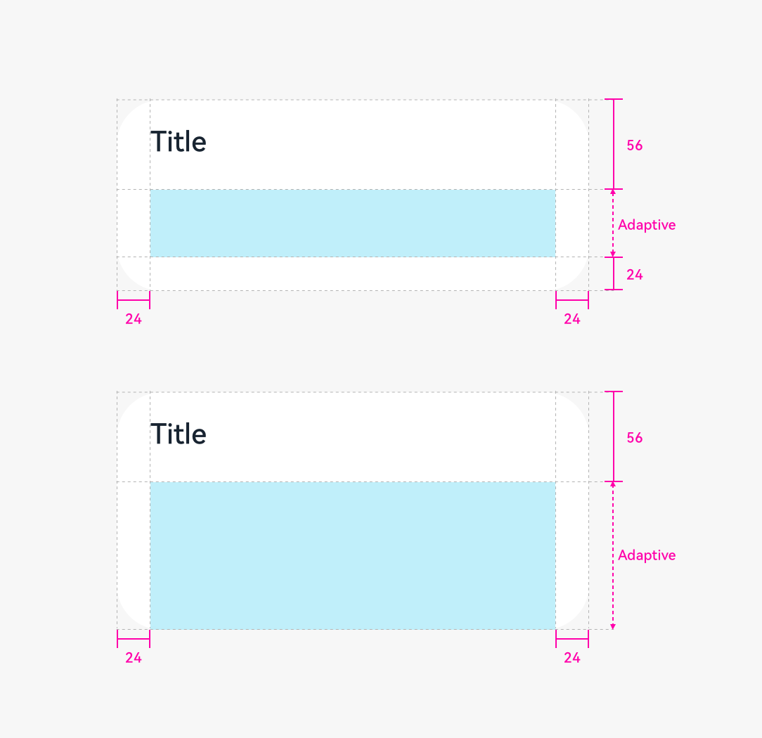
If the content is not displayed in a list, leave a margin of 24 vp both above and below the content.
 |
 |
|---|---|
| Content only | Content and button |
Dialog with a Title
In the title area, there can be a pure title in one or two lines. Alternatively, there can be a title followed by an operation icon.
 |
|---|
| Title and content |
If the content is not displayed in a list, leave a margin of 24 vp both above and below the content.
Dialog with Text Only
If there is only a title, the title is centered.
Height and Position
The height and location of a dialog differs in portrait and landscape orientations.
Portrait
Maximum height of a dialog = 0.8 x (Screen height – Status bar height – Navigation bar height)
Position: Always above the navigation bar (even if the navigation bar is hidden)
Landscape
Maximum height of a dialog = 0.9 x (Screen height – Status bar)
Position: Center aligned the screen height excluding the status bar
Writing Instructions
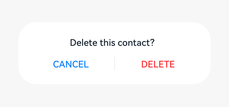
Dialog for Operation Confirmation
Title
-
Short and complete. No period is required if a statement is used.
-
Exclamation marks and question marks are required for exclamatory and interrogative sentences, respectively.
-
Concise and clear. Titles can be a phrase (verb + noun).
Content text
- Describe the content that needs to be confirmed by users. The content can be questions or statements. Try not to provide additional information. If necessary, avoid repeating the title.
Button
-
Buttons allow the user to choose whether to proceed with the next action. Use operation content for buttons.
-
Button contents are usually the same as the verbs in the title. Do not use "Yes" or "No".
Dialog for Information Confirmation
Content text
- Use statements to describe the specific items that need to be notified to users. For example, no updates available.
Button
- Use OK.
Rules for Handling Ultra-Long UI Strings
Title in a Dialog
-
Decrease the font size to 15 fp level by level.
-
Wrap lines if the length exceeds the upper limit.
-
If the text still cannot fit in, use "..." for truncation.
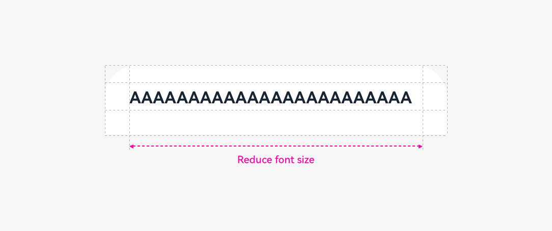
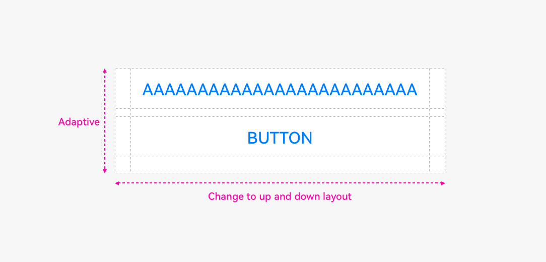
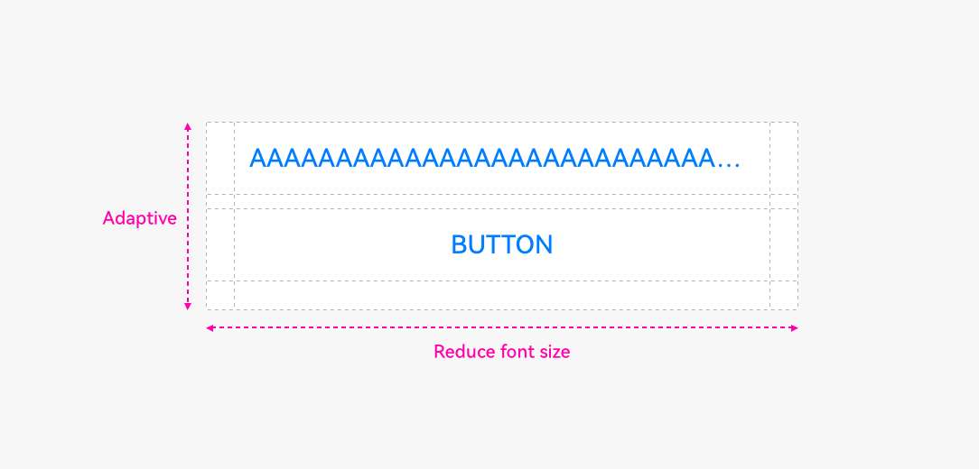
Button in a Dialog
- Do not wrap lines for button texts.
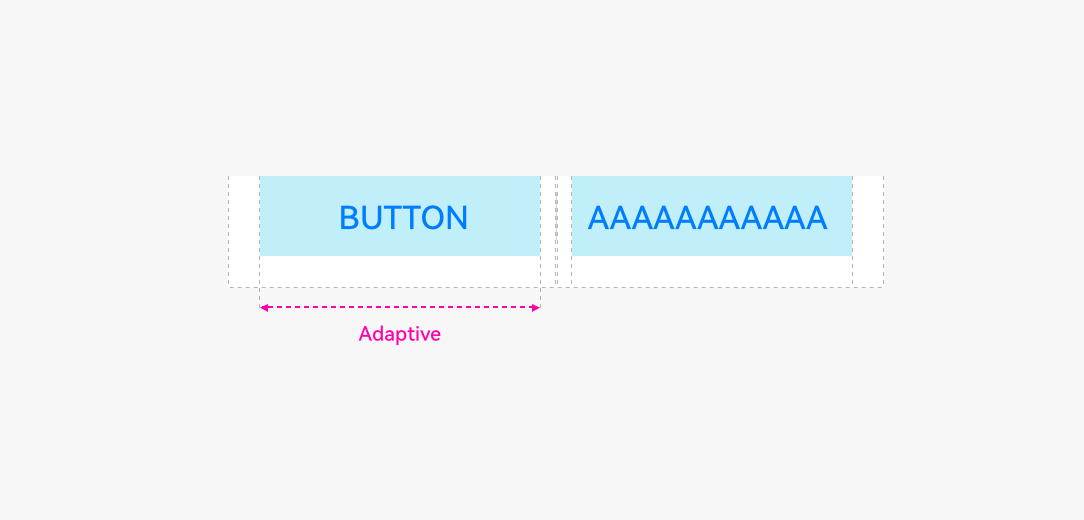
- Change the buttons from horizontal alignment to vertical alignment.
-
Reduce the font size level by level until the minimum font size 9 fp is reached.
-
If the text still cannot fit in, use "..." for truncation.
Resources
For details about the dialog box, see the API Reference.