位置设置
设置组件的对齐方式、布局方向和显示位置。
说明:
从API Version 7开始支持。后续版本如有新增内容,则采用上角标单独标记该内容的起始版本。
align
align(value: Alignment)
设置容器元素绘制区域内的子元素的对齐方式。
卡片能力: 从API version 9开始,该接口支持在ArkTS卡片中使用。
系统能力: SystemCapability.ArkUI.ArkUI.Full
参数:
| 参数名 | 类型 | 必填 | 说明 |
|---|---|---|---|
| value | Alignment | 是 | 设置容器元素绘制区域内的子元素的对齐方式。 只在Stack、Button、Marquee、StepperItem、text、TextArea、TextInput、FolderStack中生效,其中和文本相关的组件Marquee、text、TextArea、TextInput的align结果参考textAlign。 不支持textAlign属性的组件则无法设置水平方向的文字对齐。 默认值:Alignment.Center 说明: 在Stack中该属性与alignContent效果一致,只能设置子组件在容器内的对齐方式。 |
direction
direction(value: Direction)
设置容器元素内主轴方向上的布局。
卡片能力: 从API version 9开始,该接口支持在ArkTS卡片中使用。
系统能力: SystemCapability.ArkUI.ArkUI.Full
参数:
| 参数名 | 类型 | 必填 | 说明 |
|---|---|---|---|
| value | Direction | 是 | 设置容器元素内主轴方向上的布局。 该属性在Column组件上不生效。 默认值:Direction.Auto |
position
position(value: Position)
绝对定位,设置子元素左上角相对于父容器左上角偏移位置。
卡片能力: 从API version 9开始,该接口支持在ArkTS卡片中使用。
系统能力: SystemCapability.ArkUI.ArkUI.Full
参数:
| 参数名 | 类型 | 必填 | 说明 |
|---|---|---|---|
| value | Position | 是 | 绝对定位,设置子元素左上角相对于父容器左上角偏移位置。在布局容器中,设置该属性不参与父容器布局,即不占位,仅在绘制时进行位置调整。 适用于置顶显示、悬浮按钮等组件在父容器中位置固定的场景。 不支持在宽高为零的布局容器上设置。 当父容器为RelativeContainer时不生效。 |
markAnchor
markAnchor(value: Position)
设置子元素在位置定位时的锚点。
卡片能力: 从API version 9开始,该接口支持在ArkTS卡片中使用。
系统能力: SystemCapability.ArkUI.ArkUI.Full
参数:
| 参数名 | 类型 | 必填 | 说明 |
|---|---|---|---|
| value | Position | 是 | 设置子元素在位置定位时的锚点,从position或offset的位置上,进一步偏移。 设置.position({x: value1, y: value2}).markAnchor({x: value3, y: value4}),效果等于设置.position({x: value1 - value3, y: value2 - value4}),offset同理。 单独使用markAnchor,设置.markAnchor({x: value1, y: value2}),效果等于设置.offset({x: -value1, y: -value2})。 API version 9及以前,默认值为: { x: 0, y: 0 } API version 10:无默认值。 |
offset
offset(value: Position)
相对定位,设置子元素相对于自身的额外偏移量。
卡片能力: 从API version 9开始,该接口支持在ArkTS卡片中使用。
系统能力: SystemCapability.ArkUI.ArkUI.Full
参数:
| 参数名 | 类型 | 必填 | 说明 |
|---|---|---|---|
| value | Position | 是 | 相对定位,设置子元素相对于自身的额外偏移量。设置该属性后,子组件正常参与父容器布局,依然会占位,在绘制时基于父容器给予的offset做一次额外的偏移。 API version 9及以前,默认值为: { x: 0, y: 0 } API version 10:无默认值。 |
alignRules9+
alignRules(value: AlignRuleOption)
指定设置在相对容器中子组件的对齐规则,仅当父容器为RelativeContainer时生效。
卡片能力: 从API version 9开始,该接口支持在ArkTS卡片中使用。
系统能力: SystemCapability.ArkUI.ArkUI.Full
参数:
| 参数名 | 类型 | 必填 | 说明 |
|---|---|---|---|
| value | AlignRuleOption | 是 | 指定设置在相对容器中子组件的对齐规则。 |
AlignRuleOption对象说明
从API version 9开始,该接口支持在ArkTS卡片中使用。
| 名称 | 类型 | 描述 |
|---|---|---|
| left | { anchor: string, align: HorizontalAlign } | 设置左对齐参数。 - anchor:设置作为锚点的组件的id值。 - align:设置相对于锚点组件的对齐方式。 |
| right | { anchor: string, align: HorizontalAlign } | 设置右对齐参数。 - anchor:设置作为锚点的组件的id值。 - align:设置相对于锚点组件的对齐方式。 |
| middle | { anchor: string, align: HorizontalAlign } | 设置横向居中对齐方式的参数。 - anchor:设置作为锚点的组件的id值。 - align:设置相对于锚点组件的对齐方式。 |
| top | { anchor: string, align: VerticalAlign } | 设置顶部对齐的参数。 - anchor:设置作为锚点的组件的id值。 - align:设置相对于锚点组件的对齐方式。 |
| bottom | { anchor: string, align: VerticalAlign } | 设置底部对齐的参数。 - anchor:设置作为锚点的组件的id值。 - align:设置相对于锚点组件的对齐方式。 |
| center | { anchor: string, align: VerticalAlign } | 设置纵向居中对齐方式的参数。 |
| bias | Bias | 设置组件在锚点约束下的偏移参数,其值为到左/上侧锚点的距离与锚点间总距离的比值。 |
Bias对象说明
| 参数名 | 类型 | 必填 | 说明 |
|---|---|---|---|
| Bias | { horizontal?: number, vertical?: number } | 否 | 组件在锚点约束下的偏移参数。 - horizontal:水平方向上的bias值。 - vertical:垂直方向上的bias值。 - 当子组件的width可以确定并且有2个水平方向的锚点时生效。 - 当子组件的height可以确定并且有2个垂直方向的锚点时生效。 默认值:{ horizontal: 0.5, vertical: 0.5 }。 |
示例
示例1
// xxx.ets
@Entry
@Component
struct PositionExample1 {
build() {
Column() {
Column({ space: 10 }) {
// 元素内容<元素宽高,设置内容在与元素内的对齐方式
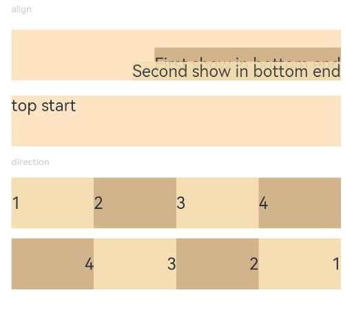
Text('align').fontSize(9).fontColor(0xCCCCCC).width('90%')
Stack() {
Text('First show in bottom end').height('65%').backgroundColor(0xD2B48C)
Text('Second show in bottom end').backgroundColor(0xF5DEB3).opacity(0.9)
}.width('90%').height(50).margin({ top: 5 }).backgroundColor(0xFFE4C4)
.align(Alignment.BottomEnd)
Stack() {
Text('top start')
}.width('90%').height(50).margin({ top: 5 }).backgroundColor(0xFFE4C4)
.align(Alignment.TopStart)
// 父容器设置direction为Direction.Ltr,子元素从左到右排列
Text('direction').fontSize(9).fontColor(0xCCCCCC).width('90%')
Row() {
Text('1').height(50).width('25%').fontSize(16).backgroundColor(0xF5DEB3)
Text('2').height(50).width('25%').fontSize(16).backgroundColor(0xD2B48C)
Text('3').height(50).width('25%').fontSize(16).backgroundColor(0xF5DEB3)
Text('4').height(50).width('25%').fontSize(16).backgroundColor(0xD2B48C)
}
.width('90%')
.direction(Direction.Ltr)
// 父容器设置direction为Direction.Rtl,子元素从右到左排列
Row() {
Text('1').height(50).width('25%').fontSize(16).backgroundColor(0xF5DEB3).textAlign(TextAlign.End)
Text('2').height(50).width('25%').fontSize(16).backgroundColor(0xD2B48C).textAlign(TextAlign.End)
Text('3').height(50).width('25%').fontSize(16).backgroundColor(0xF5DEB3).textAlign(TextAlign.End)
Text('4').height(50).width('25%').fontSize(16).backgroundColor(0xD2B48C).textAlign(TextAlign.End)
}
.width('90%')
.direction(Direction.Rtl)
}
}
.width('100%').margin({ top: 5 })
}
}
示例2
// xxx.ets
@Entry
@Component
struct PositionExample2 {
build() {
Column({ space: 20 }) {
// 设置子组件左上角相对于父组件左上角的偏移位置
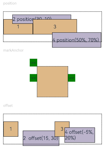
Text('position').fontSize(12).fontColor(0xCCCCCC).width('90%')
Row() {
Text('1').size({ width: '30%', height: '50' }).backgroundColor(0xdeb887).border({ width: 1 }).fontSize(16)
.textAlign(TextAlign.Center)
Text('2 position(30, 10)')
.size({ width: '60%', height: '30' })
.backgroundColor(0xbbb2cb)
.border({ width: 1 })
.fontSize(16)
.align(Alignment.Start)
.position({ x: 30, y: 10 })
Text('3').size({ width: '45%', height: '50' }).backgroundColor(0xdeb887).border({ width: 1 }).fontSize(16)
.textAlign(TextAlign.Center)
Text('4 position(50%, 70%)')
.size({ width: '50%', height: '50' })
.backgroundColor(0xbbb2cb)
.border({ width: 1 })
.fontSize(16)
.position({ x: '50%', y: '70%' })
}.width('90%').height(100).border({ width: 1, style: BorderStyle.Dashed })
// 相对于起点偏移,其中x为最终定位点距离起点水平方向间距,x>0往左,反之向右。
// y为最终定位点距离起点垂直方向间距,y>0向上,反之向下
Text('markAnchor').fontSize(12).fontColor(0xCCCCCC).width('90%')
Stack({ alignContent: Alignment.TopStart }) {
Row()
.size({ width: '100', height: '100' })
.backgroundColor(0xdeb887)
Text('text')
.fontSize('30px')
.textAlign(TextAlign.Center)
.size({ width: 25, height: 25 })
.backgroundColor(Color.Green)
.markAnchor({ x: 25, y: 25 })
Text('text')
.fontSize('30px')
.textAlign(TextAlign.Center)
.size({ width: 25, height: 25 })
.backgroundColor(Color.Green)
.markAnchor({ x: -100, y: -25 })
Text('text')
.fontSize('30px')
.textAlign(TextAlign.Center)
.size({ width: 25, height: 25 })
.backgroundColor(Color.Green)
.markAnchor({ x: 25, y: -25 })
}.margin({ top: 25 }).border({ width: 1, style: BorderStyle.Dashed })
// 相对定位,x>0向右偏移,反之向左,y>0向下偏移,反之向上
Text('offset').fontSize(12).fontColor(0xCCCCCC).width('90%')
Row() {
Text('1').size({ width: '15%', height: '50' }).backgroundColor(0xdeb887).border({ width: 1 }).fontSize(16)
.textAlign(TextAlign.Center)
Text('2 offset(15, 30)')
.size({ width: 120, height: '50' })
.backgroundColor(0xbbb2cb)
.border({ width: 1 })
.fontSize(16)
.align(Alignment.Start)
.offset({ x: 15, y: 30 })
Text('3').size({ width: '15%', height: '50' }).backgroundColor(0xdeb887).border({ width: 1 }).fontSize(16)
.textAlign(TextAlign.Center)
Text('4 offset(-5%, 20%)')
.size({ width: 100, height: '50' })
.backgroundColor(0xbbb2cb)
.border({ width: 1 })
.fontSize(16)
.offset({ x: '-5%', y: '20%' })
}.width('90%').height(100).border({ width: 1, style: BorderStyle.Dashed })
}
.width('100%').margin({ top: 25 })
}
}