@ohos.arkui.advanced.Popup (Popup)
The popup component is used to display popups in a specific style.
NOTE
This component is supported since API version 11. Updates will be marked with a superscript to indicate their earliest API version.
Modules to Import
import { Popup, PopupOptions, PopupTextOptions, PopupButtonOptions, PopupIconOptions } from '@ohos.arkui.advanced.Popup';
Child Components
Not supported
Popup
Popup(options: PopupOptions)
Decorator: @Builder
System capability: SystemCapability.ArkUI.ArkUI.Full
Parameters
| Name | Type | Mandatory | Description |
|---|---|---|---|
| options | PopupOptions | Yes | Type of the popup. |
PopupOptions
Defines the style parameters of the popup.
System capability: SystemCapability.ArkUI.ArkUI.Full
| Name | Type | Mandatory | Description |
|---|---|---|---|
| icon | PopupIconOptions | No | Icon of the popup. NOTE The icon is not displayed when size is set to an invalid value or 0. |
| title | PopupTextOptions | No | Title of the popup. |
| message | PopupTextOptions | Yes | Content of the popup. NOTE fontWeight is not available for messages. |
| showClose | boolean | Resource | No | Whether to show the close button. |
| onClose | () => void | No | Callback for the popup close button. |
| buttons | [PopupButtonOptions?,PopupButtonOptions?] | No | Buttons of the popup. A maximum of two buttons can be set. |
PopupTextOptions
Defines the text parameters of the popup.
System capability: SystemCapability.ArkUI.ArkUI.Full
| Name | Type | Mandatory | Description |
|---|---|---|---|
| text | ResourceStr | Yes | Text content. |
| fontSize | number | string | Resource | No | Text font size. |
| fontColor | ResourceColor | No | Text font color. |
| fontWeight | number | FontWeight | string | No | Text font weight. |
PopupButtonOptions
Defines the button attributes and events.
System capability: SystemCapability.ArkUI.ArkUI.Full
| Name | Type | Mandatory | Description |
|---|---|---|---|
| text | ResourceStr | Yes | Text of the button. |
| action | () => void | No | Click callback of the button. |
| fontSize | number | string | Resource | No | Font size of the button text. |
| fontColor | ResourceColor | No | Font color of the button text. |
PopupIconOptions
Defines the attributes of the icon (in the upper right corner).
System capability: SystemCapability.ArkUI.ArkUI.Full
| Name | Type | Mandatory | Description |
|---|---|---|---|
| image | ResourceStr | Yes | Icon content. |
| width | Dimension | No | Icon width. Default value: 32VP |
| height | Dimension | No | Icon height. Default value: 32VP |
| fillColor | ResourceColor | No | Icon fill color. |
| borderRadius | Length | BorderRadiuses | No | Rounded corner of the icon. Default value: 12VP |
Example
// xxx.ets
import { Popup, PopupOptions, PopupTextOptions, PopupButtonOptions, PopupIconOptions } from '@ohos.arkui.advanced.Popup';
@Entry
@Component
struct PopupExample {
build() {
Row() {
// Define the custom advanced component through popup.
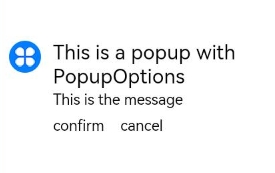
Popup({
// Set the icon through PopupIconOptions.
icon: {
image: $r('app.media.icon'),
width:32,
height:32,
fillColor:Color.White,
borderRadius: 16,
} as PopupIconOptions,
// Set the text through PopupTextOptions.
title: {
text: 'This is a popup with PopupOptions',
fontSize: 20,
fontColor: Color.Black,
fontWeight: FontWeight.Normal,
} as PopupTextOptions,
// Set the text through PopupTextOptions.
message: {
text: 'This is the message',
fontSize: 15,
fontColor: Color.Black,
} as PopupTextOptions,
showClose: false,
onClose: () => {
console.info('close Button click')
},
// Set the button through PopupButtonOptions.
buttons: [{
text: 'confirm',
action: () => {
console.info('confirm button click')
},
fontSize: 15,
fontColor: Color.Black,
},
{
text: 'cancel',
action: () => {
console.info('cancel button click')
},
fontSize: 15,
fontColor: Color.Black,
},] as [PopupButtonOptions?, PopupButtonOptions?],
})
}
.width(300)
.height(200)
.borderWidth(2)
.justifyContent(FlexAlign.Center)
}
}