Obscuring
When needed, you can obscure content of a component.
NOTE
The APIs of this module are supported since API version 10. Updates will be marked with a superscript to indicate their earliest API version.
obscured
obscured(reasons: Array<ObscuredReasons>)
Sets how the component content is obscured.
System capability: SystemCapability.ArkUI.ArkUI.Full
Parameters
| Name | Type | Mandatory | Description |
|---|---|---|---|
| reasons | Array<ObscuredReasons> | Yes | How the component content is obscured. Default value: [] This API is supported in ArkTS widgets. This API only works for the <Image> and <Text> components. NOTE To obscure an image when it is being loaded, you must set the width and height of the <Image> component. Obscuring is not available for <Text> components that have child components. |
Example
// xxx.ets
@Entry
@Component
struct ObscuredExample {
build() {
Row() {
Column() {
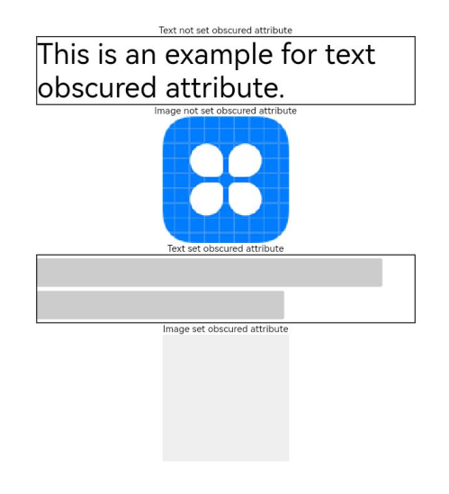
Text('Text not set obscured attribute').fontSize(10).fontColor(Color.Black)
Text('This is an example for text obscured attribute.')
.fontSize(30)
.width('600px')
.fontColor(Color.Black)
.border({ width: 1 })
Text('Image not set obscured attribute').fontSize(10).fontColor(Color.Black)
Image($r('app.media.icon'))
.width('200px')
.height('200px')
Text('Text set obscured attribute').fontSize(10).fontColor(Color.Black)
Text('This is an example for text obscured attribute.')
.fontSize(30)
.width('600px')
.fontColor(Color.Black)
.border({ width: 1 })
.obscured([ObscuredReasons.PLACEHOLDER])
Text('Image set obscured attribute').fontSize(10).fontColor(Color.Black)
Image($r('app.media.icon'))
.width('200px')
.height('200px')
.obscured([ObscuredReasons.PLACEHOLDER])
}
.width('100%')
}
.height('100%')
}
}