Select
The <Select> component provides a drop-down list box that allows users to select among multiple options.
NOTE
This component is supported since API version 8. Updates will be marked with a superscript to indicate their earliest API version.
Child Components
Not supported
APIs
Select(options: Array<SelectOption>)
Parameters
| Name | Type | Mandatory | Description |
|---|---|---|---|
| options | Array<SelectOption> | Yes | Options in the drop-down list box. |
SelectOption
| Name | Type | Mandatory | Description |
|---|---|---|---|
| value | ResourceStr | Yes | Value of an option in the drop-down list box. |
| icon | ResourceStr | No | Icon of an option in the drop-down list box. |
Attributes
In addition to the universal attributes, the following attributes are supported.
| Name | Type | Description |
|---|---|---|
| selected | number | Resource11+ | Index of the initial selected option in the drop-down list box. The index of the first option is 0. If this attribute is set to an invalid value or is not set, the default value -1 will be used, which means that no option will be selected. If this attribute is set to undefined or null, the first option will be selected. Since API version 10, this attribute supports two-way binding through $$. |
| value | ResourceStr11+ | Text of the drop-down button. By default, it will be replaced by the content of the selected option. Since API version 10, this attribute supports two-way binding through $$. |
| font | Font | Text font of the drop-down button. Default value: { size: '16fp', weight: FontWeight.Medium } NOTE When size is set to 0, the text is not displayed. When size is set to a negative value, the text is displayed at its default size. |
| fontColor | ResourceColor | Text color of the drop-down button. Default value: '#E5182431' |
| selectedOptionBgColor | ResourceColor | Background color of the selected option in the drop-down list box. Default value: '#33007DFF' |
| selectedOptionFont | Font | Text font of the selected option in the drop-down list box. Default value: { size: '16fp', weight: FontWeight.Regular } NOTE When size is set to 0, the text is not displayed. When size is set to a negative value, the text is displayed at its default size. |
| selectedOptionFontColor | ResourceColor | Text color of the selected option in the drop-down list box. Default value: '#ff007dff' |
| optionBgColor | ResourceColor | Background color of an option in the drop-down list box. Default value: '#ffffffff' |
| optionFont | Font | Text font of an option in the drop-down list box. Default value: { size: '16fp', weight: FontWeight.Regular } NOTE When size is set to 0, the text is not displayed. When size is set to a negative value, the text is displayed at its default size. |
| optionFontColor | ResourceColor | Text color of an option in the drop-down list box. Default value: '#ff182431' |
| space10+ | Length | Spacing between the text and arrow of an option. NOTE This attribute cannot be set in percentage. Default value: 8 If this attribute to null, undefined, or a value less than or equal to 8, the default value is used. |
| arrowPosition10+ | ArrowPosition | Alignment between the text and arrow of an option. Default value: ArrowPosition.END |
| menuAlign10+ | alignType: MenuAlignType, offset?: Offset |
Alignment between the drop-down button and the drop-down menu. - alignType: alignment type. Mandatory. Default value: MenuAlignType.START - offset: offset of the drop-down menu relative to the drop-down button after alignment based on the specified alignment type. Default value: {dx: 0, dy: 0} |
| optionWidth11+ | Dimension | OptionWidthMode | Width of the option in the drop-down list box. OptionWidthMode specifies whether to inherit the width of the drop-down list button. If set to undefined, null, or a negative number, this attribute does not take effect. In this case, the default width of two columns is used. If the value is less than the minimum width 56 vp, the default width of two columns is used. The value must be greater than or equal to 0. NOTE This attribute cannot be set in percentage. |
| optionHeight11+ | Dimension | Maximum height of the option in the drop-down list box. The default and maximum value is 80% of the available height of the screen. If set to undefined, null, or a negative number, this attribute does not take effect. In this case, the default value is used. The value must be greater than 0 If the actual height of all options in the drop-down list box is less than the preset height, the options are displayed at their actual height. NOTE This attribute cannot be set in percentage. |
| menuBackgroundColor11+ | ResourceColor | Background color of the drop-down list box. Default value: Color.Transparent |
| menuBackgroundBlurStyle11+ | BlurStyle | Background blur style of the drop-down list box. Default value: BlurStyle.COMPONENT_ULTRA_THICK |
OptionWidthMode11+
| Name | Description |
|---|---|
| FIT_CONTENT | Uses the default width, that is, width of two columns. |
| FIT_TRIGGER | Inherits the width of the drop-down list button. |
ArrowPosition10+
| Name | Description |
|---|---|
| END10+ | The text is in front of the arrow. |
| START10+ | The arrow is in front of the text. |
MenuAlignType10+
| Name | Description |
|---|---|
| START | Aligned with the start edge in the same direction as the language in use. |
| CENTER | Aligned with the center. |
| END | Aligned with the end edge in the same direction as the language in use. |
Events
| Name | Description |
|---|---|
| onSelect(callback: (index: number, value?: string) => void) | Invoked when an option in the drop-down list box is selected. index: index of the selected option. value: value of the selected option. |
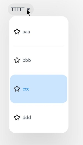
Example
// xxx.ets
@Entry
@Component
struct SelectExample {
  @State text: string = "TTTTT"
  @State index: number = 2
  @State space: number = 8
  @State arrowPosition: ArrowPosition = ArrowPosition.END
  build() {
    Column() {
      Select([{ value: 'aaa', icon: $r("app.media.selecticon") },
        { value: 'bbb', icon: $r("app.media.selecticon") },
        { value: 'ccc', icon: $r("app.media.selecticon") },
        { value: 'ddd', icon: $r("app.media.selecticon") }])
        .selected(this.index)
        .value(this.text)
        .font({ size: 16, weight: 500 })
        .fontColor('#182431')
        .selectedOptionFont({ size: 16, weight: 400 })
        .optionFont({ size: 16, weight: 400 })
        .space(this.space)
        .arrowPosition(this.arrowPosition)
        .menuAlign(MenuAlignType.START, {dx:0, dy:0})
        .optionWidth(200)
        .optionHeight(100)
        .onSelect((index:number, text?: string | undefined)=>{
          console.info('Select:' + index)
          this.index = index;
          if(text){
            this.text = text;
          }
        })
    }.width('100%')
  }
}