Image Effects (System API)
Image effects include blur, shadow, spherical effect, and much more.
NOTE
The APIs of this module are supported since API version 7. Updates will be marked with a superscript to indicate their earliest API version.
This topic describes only system APIs provided by the module. For details about its public APIs, see Image Effects.
sphericalEffect10+
sphericalEffect(value: number)
Spherical degree of the component.
System capability: SystemCapability.ArkUI.ArkUI.Full
System API: This is a system API.
Parameters
| Name | Type | Mandatory | Description |
|---|---|---|---|
| value | number | Yes | Spherical degree of the component. The value ranges from 0 to 1. NOTE 1. If the value is 0, the component remains unchanged. If the value is 1, the component is completely spherical. Between 0 and 1, a larger value indicates a higher spherical degree. A value less than 0 evaluates to the value 0. A value greater than 1 evaluates to the value 1. 2. If a component image is loaded asynchronously, the spherical effect is not supported. For example, the <Image> component uses asynchronous loading by default, which means that syncLoad must be set to true to apply the spherical effect. However, this setting is not recommended. Asynchronous loading is also used for backgroundImage. Therefore, if backgroundImage is set, the spherical effect is not supported. 3. If the shadow effect is set for a component, the spherical effect is not supported. |
lightUpEffect10+
lightUpEffect(value: number)
Light up degree of the component.
System capability: SystemCapability.ArkUI.ArkUI.Full
System API: This is a system API.
Parameters
| Name | Type | Mandatory | Description |
|---|---|---|---|
| value | number | Yes | Light up degree of the component. The value ranges from 0 to 1. If the value is 0, the component is dark. If the value is 1, the component is fully illuminated. Between 0 and 1, a larger value indicates higher luminance. A value less than 0 evaluates to the value 0. A value greater than 1 evaluates to the value 1. |
pixelStretchEffect10+
pixelStretchEffect(options: PixelStretchEffectOptions)
Pixel stretch effect options.
System capability: SystemCapability.ArkUI.ArkUI.Full
System API: This is a system API.
Parameters
| Name | Type | Mandatory | Description |
|---|---|---|---|
| options | PixelStretchEffectOptions | Yes | Pixel stretch effect options. The options parameter includes the length by which a pixel is stretched toward the four edges. NOTE \1. If the length is a positive value, the original image is stretched, and the image size increases. The edge pixels grow by the set length toward the top, bottom, left, and right edges. \2. 2. If the length is a negative value, the original image shrinks as follows, but the image size remains unchanged: (1) The image shrinks from the four edges by the absolute value of length set through options. (2) The image is stretched back to the original size with edge pixels. \3. Constraints on options: (1) The length values for the four edges must be all positive or all negative. That is, the four edges are stretched or shrink at the same time in the same direction. (2) The length values must all be a percentage or a specific value. Combined use of the percentage and specific value is not allowed. (3) If the input value is invalid, the image is displayed as {0, 0, 0, 0}, that is, the image is the same as the original image. |
Example
Example 1
Apply a spherical effect to a component to make it appear spherized.
// xxx.ets
@Entry
@Component
struct SphericalEffectExample {
  build() {
    Stack() {
      TextInput({placeholder: "Enter a percentage."})
        .width('50%')
        .height(35)
        .type(InputType.Number)
        .enterKeyType(EnterKeyType.Done)
        .caretColor(Color.Red)
        .placeholderColor(Color.Blue)
        .placeholderFont({
          size: 20,
          style: FontStyle.Italic,
          weight: FontWeight.Bold
        })
        .sphericalEffect(0.5)
    }.alignContent(Alignment.Center).width("100%").height("100%")
  }
}
Below is how the component looks with the spherical effect applied:

Below is how the component looks without the spherical effect applied:

Example 2
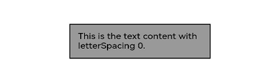
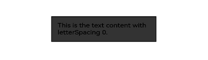
Apply a light up effect to a component.
// xxx.ets
@Entry
@Component
struct LightUpExample {
  build() {
    Stack() {
      Text('This is the text content with letterSpacing 0.')
        .letterSpacing(0)
        .fontSize(12)
        .border({ width: 1 })
        .padding(10)
        .width('50%')
        .lightUpEffect(0.6)
    }.alignContent(Alignment.Center).width("100%").height("100%")
  }
}
Below is how the component looks with lightUpEffect set to 0.6:
Below is how the component looks with lightUpEffect set to 0.2:
Below is how the component looks without the light up effect applied:
Example 3
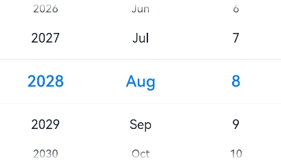
// xxx.ets
@Entry
@Component
struct LightUpExample {
  @State isLunar: boolean = false
  private selectedDate: Date = new Date('2028-08-08')
  build() {
    Stack() {
      DatePicker({
        start: new Date('1970-1-1'),
        end: new Date('2100-1-1'),
        selected: this.selectedDate
      })
        .lunar(this.isLunar)
        .onDateChange((value: Date) => {
          this.selectedDate = value
          console.info('select current date is: ' + value.toString())
        })
        .lightUpEffect(0.6)

    }.alignContent(Alignment.Center).width("100%").height("100%")
  }
}
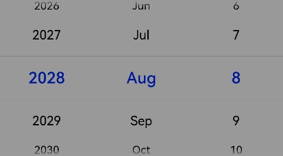
Below is how the component looks without the light up effect applied:
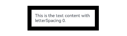
Example 4
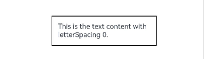
You can apply a pixel stretch effect to a component.
// xxx.ets
@Entry
@Component
struct PixelStretchExample {
  build() {
    Stack() {
      Text('This is the text content with letterSpacing 0.')
        .letterSpacing(0)
        .fontSize(12)
        .border({ width: 1 })
        .padding(10)
        .clip(false)
        .width('50%')
        .pixelStretchEffect({top:10,left:10,right:10,bottom:10 })
    }.alignContent(Alignment.Center).width("100%").height("100%")
  }
}
Below is how the component looks with lightUpEffect set to 0.6:
Below is how the component looks without the pixel stretch effect applied:
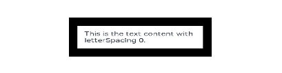
Example 5
Based on Example 4, change the length values of the pixel stretch effect to negative:
// xxx.ets
@Entry
@Component
struct PixelStretchExample {
  build() {
    Stack() {
      Text('This is the text content with letterSpacing 0.')
        .letterSpacing(0)
        .fontSize(12)
        .border({ width: 1 })
        .padding(10)
        .width('50%')
        .pixelStretchEffect({top:-10,left:-10,right:-10,bottom:-10 })
    }.alignContent(Alignment.Center).width("100%").height("100%")
  }
}
Below is how the component looks:
Compared with the original image, the effect drawing is implemented in two steps:
1. The image size is reduced. The resultant size is the original image size minus
the lengths by which the pixels shrink. For example, if the original image size is 100 x 100 and pixelStretchEffect({top:-10,left:-10,
right:-10,bottom:-10}) is set, the resultant size is (100-10-10) x (100-10-10), that is, 8080.
2. Edge pixels are stretched to restore the image to its original size.