Grid System
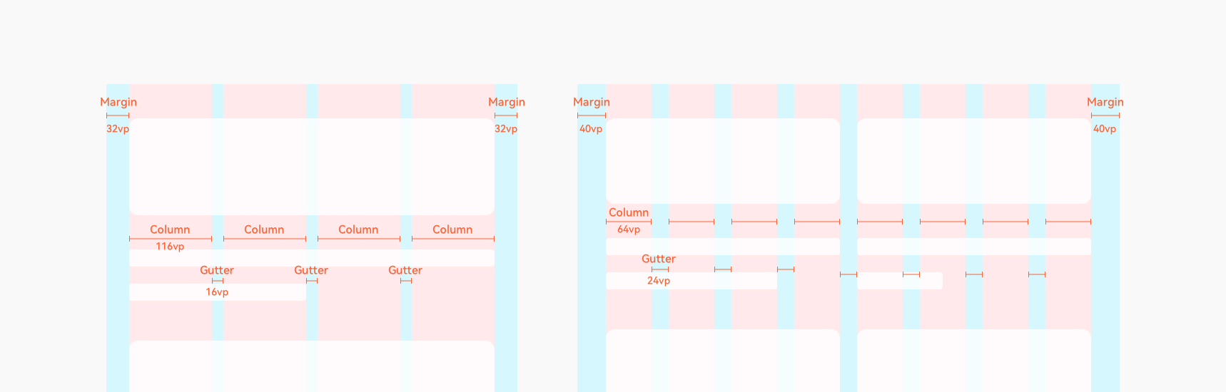
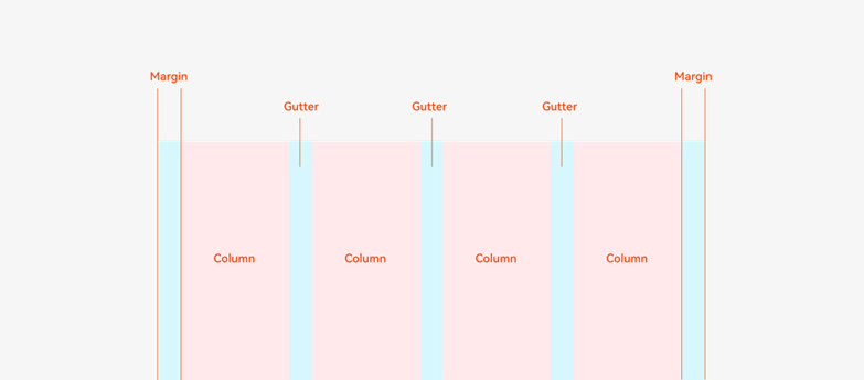
The grid system is a common auxiliary positioning tool for multi-device design. It can be used for an entire application window or part of a window. A grid system consists of three attributes: margin, gutter, and column. Margin represents the distance of a column relative to the left and right edges of its parent container such as the screen or window. It determines the overall width of the content that can be displayed. Gutter is the spacing between two adjacent columns and determines how close the content tracks are with each other. Column is the placeholder element of the content and determines the layout complexity of the content. The margin, gutter, and columns together determine the width of a column.
The grid system ensures layout consistency among multiple devices.
You can customize the margin, gutter, and columns. The UI content is located based on the edge of a column. You can use different values to adjust the content volume and closeness. Generally, you are advised to use a multiple of 4 or 8. Example values: margin: 32 vp, gutter: 16 vp, columns: 4; margin: 40 vp, gutter: 24 vp, columns: 8.