input
The <input> component provides an interactive interface to receive user input. It can be a radio button, check box, or button.
NOTE
This component is supported since API version 4. Updates will be marked with a superscript to indicate their earliest API version.
Child Components
Not supported
Attributes
| Name | Type | Default Value | Mandatory | Description |
|---|---|---|---|---|
| type | string | button |
No | Type of the component, which cannot be dynamically modified. The options are as follows: - button: a button that can be clicked. - checkbox: a check box. - radio: a radio button that allows users to select one from multiple others with the same name. |
| checked | boolean | false | No | Whether the component is selected. This attribute is valid only when type is set to checkbox or radio. |
| name | string | - | No | Name of the component. |
| value | string | - | No | Value of the component. When type is radio, this attribute is mandatory and the value must be unique for radio buttons with the same name. |
| id | string | - | No | Unique ID of the component. |
| style | string | - | No | Style declaration of the component. |
| class | string | - | No | Style class of the component, which is used to refer to a style table. |
| ref | string | - | No | Reference information of child elements, which is registered with the parent component on $refs. |
Events
- When type is set to checkbox or radio, the following events are supported.
| Name | Parameter | Description |
|---|---|---|
| change | { checked:true | false } | Triggered when the checked status of the checkbox or radio button changes. |
| click | - | Triggered when the component is clicked. |
| longpress | - | Triggered when the component is long pressed. |
| swipe5+ | SwipeEvent | Triggered when a user quickly swipes on the component. |
- When type is set to button, the following events are supported.
| Name | Parameter | Description |
|---|---|---|
| click | - | Triggered when the component is clicked. |
| longpress | - | Triggered when the component is long pressed. |
| swipe5+ | SwipeEvent | Triggered when a user quickly swipes on the component. |
Styles
| Name | Type | Default Value | Mandatory | Description |
|---|---|---|---|---|
| color | <color> | #ffffff | No | Text color of the component. |
| font-size | <length> | 30px | No | Font size of the component. |
| width | <length> | - | No | Width of the component. The default value for a button is 100px. |
| height | <length> | - | No | Height of the component. The default value for a button is 50px. |
| font-family | string | SourceHanSansSC-Regular | No | Font. Only the SourceHanSansSC-Regular font is supported. |
| padding | <length> | 0 | No | Shorthand attribute to set the padding for all sides. The attribute can have one to four values: - If you set only one value, it specifies the padding for all the four sides. - If you set two values, the first value specifies the top and bottom padding, and the second value specifies the left and right padding. - If you set three values, the first value specifies the top padding, the second value specifies the left and right padding, and the third value specifies the bottom padding. - If you set four values, they respectively specify the padding for top, right, bottom, and left sides (in clockwise order). |
| padding-[left|top|right|bottom] | <length> | 0 | No | Left, top, right, and bottom padding. |
| margin | <length> | <percentage>5+ | 0 | No | Shorthand attribute to set the margin for all sides. The attribute can have one to four values: - If you set only one value, it specifies the margin for all the four sides. - If you set two values, the first value specifies the top and bottom margins, and the second value specifies the left and right margins. - If you set three values, the first value specifies the top margin, the second value specifies the left and right margins, and the third value specifies the bottom margin. - If you set four values, they respectively specify the margin for top, right, bottom, and left sides (in clockwise order). |
| margin-[left|top|right|bottom] | <length> | <percentage>5+ | 0 | No | Left, top, right, and bottom margins. |
| border-width | <length> | 0 | No | Shorthand attribute to set the margin for all sides. |
| border-color | <color> | black | No | Shorthand attribute to set the color for all borders. |
| border-radius | <length> | - | No | Radius of round-corner borders. |
| background-color | <color> | - | No | Background color. |
| display | string | flex | No | How and whether to display the box containing an element. Available values are as follows: - flex: flexible layout - none: not rendered |
| [left|top] | <length> | <percentage>6+ | - | No | Edge of the element. - left: left edge position of the element. This attribute defines the offset between the left edge of the margin area of a positioned element and left edge of its containing block. - top: top edge position of the element. This attribute defines the offset between the top edge of a positioned element and that of a block included in the element. |
Example
-
Common button
<!-- xxx.hml -->
<div class="div-button">
  <input class="button" type="button" value="Input-Button"></input>
</div>
/* xxx.css */ .div-button { flex-direction: column; align-items: center; width: 100%; height: 100%; } .button { margin-top: 30px; width: 280px; }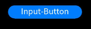
-
Check box
<!-- xxx.hml -->
<div class="content">
  <input onchange="checkboxOnChange" checked="true" type="checkbox"></input>
  <text class="text">{{text}}</text>
</div>
/* xxx.css */ .content{ width: 100%; height: 100%; flex-direction: column; align-items: center; justify-content: center; } .text{ font-size: 30px; text-align: center; width: 200px; margin-top: 20px; height: 100px; }// xxx.js export default { data: { text: "text" }, checkboxOnChange(e) { this.text = e.checked; } }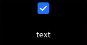
-
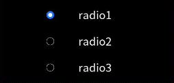
Radio button
<!-- xxx.hml -->
<div class="container">
  <div class="item">
    <input type="radio" checked="true" name="radioSample" value="radio1" onchange="onRadioChange"></input>
    <text class="text">radio1</text>
  </div>
  <div class="item">
    <input type="radio" checked="false" name="radioSample" value="radio2" onchange="onRadioChange"></input>
    <text class="text">radio2</text>
  </div>
  <div class="item">
    <input type="radio" checked="false" name="radioSample" value="radio3" onchange="onRadioChange"></input>
    <text class="text">radio3</text>
  </div>
</div>
/* xxx.css */ .container { width: 100%; height: 100%; justify-content: center; align-items: center; flex-direction: column; } .item { width: 50%; height: 30%; justify-content: center; } .text { margin-top: 25%; font-size: 30px; text-align: center; width: 200px; height: 100px; }