Grid
NOTE
The APIs of this module are supported since API version 7. Updates will be marked with a superscript to indicate their earliest API version.
The column width and column gap in the grid layout are determined by the nearest parent component <GridContainer>. The component tree that uses grid attributes must contain one <GridContainer> component or more.
- To call the gridSpan or gridOffset attribute, its parent or ancestor component must be <GridContainer>.
Attributes
| Name | Type | Description |
|---|---|---|
| useSizeType(deprecated) | { xs?: number | { span: number, offset: number }, sm?: number | { span: number, offset: number }, md?: number | { span: number, offset: number }, lg?: number | { span: number, offset: number } } |
Number of occupied columns and offset columns for a specific device width type. span indicates the number of occupied columns, and offset indicates the number of offset columns. If the value is of the number type, only the number of columns can be set. If the value is in the format of {"span": 1, "offset": 0}, both the number of occupied columns and the number of offset columns need to be set. - xs indicates that the device width type is SizeType.XS. - sm indicates that the device width type is SizeType.SM. - md indicates that the device width type is SizeType.MD. - lg indicates that the device width type is SizeType.LG. This attribute is deprecated since API version 9. You are advised to use GridCol and GridRow instead. |
| gridSpan | number | Default number of occupied columns, that is, the number of occupied columns when span in useSizeType is not set. NOTE If the span attribute is set, the component width is determined by the grid layout. Default value: 1 |
| gridOffset | number | Default number of offset columns, that is, the number of offset columns in the start direction of the parent component (which is also the nth column that the component is in) when offset in useSizeType is not set. NOTE - After this attribute is set, the horizontal layout of the current component does not follow the original layout of the parent component. Instead, it offsets along the start direction of the parent component. - Offset = (Column width + Gap) * Number of columns. - After this attribute is set, sibling components will be arranged relatively to this component, as in the relative layout. Default value: 0 |
Example
// xxx.ets
@Entry
@Component
struct GridContainerExample1 {
build() {
Column() {
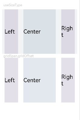
Text('useSizeType').fontSize(15).fontColor(0xCCCCCC).width('90%')
GridContainer() {
Row({}) {
Row() {
Text('Left').fontSize(25)
}
.useSizeType({
xs: { span: 1, offset: 0 }, sm: { span: 1, offset: 0 },
md: { span: 1, offset: 0 }, lg: { span: 2, offset: 0 }
})
.height("100%")
.backgroundColor(0x66bbb2cb)
Row() {
Text('Center').fontSize(25)
}
.useSizeType({
xs: { span: 1, offset: 0 }, sm: { span: 2, offset: 1 },
md: { span: 5, offset: 1 }, lg: { span: 7, offset: 2 }
})
.height("100%")
.backgroundColor(0x66b6c5d1)
Row() {
Text('Right').fontSize(25)
}
.useSizeType({
xs: { span: 1, offset: 0 }, sm: { span: 1, offset: 3 },
md: { span: 2, offset: 6 }, lg: { span: 3, offset: 9 }
})
.height("100%")
.backgroundColor(0x66bbb2cb)
}
.height(200)
}
.backgroundColor(0xf1f3f5)
.margin({ top: 10 })
// Set the span and offset of the component separately. The resultant effect is equivalent to that achieved by using sm in useSizeType on the device of the sm type.
Text('gridSpan,gridOffset').fontSize(15).fontColor(0xCCCCCC).width('90%')
GridContainer() {
Row() {
Row() {
Text('Left').fontSize(25)
}
.gridSpan(1)
.height("100%")
.backgroundColor(0x66bbb2cb)
Row() {
Text('Center').fontSize(25)
}
.gridSpan(2)
.gridOffset(1)
.height("100%")
.backgroundColor(0x66b6c5d1)
Row() {
Text('Right').fontSize(25)
}
.gridSpan(1)
.gridOffset(3)
.height("100%")
.backgroundColor(0x66bbb2cb)
}.height(200)
}
}
}
}
Figure 1 Device width type SM
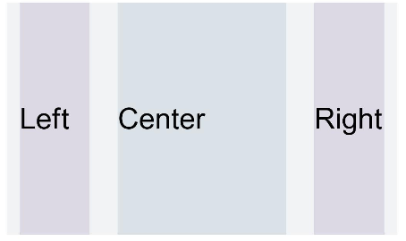
Figure 2 Device width type MD
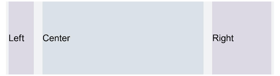
Figure 3 Device width type LG
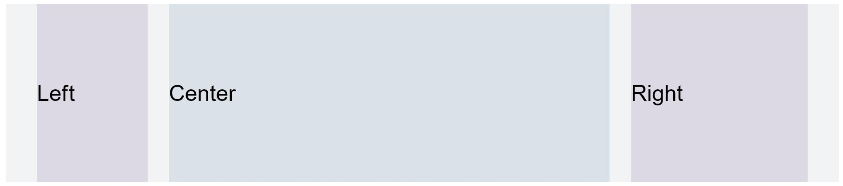
Figure 4 Setting gridSpan and gridOffset separately has the same effect as useSizeType for a specific device width type