Custom Dialog Box (CustomDialog)
A custom dialog box is a dialog box you customize by using APIs of the CustomDialogController class. You can set the style and content to your preference for a custom dialog box.
NOTE
The APIs of this module are supported since API version 7. Updates will be marked with a superscript to indicate their earliest API version.
APIs
CustomDialogController(value: CustomDialogControllerOptions)
Defines a custom dialog box.
NOTE
No parameters of the custom dialog box can be dynamically updated.
System capability: SystemCapability.ArkUI.ArkUI.Full
Parameters
| Name | Type | Mandatory | Description |
|---|---|---|---|
| value | CustomDialogControllerOptions | Yes | Parameters of the custom dialog box. |
CustomDialogControllerOptions
| Name | Type | Mandatory | Description |
|---|---|---|---|
| builder | CustomDialog | Yes | Builder of the custom dialog box content. |
| cancel | () => void | No | Callback invoked when the dialog box is closed after the Back key, the ESC key, or the mask is clicked. |
| autoCancel | boolean | No | Whether to close the dialog box when the overlay is clicked. The value true means to close the dialog box when the overlay is clicked, and false means the opposite. Default value: true |
| alignment | DialogAlignment | No | Alignment mode of the dialog box in the vertical direction. Default value: DialogAlignment.Default |
| offset | Offset | No | Offset of the dialog box relative to the alignment position. |
| customStyle | boolean | No | Whether to use a custom style for the dialog box. false (default): The dialog box automatically adapts its width to the grid system and its height to the child components; the maximum height is 90% of the container height; the rounded corner is 24 vp. true: The dialog box automatically adapts its width to the child components; the rounded corner is 0; the background color is transparent. |
| gridCount8+ | number | No | Number of grid columns occupied by the dialog box. The default value is subject to the window size, and the maximum value is the maximum number of columns supported by the system. If this parameter is set to an invalid value, the default value is used. |
| maskColor10+ | ResourceColor | No | Custom mask color. Default value: 0x33000000 |
| maskRect10+ | Rectangle | No | Mask area of the dialog box. Events outside the mask area are transparently transmitted, and events within the mask area are not. Default value: { x: 0, y: 0, width: '100%', height: '100%' } |
| openAnimation10+ | AnimateParam | No | Parameters for defining the open animation of the dialog box. NOTE iterations: The default value is 1, indicating that the animation is played once; any other value evaluates to the default value. playMode: The default value is PlayMode.Normal; any other value evaluates to the default value. |
| closeAnimation10+ | AnimateParam | No | Parameters for defining the close animation of the dialog box. NOTE iterations: The default value is 1, indicating that the animation is played once; any other value evaluates to the default value. playMode: The default value is PlayMode.Normal; any other value evaluates to the default value. For page transition, you are advised to use the default close animation. |
| showInSubWindow10+ | boolean | No | Whether to show the dialog box in a sub-window when the dialog box needs to be displayed outside the main window. Default value: false NOTE A dialog box whose showInSubWindow attribute is true cannot trigger the display of another dialog box whose showInSubWindow attribute is also true. |
| backgroundColor10+ | ResourceColor | No | Background color of the dialog box. NOTE If the content builder also has the background color set, the background color set here will be overridden by the background color of the content builder. |
| cornerRadius10+ | BorderRadiuses | Dimension | No | Radius of the rounded corners of the background. You can set separate radiuses for the four rounded corners. Default value: { topLeft: '24vp', topRight: '24vp', bottomLeft: '24vp', bottomRight: '24vp' } NOTE This attribute must be used together with the borderRadius attribute. |
| isModal11+ | boolean | No | Whether the dialog box is a modal. A modal dialog box has a mask applied, while a non-modal dialog box does not. Default value: true |
NOTE
- Pressing the Back or ESC key closes the dialog box.
- Use the custom dialog box to contain simple information only. Do not use it as a page. If the dialog box's height is too large, it may be partly blocked by the soft keyboard (if any), which is automatically raised when displayed.
CustomDialogController
Objects to Import
let dialogController : CustomDialogController = new CustomDialogController(CustomDialogControllerOptions)
NOTE
CustomDialogController is effective only when it is a member variable of the @CustomDialog and @Component decorated struct and is defined in the @Component decorated struct. For details, see the following example.
open
open(): void
Opens the content of the custom dialog box. This API can be called multiple times. If the dialog box displayed in a subwindow, no new subwindow is allowed.
close
close(): void
Closes the custom dialog box. If the dialog box is closed, this API does not take effect.
Example
Example 1
// xxx.ets
@CustomDialog
struct CustomDialogExampleTwo {
  controllerTwo?: CustomDialogController
  build() {
    Column() {
      Text('I'm the second dialog box.')
        .fontSize(30)
        .height(100)
      Button ('Close Second Dialog Box')
        .onClick(() => {
          if (this.controllerTwo != undefined) {
            this.controllerTwo.close()
          }
        })
        .margin(20)
    }
  }
}
@CustomDialog
struct CustomDialogExample {
  @Link textValue: string
  @Link inputValue: string
  dialogControllerTwo: CustomDialogController | null = new CustomDialogController({
    builder: CustomDialogExampleTwo(),
    alignment: DialogAlignment.Bottom,
    offset: { dx: 0, dy: -25 } })
  controller?: CustomDialogController
  // You can pass in multiple other controllers in the CustomDialog to open one or more other CustomDialogs in the CustomDialog. In this case, you must place the controller pointing to the self behind all controllers.
  cancel: () => void = () => {
  }
  confirm: () => void = () => {
  }

  build() {
    Column() {
      Text('Change text').fontSize(20).margin({ top: 10, bottom: 10 })
      TextInput({ placeholder: '', text: this.textValue }).height(60).width('90%')
        .onChange((value: string) => {
          this.textValue = value
        })
      Text('Are you sure you want to change text?').fontSize(16).margin({ bottom: 10 })
      Flex({ justifyContent: FlexAlign.SpaceAround }) {
        Button('No')
          .onClick(() => {
            if (this.controller != undefined) {
              this.controller.close()
              this.cancel()
            }
          }).backgroundColor(0xffffff).fontColor(Color.Black)
        Button('Yes')
          .onClick(() => {
            if (this.controller != undefined) {
              this.inputValue = this.textValue
              this.controller.close()
              this.confirm()
            }
          }).backgroundColor(0xffffff).fontColor(Color.Red)
      }.margin({ bottom: 10 })

      Button ('Open Second Dialog Box')
        .onClick(() => {
          if (this.dialogControllerTwo != null) {
            this.dialogControllerTwo.open()
          }
        })
        .margin(20)
    }.borderRadius(10)
    // When using the border or cornerRadius attribute, use it together with the borderRadius attribute.
  }
}
@Entry
@Component
struct CustomDialogUser {
  @State textValue: string = ''
  @State inputValue: string = 'Click Me'
  dialogController: CustomDialogController | null = new CustomDialogController({
    builder: CustomDialogExample({
      cancel: this.onCancel,
      confirm: this.onAccept,
      textValue: $textValue,
      inputValue: $inputValue
    }),
    cancel: this.exitApp,
    autoCancel: true,
    alignment: DialogAlignment.Bottom,
    offset: { dx: 0, dy: -20 },
    gridCount: 4,
    customStyle: false,
    cornerRadius: 10,
  })

  // Set dialogController to null when the custom component is about to be destructed.
  aboutToDisappear() {
    this.dialogController = null // Set dialogController to null.
  }

  onCancel() {
    console.info('Callback when the first button is clicked')
  }

  onAccept() {
    console.info('Callback when the second button is clicked')
  }

  exitApp() {
    console.info('Click the callback in the blank area')
  }
  build() {
    Column() {
      Button(this.inputValue)
        .onClick(() => {
          if (this.dialogController != null) {
            this.dialogController.open()
          }
        }).backgroundColor(0x317aff)
    }.width('100%').margin({ top: 5 })
  }
}
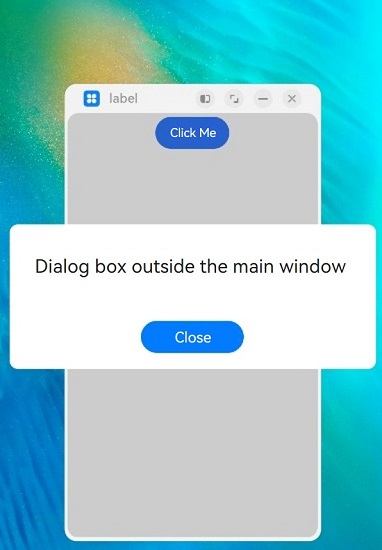
Example 2
// xxx.ets
@CustomDialog
struct CustomDialogExample {
  controller?: CustomDialogController
  cancel: () => void = () => {
  }
  confirm: () => void = () => {
  }
  build() {
    Column() {
      Text('Dialog box outside the main window')
        .fontSize(30)
        .height(100)
      Button ('Close')
        .onClick(() => {
          if (this.controller != undefined) {
            this.controller.close()
          }
        })
        .margin(20)
    }
  }
}
@Entry
@Component
struct CustomDialogUser {
  dialogController: CustomDialogController | null = new CustomDialogController({
    builder: CustomDialogExample({
      cancel: this.onCancel,
      confirm: this.onAccept
    }),
    cancel: this.existApp,
    autoCancel: true,
    alignment: DialogAlignment.Center,
    offset: { dx: 0, dy: -20 },
    gridCount: 4,
    showInSubWindow: true,
    isModal: true,
    customStyle: false,
    cornerRadius: 10,
  })
  // Set dialogController to null when the custom component is about to be destroyed.
  aboutToDisappear() {
    this.dialogController = null // Set dialogController to null.
  }

  onCancel() {
    console.info('Callback when the first button is clicked')
  }

  onAccept() {
    console.info('Callback when the second button is clicked')
  }

  existApp() {
    console.info('Click the callback in the blank area')
  }

  build() {
    Column() {
      Button('Click Me')
        .onClick(() => {
          if (this.dialogController != null) {
            this.dialogController.open()
          }
        }).backgroundColor(0x317aff)
    }.width('100%').margin({ top: 5 })
  }
}