Visibility
The visibility attribute controls whether a component is visible.
NOTE
This event is supported since API version 7. Updates will be marked with a superscript to indicate their earliest API version.
visibility
visibility(value: Visibility)
Sets the visibility of the component.
Widget capability: Since API version 9, this feature is supported in ArkTS widgets.
System capability: SystemCapability.ArkUI.ArkUI.Full
Parameters
| Name | Type | Mandatory | Description |
|---|---|---|---|
| value | Visibility | Yes | Whether the component is visible. When appropriate, consider using conditional rendering as a substitute. Default value: Visibility.Visible |
Example
// xxx.ets
@Entry
@Component
struct VisibilityExample {
build() {
Column() {
Column() {
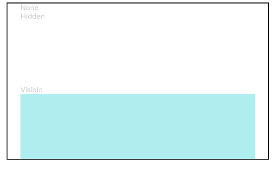
// The component is hidden and does not take up space in the layout.
Text('None').fontSize(9).width('90%').fontColor(0xCCCCCC)
Row().visibility(Visibility.None).width('90%').height(80).backgroundColor(0xAFEEEE)
// The component is hidden but takes up space in the layout.
Text('Hidden').fontSize(9).width('90%').fontColor(0xCCCCCC)
Row().visibility(Visibility.Hidden).width('90%').height(80).backgroundColor(0xAFEEEE)
// The component is visible, which is the default display mode.
Text('Visible').fontSize(9).width('90%').fontColor(0xCCCCCC)
Row().visibility(Visibility.Visible).width('90%').height(80).backgroundColor(0xAFEEEE)
}.width('90%').border({ width: 1 })
}.width('100%').margin({ top: 5 })
}
}