ArkUI Subsystem Changelog
cl.arkui.1 Change in the Custom Navigation Title Position
-
NavigationTitleMode is set to Full, Free, or Mini without the back button.
API version 9: The left margin remains at 24 vp.
API version 10: The left margin is changed from 24 vp to 0. The top margin is changed from center to 0.
-
NavigationTitleMode is set to Mini and the back button is displayed.
API version 9: The spacing between the custom title and the back button is 16 vp.
API version 10: The spacing between the custom title bar and the back button is changed from 16 vp to 12 vp.
-
A custom menu is configured.
API version 9: The right margin is 24 vp.
API version 10: The right margin is changed from 24 vp to 0.
Reason for Change
Since API version 9, offsets are added the custom title and menu of the <Navigation> component, which affects the use of custom components. Since OpenHarmony 4.0.10.6, the offsets are removed from applications in API version 10.
Change Impact
In API version 10, the custom navigation title is displayed on the left of or above the position where it would appear in previous API versions.
Adaptation Guide
-
For NavigationTitleMode.Full, NavigationTitleMode.Free, and NavigationTitleMode.Mini, you can add a left margin by using $r('sys.float.ohos_id_max_padding_start'). To center the title on the top, use .height('100%').alignItems(VerticalAlign.Center).
-
For NavigationTitleMode.Mini with the back button displayed, you can add a left margin by using .margin({left: 4}). To center the title on the top, use .height('100%').alignItems(VerticalAlign.Center).
-
When a custom menu is configured, you can add a right margin by using .margin({right: $r('sys.float.ohos_id_max_padding_end')}).
Example
@Entry
@Component
struct Index {
  @State titleMode: NavigationTitleMode = NavigationTitleMode.Free
  @State backButton: boolean = false;
  @Builder CustomMenu() {
    Column() {
      Image($r('app.media.icon')).width(24).height(24)
    }
  }

  @Builder CustomTitle() {
    Column() {
      Text('Custom title').fontSize(20)
    }
  }

  build() {
    Column() {
      Navigation() {
        Column() {
          Text(`Change current title mode: ${this.titleMode}`)
            .onClick(()=>{
              if (this.titleMode == NavigationTitleMode.Free) {
                this.titleMode = NavigationTitleMode.Full;
              } else if (this.titleMode == NavigationTitleMode.Full) {
                this.titleMode = NavigationTitleMode.Mini;
              } else {
                this.titleMode = NavigationTitleMode.Free;
              }
            })

          Text(`Change back button: ${this.backButton}`).onClick(()=>{
            this.backButton = !this.backButton;
          }).margin({top: 10})
        }.margin({top: 40})
      }.title(this.CustomTitle)
      .titleMode(this.titleMode)
      .menus(this.CustomMenu)
      .hideBackButton(this.backButton)
    }
  }
}
API version 9: Custom title and menu in NavigationTitleMode.Full settings

API version 10: Custom title and menu in NavigationTitleMode.Full settings

API version 9: Custom title with the back button in NavigationTitleMode.Mini settings
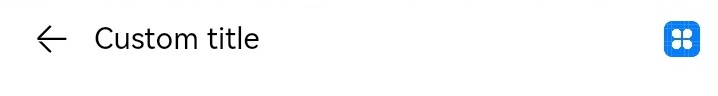
API version 10: Custom title with the back button in NavigationTitleMode.Mini settings

API version 9: Custom title without the back button in NavigationTitleMode.Mini settings

API version 10: Custom title without the back button in NavigationTitleMode.Mini settings

cl.arkui.2 Title Bar Change of the <NavDestination> Component
For custom titles:
-
With the back button
API version 9: The spacing between the back button and the title bar is 16 vp, and the title bar is centered.
API version 10: The spacing between the back button and the title bar is changed from 16 vp to 12 vp, and the top offset of the title bar is changed to 0.
-
Without the back button
API version 9: The title bar is centered, with a left margin of 24 vp.
API version 10: The left margin of the title bar is changed from 24 vp to 0, and its top offset is changed to 0.
Reason for Change
Since API version 9, offsets are added to the custom title of the <Navigation> component, which affects the use of custom components. Since OpenHarmony 4.0.10.6, the offsets are removed from applications in API version 10.
Change Impact The custom title bar of the <NavDestination> component is displayed in the upper left corner of the position where it would appear in previous API versions.
Adaptation Guide
To retain the display effect in previous versions, you can use the following solution:
-
Where the back button is not displayed: Add a left offset by using margin({left: $r('sys.float.ohos_id_max_padding_start')}). To center the title bar on the top, use .height ('100%').alignItems (VerticalAlign.Center).
-
Where the back button is displayed: Add a left offset by using margin ({left: 4}). To center the title bar on the top, use .height ('100%').alignItems (VerticalAlign.Center).
Example
@Entry
@Component
struct Index {
  @Builder NavigationTile() {
    Column() {
      Text('title').fontColor('#182431').fontSize(30).lineHeight(41)
      Text('subTitle').fontColor('#182431').fontSize(14).lineHeight(19).margin(top:2, bottom: 20)
    }
  }

  build() {
    Column() {
      Navigation() {
        Text('Navigation')
      }.title(this.NavigationTitle)
       .titleMode(NavigationTitleMode.Free)
       .menus([
        {icon: 'common/image/icon.png', value: 'menu1'}
       ])
    }
  }
}
API version 9: Custom title bar with the back button

API version 10: Custom title bar with the back button

API version 9: Custom title bar without the back button

API version 10: Custom title bar without the back button

cl.arkui.3 OnStateChange Callback Change of the <NavRouter> Component
Changed the number of OnStateChange calls for displaying the <NavDestination> component from 2 to 1, which does not affect the call sequence.
Change Impact
Applications that use OnStateChange for call timing are affected.
-
Call sequence before the change: OnStateChange(true) triggered by display of <NavRouter> -> OnStateChange(false) triggered by exiting of <NavRouter> -> OnStateChange(true) triggered by display of <NavRouter>
-
Call sequence after the change: OnStateChange(true) triggered by display of <NavRouter> -> OnStateChange(false) triggered by exiting of <NavRouter>