Radio Button (Radio)
The <Radio> component allows users to select from a set of mutually exclusive options. Only one radio button in a given group can be selected at the same time. For details, see Radio.
Creating a Radio Button
You can create a radio button by calling the following API:
Radio(options: {value: string, group: string})
In this API, value indicates the name of the radio button, and group indicates the name of the group to which the radio button belongs. You can use the checked attribute of the radio button to specify whether it is selected. The value true means that the radio button is selected.
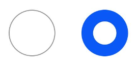
The style of the radio button can be customized for the selected and unselected states, but the shape cannot be customized.
Radio({ value: 'Radio1', group: 'radioGroup' })
  .checked(false)
Radio({ value: 'Radio2', group: 'radioGroup' })
  .checked(true)
Adding Events
The <Radio> component supports the universal events. In addition, it can be bound to the onChange event so that it responds with custom behavior after being selected.
  Radio({ value: 'Radio1', group: 'radioGroup' })
    .onChange((isChecked: boolean) => {
      if(isChecked) {
        // Operation
      }
    })
  Radio({ value: 'Radio2', group: 'radioGroup' })
    .onChange((isChecked: boolean) => {
      if(isChecked) {
        // Operation
      }
    })
Example Scenario
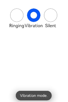
In this example, the <Radio> components are used to switch between sound modes.
// xxx.ets
import promptAction from '@ohos.promptAction';
@Entry
@Component
struct RadioExample {
  @State Rst:promptAction.ShowToastOptions = {'message': 'Ringing mode.'}
  @State Vst:promptAction.ShowToastOptions = {'message': 'Vibration mode.'}
  @State Sst:promptAction.ShowToastOptions = {'message': 'Silent mode.'}
  build() {
    Row() {
      Column() {
        Radio({ value: 'Radio1', group: 'radioGroup' }).checked(true)
          .height(50)
          .width(50)
          .onChange((isChecked: boolean) => {
            if(isChecked) {
              // Switch to the ringing mode.
              promptAction.showToast(this.Rst)
            }
          })
        Text('Ringing')
      }
      Column() {
        Radio({ value: 'Radio2', group: 'radioGroup' })
          .height(50)
          .width(50)
          .onChange((isChecked: boolean) => {
            if(isChecked) {
              // Switch to the vibration mode.
              promptAction.showToast(this.Vst)
            }
          })
        Text('Vibration')
      }
      Column() {
        Radio({ value: 'Radio3', group: 'radioGroup' })
          .height(50)
          .width(50)
          .onChange((isChecked: boolean) => {
            if(isChecked) {
              // Switch to the silent mode.
              promptAction.showToast(this.Sst)
            }
          })
        Text('Silent')
      }
    }.height('100%').width('100%').justifyContent(FlexAlign.Center)
  }
}