Attribute Modifier
With the attribute modifier, you can dynamically set component attributes, complete with the if/else syntax and polymorphic style.
NOTE
This feature is supported since API Version 11. Updates will be marked with a superscript to indicate their earliest API version.
attributeModifier
attributeModifier(modifier: AttributeModifier<T>)
Creates an attribute modifier.
System capability: SystemCapability.ArkUI.ArkUI.Full
Parameters
| Name | Type | Mandatory | Description |
|---|---|---|---|
| modifier | AttributeModifier<T> | Yes | Modifier for dynamically setting attributes on the current component. The if/else syntax is supported. modifier: attribute modifier. You need to customize classes to implement the AttributeModifier API. |
AttributeModifier<T>
You need to customize classes to implement the AttributeModifier API.
applyNormalAttribute
applyNormalAttribute(instance: T) : void
Applies the style of a component in the normal state.
applyPressedAttribute
applyPressedAttribute(instance: T) : void
Applies the style of a component in the pressed state.
applyFocusedAttribute
applyFocusedAttribute(instance: T) : void
Applies the style of a component in the focused state.
applyDisabledAttribute
applyDisabledAttribute(instance: T) : void
Applies the style of a component in the disabled state.
applySelectedAttribute
applySelectedAttribute(instance: T) : void
Applies the style of a component in the selected state.
In the preceding APIs, instance indicates the component type. You can customize these APIs and use them with the **if/else **syntax.
Parameters
| Name | Description |
|---|---|
| instance | Component attribute class, which identifies the type of component to which attributes will be applied, for example, ButtonAttribute for the <Button> component and TextAttribute of the <Text> component. |
Value range of the instance parameter
AlphabetIndexerAttribute, BadgeAttribute, BlankAttribute, ButtonAttribute, CalendarPickerAttribute, CanvasAttribute, CheckboxAttribute, CheckboxGroupAttribute, CircleAttribute, ColumnAttribute, ColumnSplitAttribute, ShapeAttribute, CommonAttribute, CounterAttribute, DataPanelAttribute, DatePickerAttribute, DividerAttribute, EffectComponentAttribute, EllipseAttribute, FlexAttribute, FlowItemAttribute, FormComponentAttribute, FormLinkAttribute, GaugeAttribute, GridAttribute, GridColAttribute, ColumnAttribute, GridItemAttribute, GridRowAttribute, HyperlinkAttribute, ImageAttribute, ImageAnimatorAttribute, ImageSpanAttribute, LineAttribute, ListAttribute, ListItemAttribute, ListItemGroupAttribute, LoadingProgressAttribute, MarqueeAttribute, MenuAttribute, MenuItemAttribute, MenuItemGroupAttribute, NavDestinationAttribute, NavigationAttribute, NavigatorAttribute, NavRouterAttribute, PanelAttribute, PathAttribute, PatternLockAttribute, PluginComponentAttribute, PolygonAttribute, PolylineAttribute, ProgressAttribute, QRCodeAttribute, RadioAttribute, RatingAttribute, RectAttribute, RefreshAttribute, RelativeContainerAttribute, RemoteWindowAttribute, RichEditorAttribute, RichTextAttribute, RowAttribute, RowSplitAttribute, ScrollAttribute, ScrollBarAttribute, SearchAttribute, SelectAttribute, ShapeAttribute, SideBarContainerAttribute, SliderAttribute, SpanAttribute, StackAttribute, StepperAttribute, StepperItemAttribute, SwiperAttribute, TabContentAttribute, TabsAttribute, TextAttribute, TextAreaAttribute, TextClockAttribute, TextInputAttribute, TextPickerAttribute, TextTimerAttribute, TimePickerAttribute, ToggleAttribute, UIExtensionComponentAttribute, VideoAttribute, WaterFlowAttribute, WebAttribute, XComponentAttribute
Supported attributes
Attributes whose input parameters are CustomBuilder or Lambda expressions are not supported. Events and gestures are not supported.
Example
// xxx.ets
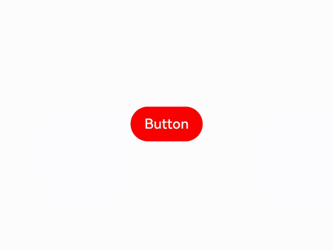
class MyButtonModifier implements AttributeModifier<ButtonAttribute> {
isDark: boolean = false
applyNormalAttribute(instance: ButtonAttribute): void {
if (this.isDark) {
instance.backgroundColor(Color.Black)
} else {
instance.backgroundColor(Color.Red)
}
}
}
@Entry
@Component
struct attributeDemo {
@State modifier: MyButtonModifier = new MyButtonModifier()
build() {
Row() {
Column() {
Button("Button")
.attributeModifier(this.modifier)
.onClick(() => {
this.modifier.isDark = !this.modifier.isDark
})
}
.width('100%')
}
.height('100%')
}
}
// xxx.ets
class MyButtonModifier implements AttributeModifier<ButtonAttribute> {
  applyNormalAttribute(instance: ButtonAttribute): void {
    instance.backgroundColor(Color.Black)
  }

  applyPressedAttribute(instance: ButtonAttribute): void {
    instance.backgroundColor(Color.Red)
  }
}

@Entry
@Component
struct attributePressedDemo {
  @State modifier: MyButtonModifier = new MyButtonModifier()

  build() {
    Row() {
      Column() {
        Button("Button")
          .attributeModifier(this.modifier)
      }
      .width('100%')
    }
    .height('100%')
  }
}