Motion Path Animation (motionPath)
The motion path animation is used to animate a component along a custom path.
NOTE
The APIs of this module are supported since API version 7. Updates will be marked with a superscript to indicate their earliest API version.
Attributes
| Name | Type | Description |
|---|---|---|
| motionPath | { path: string, from?: number, to?: number, rotatable?: boolean } |
Motion path of the component. - path: motion path of the translation animation. The value is an SVG path string. In the value, start and end can be used in place of the start point and end point, for example, 'Mstart.x start.y L50 50 Lend.x end.y Z'. For details, see Path Drawing. If this parameter is set to an empty string, the path animation is not set. - from: start point of the motion path. Default value: 0.0 Value range: [0, 1] A value less than 0 or greater than 1 evaluates to the default value 0. - to: end point of the motion path. Default value: 1.0 Value range: [0, 1] A value less than 0 or greater than 1 evaluates to the default value 1, provided that the value of to is greater than or equal to the value of from. - rotatable: whether to rotate along the path. Default value: false |
Example
// xxx.ets
@Entry
@Component
struct MotionPathExample {
@State toggle: boolean = true
build() {
Column() {
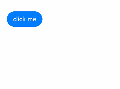
Button('click me').margin(50)
// Execute the animation: Move from the start point to (300,200), then to (300,500), and finally to the end point.
.motionPath({ path: 'Mstart.x start.y L300 200 L300 500 Lend.x end.y', from: 0.0, to: 1.0, rotatable: true })
.onClick(() => {
animateTo({ duration: 4000, curve: Curve.Linear }, () => {
this.toggle =! this.toggle // Use this.toggle to change the position of the component.
})
})
}.width('100%').height('100%').alignItems(this.toggle ? HorizontalAlign.Start : HorizontalAlign.Center)
}
}